by Layale Bassil | May 7, 2020 | Dashboard, Generic, Visualization
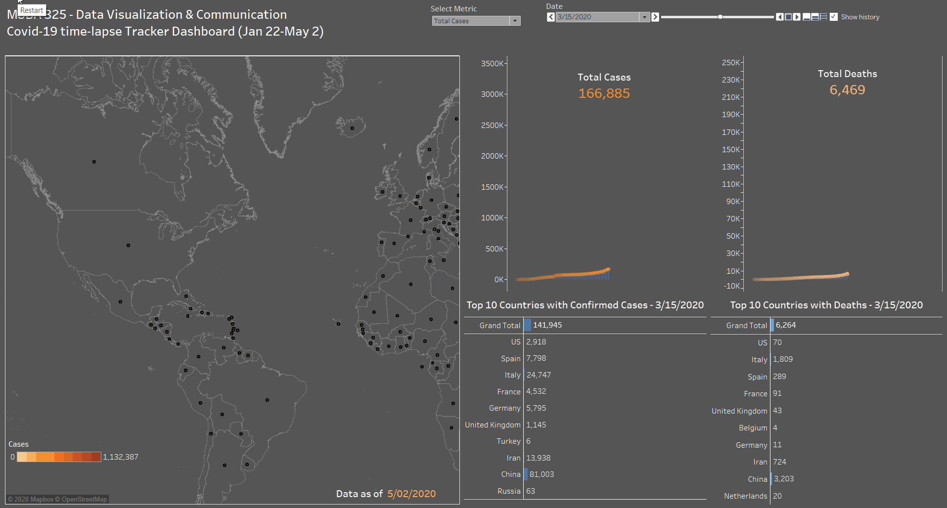
As part of the MSBA 325 Final Project done on Covid-19 and its impact on the World, we have created a time-lapse interactive Covid-19 tracker dashboard containing the following sections:
- A map to show the total confirmed active cases and new cases based on the user’s selection. Every country contains a circular mark, which size is determined by the metric (# of cases) and color is a degradation of orange (9 steps).
- A side by side line+area chart for Cases and Death. With a dynamic label to show the total number increasing with time. This was done by combining a line chart with an area chart, using only one Axis (hiding the right one) to create the below effect.
- A side by side bar chart for Cases and Death. This part shows the top 10 countries with confirmed cases (total and new) and deaths (total and new). A Grand Total has also been added to these charts. A manual sort has been performed on this chart since the total number is by date (as of the max date May 2 2020).
- As for the dashboard parameters, we have added a drop-down to select between Total Cases or New Cases. In addition to the Date control that is used to add the animation to the dashboard and will show the progress of all the dashboard sections by date starting from January 22 till May 2 by default. The user can start from a different start point to monitor the progress.
Click on the below animated image to see the dashboard in action!

Data source: Global Coronavirus (COVID-19) Data (Johns Hopkins)

by Sara Dabbous | May 7, 2020 | Dashboard, Visualization
Since I started working in the healthcare sector I’ve always been interested in knowing more about this industry. As such, while exploring the WDI Data I studied several healthcare indicators and it turns out – Lebanon is doing better than we thought! I was intrigued to know what’s beyond those indicators, and luckily I found a detailed dataset about Primary Health Care Centers in Lebanon on The Humanitarian Data Exchange, I was surprised to know we had this many centers.
Could this visualization be a sign of a sound healthcare system ?
Did this awareness in healthcare aid us in containing the Covid-19?
Do you think there is a better future for the healthcare system for Lebanon, or will it be worst?
Personally, I am optimistic..
So here are some things I didn’t know:
- There are 174 Operational Primary Healthcare Centers in Lebanon
- There are 25 PHC funded by UNHCR
- There are 100 PHC that provide subsidized services.
- Nabatieh has 0 operational PHCs.
- The North governorate has the highest number of operational PHC: 36

In this dashboard, I prepared – using Tableau – a map that shows the different Operational PHC locations in Lebanon filtered by UNHCR Funding. Alongside it, is a bar chart showing the percentage of operational PHC in each Governorate. Finally, at the bottom, you can find a stacked bar chart representing the number of operational PHC per governorate, highlighting those who offer subsidized services.

by Anna Maria | May 6, 2020 | Visualization
Accommodating the Covid-19 Sick Patients within Hospital Beds has been the main challenge worldwide for poor and rich countries alike and for countries with strong healthcare systems and weak healthcare systems alike. Securing these beds is a life or death situation for the Covid-19 critically ill patients who need special intensive care beds. This visulaization will show you the distribution of intensive care patients by country and will show you that the more hospital beds available per 1,000 poulation the lower the Covid-10 mortalility rates.
As per the scatter diagram, countries with higher number of beds per 1,000 population have maintained lower Covid-19 mortality rate even after they went into the peak of Covid-19; best example being Japan with only 4 dead per 1 million population. This is contrasted with England for example which, even prior to reaching the peak of Covid-19, had a high Covid-19 mortality rate of 305 per million. In Japan, there are 13.4 beds per 1000 population whereas in England there are only 2.8 beds per 1000 population.

As per the heat map, we find that Brazil, Iran, Vietnam and Thailand are having the highest percent of critical care patients. Also, this map shows that Lebanon has a 6.53% of critical Covid-19 cases.


by Nourhan Mahmassani | May 5, 2020 | Visualization
We all heard that Covid-19 pandemic lock down has some positive impacts on earth. We did a project studying the impacts of Covid-19 on stock market, healthcare sector, flights, and Pollution. The visualization below shows NO2 levels in different continents before and after Covid-19.There was a decrease of NO2 levels in some continents due to lockdown(the factories closing, less pollutants emissions from cars, flights, etc.)