by Patricia Tawk | May 13, 2020 | Dashboard, Visualization
According to UNESCO, about 258 million children and youth are out of school for the school year ending in 2018. The total includes 59 million children of primary school age, 62 million of lower secondary school age and 138 million of upper secondary age. This is a major humanitarian challenge that all countries have united to address by anchoring it within SDG number 4: Quality Education.
Every Child deserves the opportunity to learn. In this Dashboard, we tried to show visualizations that highlight the reality behind Children Out Of School.

Poverty is a barrier that keeps children out of schools.
The gap between males and females attending schools was equal to 14% in 1970 and decreased to reach 2% in 2018. For girls in some part of this world, education chances are still restricted.
Data Source: World Bank Data

by Jennifer Mardelli | May 10, 2020 | Visualization
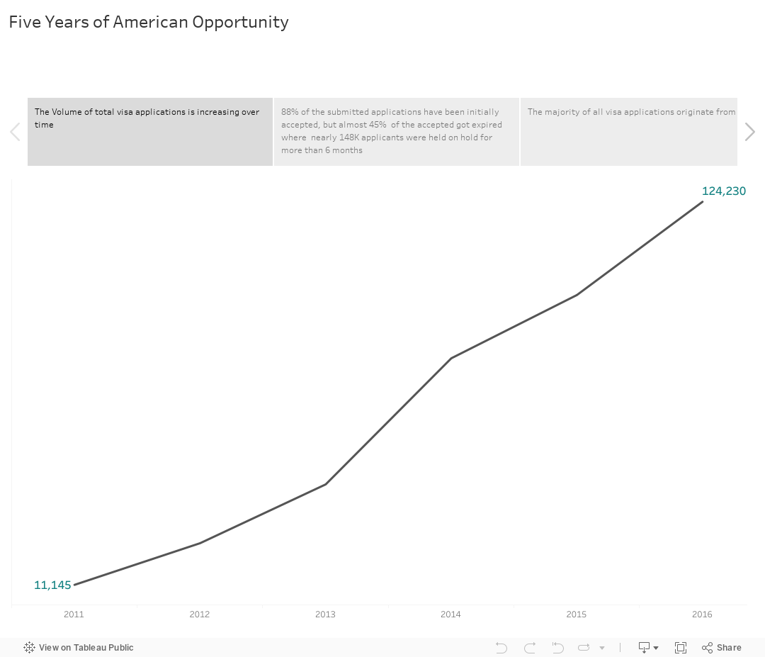
America: its name alone has been enough to bring a sparkle in the eye of several generations of young people. A sparkle of hope, initially: hope for a better life, a future free from hunger and poverty. But also a sparkle mirroring opportunities and dreams, endless possibilities and fresh starts.
Although immigrating to the USA for work is a dream for many, it is to be noted that the employer has to obtain a certified labor certification which guarantees that there are not sufficient U.S. citizens able, willing, qualified and available to accept the job proposed to the foreign worker in order to assure that the employment of the foreign worker will not negatively affect the salaries and working conditions of the similarly employed U.S. workers.
For that reason and , it is important to become familiar with the American job market and get a good understanding of large and important markets, companies, states, and average pay per sector in the USA.

by Layale Bassil | May 7, 2020 | Dashboard, Generic, Visualization
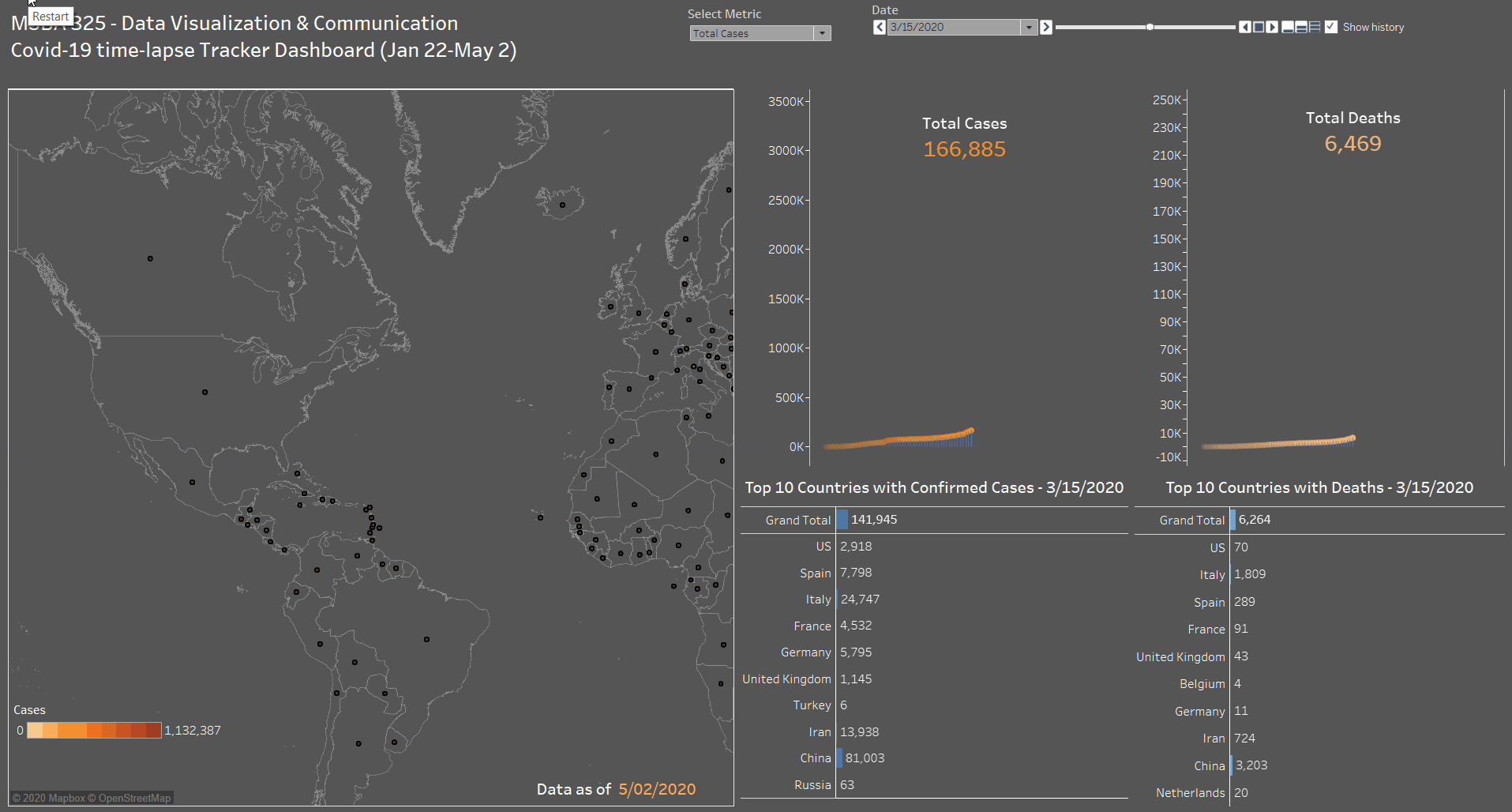
As part of the MSBA 325 Final Project done on Covid-19 and its impact on the World, we have created a time-lapse interactive Covid-19 tracker dashboard containing the following sections:
- A map to show the total confirmed active cases and new cases based on the user’s selection. Every country contains a circular mark, which size is determined by the metric (# of cases) and color is a degradation of orange (9 steps).
- A side by side line+area chart for Cases and Death. With a dynamic label to show the total number increasing with time. This was done by combining a line chart with an area chart, using only one Axis (hiding the right one) to create the below effect.
- A side by side bar chart for Cases and Death. This part shows the top 10 countries with confirmed cases (total and new) and deaths (total and new). A Grand Total has also been added to these charts. A manual sort has been performed on this chart since the total number is by date (as of the max date May 2 2020).
- As for the dashboard parameters, we have added a drop-down to select between Total Cases or New Cases. In addition to the Date control that is used to add the animation to the dashboard and will show the progress of all the dashboard sections by date starting from January 22 till May 2 by default. The user can start from a different start point to monitor the progress.
Click on the below animated image to see the dashboard in action!

Data source: Global Coronavirus (COVID-19) Data (Johns Hopkins)

by Nour Chaccour | May 7, 2020 | Dashboard, Visualization
It will be interesting to explore what all insights can be obtained from a Netflix dataset.