Lebanese Vital Statistics Dashboard (1999-June 2019)
This dashboard contains several interactive visualizations about the “Vital Statistics in Lebanon” for the period 1999 till June 2019. The user can use the dashboard to get insights about the following Vital Stats: Births, Deaths, Marriages, and Divorce.
The user can select the desired measure and some provided filters like year-slider, Mohafaza, etc. in order to generate desired visuals!
Below is a list of available charts:
- Vital Statistics – Consolidated: this is a consolidated interactive chart. It gives the user the needed flexibility to select the x-axis and the y-axis from the four possible indicators (deaths, births, marriages, and divorce) and the gender (female, male) where applicable. By mousing over the points in the scatter plot on the left, the line graphs on the right update based on the point that you are hovering over.
- Yearly Vital Statistics Change (%) in Lebanon: the user can see the yearly percent change for the different measures (births, deaths, marriages, divorces) by gender and Mohafaza.
- Total Births/Deaths: an interactive bar chart to show the total number of births and deaths by gender and Mohafaza.
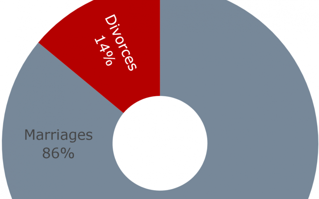
- Total Marriages/Divorces: an interactive stacked bar chart to show the total number of marriages and divorces by Mohafaza.
- Marriages/Divorces Progress: another interactive scatter plot that shows the progress on divorce with respect to marriages categorized by Mohafaza. The user has the option to select only one year or see the progress over all the years.
- Divorce Rate with respect to Marriage: this interactive bar chart shows the divorce rate (%) with respect to marriages by Mohafaza. The user has the option to select only one year or see the progress over all the years.
Moral of the Story: divorce rate in Lebanon on the rise (increased by 101% for the past 10 years)! So please protect your marriages!
Data source (Vital Data 1999-2019: Births, Deaths, Marriages, Divorces): Open Data Lebanon.