by Layale Bassil | May 7, 2020 | Dashboard, Generic, Visualization
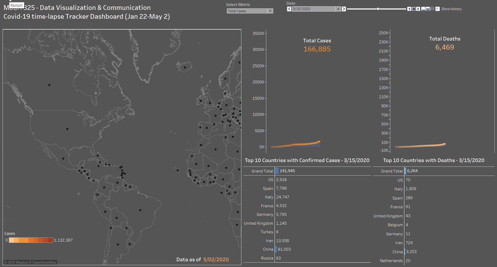
As part of the MSBA 325 Final Project done on Covid-19 and its impact on the World, we have created a time-lapse interactive Covid-19 tracker dashboard containing the following sections:
- A map to show the total confirmed active cases and new cases based on the user’s selection. Every country contains a circular mark, which size is determined by the metric (# of cases) and color is a degradation of orange (9 steps).
- A side by side line+area chart for Cases and Death. With a dynamic label to show the total number increasing with time. This was done by combining a line chart with an area chart, using only one Axis (hiding the right one) to create the below effect.
- A side by side bar chart for Cases and Death. This part shows the top 10 countries with confirmed cases (total and new) and deaths (total and new). A Grand Total has also been added to these charts. A manual sort has been performed on this chart since the total number is by date (as of the max date May 2 2020).
- As for the dashboard parameters, we have added a drop-down to select between Total Cases or New Cases. In addition to the Date control that is used to add the animation to the dashboard and will show the progress of all the dashboard sections by date starting from January 22 till May 2 by default. The user can start from a different start point to monitor the progress.
Click on the below animated image to see the dashboard in action!

Data source: Global Coronavirus (COVID-19) Data (Johns Hopkins)
by Layale Bassil | Apr 30, 2020 | Dashboard, Visualization
This dashboard contains several interactive visualizations about the “Vital Statistics in Lebanon” for the period 1999 till June 2019. The user can use the dashboard to get insights about the following Vital Stats: Births, Deaths, Marriages, and Divorce.
The user can select the desired measure and some provided filters like year-slider, Mohafaza, etc. in order to generate desired visuals!
Below is a list of available charts:
- Vital Statistics – Consolidated: this is a consolidated interactive chart. It gives the user the needed flexibility to select the x-axis and the y-axis from the four possible indicators (deaths, births, marriages, and divorce) and the gender (female, male) where applicable. By mousing over the points in the scatter plot on the left, the line graphs on the right update based on the point that you are hovering over.
- Yearly Vital Statistics Change (%) in Lebanon: the user can see the yearly percent change for the different measures (births, deaths, marriages, divorces) by gender and Mohafaza.
- Total Births/Deaths: an interactive bar chart to show the total number of births and deaths by gender and Mohafaza.
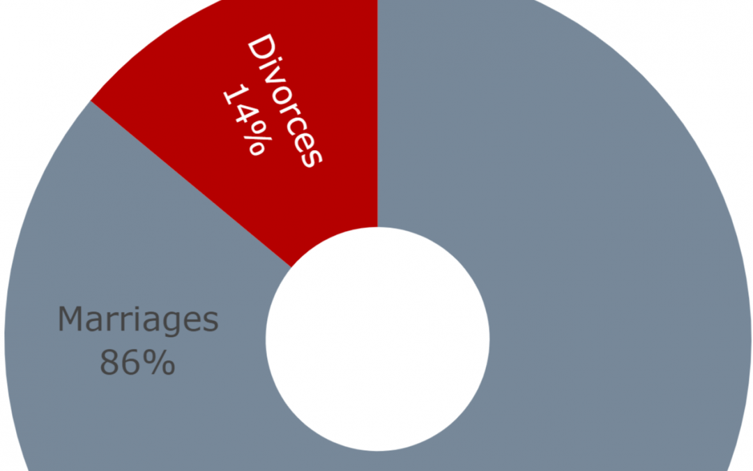
- Total Marriages/Divorces: an interactive stacked bar chart to show the total number of marriages and divorces by Mohafaza.
- Marriages/Divorces Progress: another interactive scatter plot that shows the progress on divorce with respect to marriages categorized by Mohafaza. The user has the option to select only one year or see the progress over all the years.
- Divorce Rate with respect to Marriage: this interactive bar chart shows the divorce rate (%) with respect to marriages by Mohafaza. The user has the option to select only one year or see the progress over all the years.
Moral of the Story: divorce rate in Lebanon on the rise (increased by 101% for the past 10 years)! So please protect your marriages!
Data source (Vital Data 1999-2019: Births, Deaths, Marriages, Divorces): Open Data Lebanon.