by jta20 | Nov 21, 2025 | Visualization
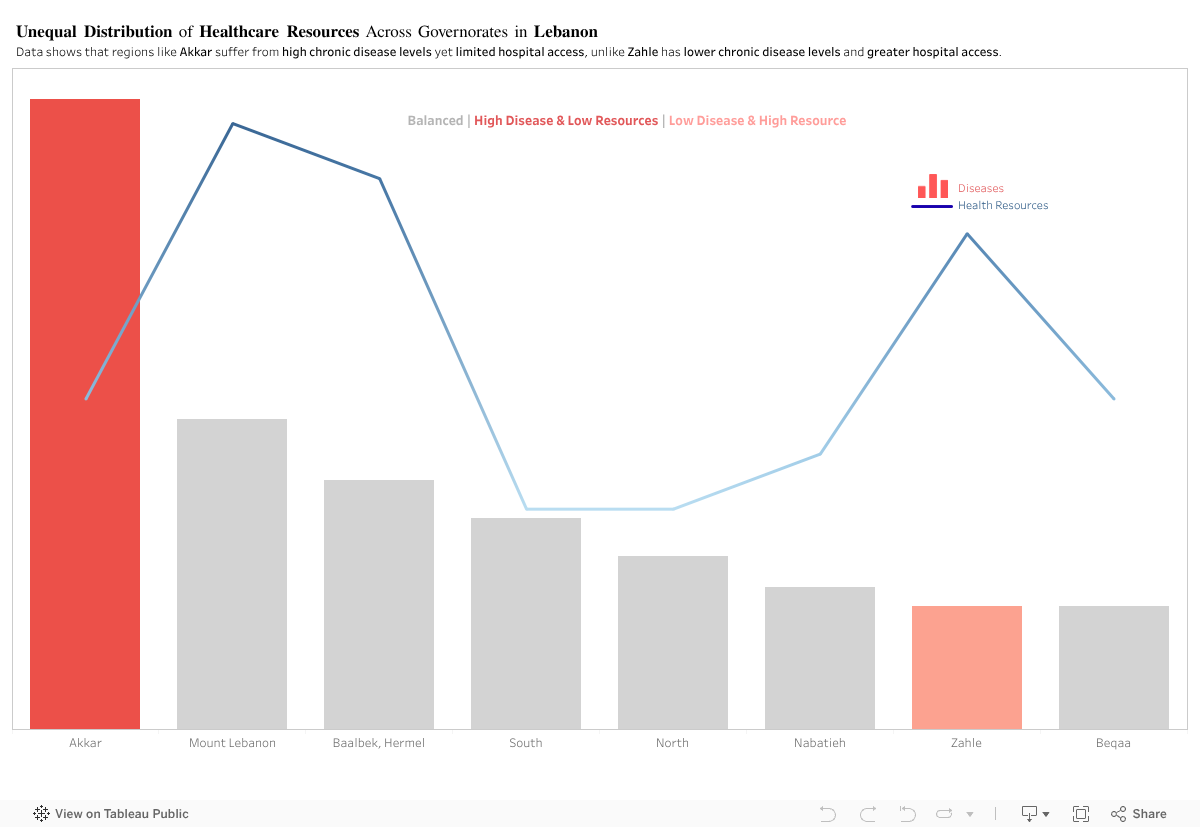
In principle, regions with higher disease levels should have stronger access to healthcare resources. This visualization, however, shows a different pattern.
For this analysis, I compared two indicators across Lebanon’s Governorates:
(1) Diseases
(2) Access to Health Resources
Akkar: High Disease, Limited Access
Akkar consistently shows some of the highest chronic disease levels, yet it has one of the lowest levels of hospital access among the regions.
Zahle: Lower Disease, Higher Access
In contrast, Zahle displays lower disease levels but relatively higher access to hospitals.
By comparing disease levels with healthcare access, the visualization shows a clear mismatch across several governorates. Akkar and Zahle represent two opposite cases, yet the overall pattern remains consistent: health needs and available resources are not aligned across Lebanon.
This raises a key policy question: Are healthcare resources being allocated based on current population needs, or on outdated infrastructure patterns? The evidence suggests that capacity does not scale with actual disease burden in several regions.
To address this, the government should:
- Conduct a nationwide needs-based healthcare assessment to map disease burden against current facility distribution.
- Reallocate resources and funding toward governorates with persistent gaps, particularly in high-need, low-access areas like Akkar.
- Implement dynamic resource planning models that adjust allocations annually based on updated health data.
- Expand primary healthcare centers in underserved regions to reduce pressure on major hospitals.
- Improve transportation and referral systems to ensure patients in remote areas can reach care efficiently
This isn’t about hospital numbers. It’s about a system that gives some regions a chance and leaves others without one.

by cse13 | Nov 21, 2025 | Dashboard, Visualization
Samer is a 58-year-old shop owner in Baabda.
He has diabetes and hypertension, and like many others living with chronic conditions, he spent the early months of the pandemic in quiet fear. He followed every guideline, avoided unnecessary outings, and even closed his shop early just to stay safe.
As I began working with data on chronic disease prevalence across Lebanon, I kept thinking about people like Samer; individuals whose health risks existed long before COVID-19 arrived. It made me wonder:
Do districts with more people like Samer also end up reporting more COVID-19 cases?
At first, the logic seemed simple:
more chronic conditions should mean higher vulnerability, and higher vulnerability should mean more cases.
But once I visualized the data, the story turned out to be more complicated than that.
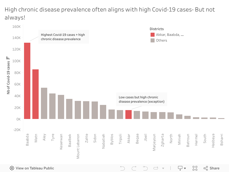
When we look at Baabda, Samer’s home district, the pattern is exactly what we expect.
Baabda and Matn have a high chronic disease prevalence which explains why they recorded the highest number of COVID-19 cases. These districts appear in red in the visualization because they represent the expected relationship:
high chronic disease prevalence accompanied by high COVID-19 case counts.
Most other districts show the same downward pattern: fewer chronic illnesses tend to come with fewer reported infections.
It’s the straightforward story we anticipate.
Until one district breaks it.
While exploring the data, Akkar immediately stood out.
Unlike Baabda or Matn, Akkar shows relatively low COVID-19 case numbers despite having a high prevalence of chronic diseases.
At first glance, this shouldn’t happen. But Akkar tells a different health story.
Akkar is less dense, has fewer specialized medical centers, and mobility patterns differ.
But an important social factor also played a role: many residents initially believed COVID-19 was “just a flu”, something exaggerated, not dangerous. Because of that, people were far less likely to get tested, especially when symptoms were mild or unclear.
So, the low case numbers may not reflect low infections, they reflect low detection.
Akkar shows us that vulnerability isn’t only biological or medical. Sometimes it’s cultural, structural, or tied to trust in the health system itself.
That was the moment when the visualization stopped being merely a chart and became a real narrative.
People like Samer live in districts where both chronic disease and COVID-19 risks were high and highly visible.
But in Akkar, people with the same medical vulnerabilities faced a quieter, more hidden risk, one that doesn’t always show up in official numbers but still shapes their health outcomes.
This is the heart of the story: patterns tell us what usually happens, but exceptions reveal what we might be missing.
Understanding these mismatches matters.
High-case, high-risk districts like Baabda and Matn may need more hospital capacity and emergency planning.
High-risk, low-case districts like Akkar may need earlier outreach, awareness campaigns, and accessible screening, especially in communities that may initially resist testing.
If we focus only on case counts, we risk overlooking communities that need protection long before outbreaks become visible.
When I think back to Samer, closing his shop early every night, hoping to stay healthy, I’m reminded that data becomes meaningful when it reflects real people.
In public health, the story doesn’t live only in the trend.
It lives in the exception.
Because that’s where we discover the next challenge before it appears.

by amk112 | Nov 21, 2025 | Dashboard, Visualization
The Surprising Fact
Around one out of every five tourism facilities in Lebanon is concentrated in just two governorates: Baabda and Akkar.
When I first mapped the number of hotels, restaurants, cafés, and guest houses across all regions, this pattern immediately stood out.
Lebanon is often celebrated for its geographic diversity – mountains, coast, valleys, and historic towns – yet the distribution of tourism infrastructure reveals a different story, one marked by clear regional imbalance. Even more interesting, Baabda and Akkar are not traditionally seen as the country’s top touristic destinations, which makes this concentration even more surprising.
Setting the Context
Tourism has long been one of Lebanon’s essential economic pillars. It creates jobs, sustains small and medium businesses, and brings much-needed spending into local communities.
Because of this, understanding where tourism infrastructure is located is not just a mapping exercise. It helps us see deeper patterns in development, accessibility, and how opportunities are distributed across the country. Regions with more facilities attract more visitors, investment, and employment, while others risk being left behind.
Introducing the Visualization
To explore this issue, I developed the visualization shown below. It ranks Lebanese governorates by their total number of tourism facilities, combining four types of establishments:
-
Hotels
-
Restaurants
-
Cafés
-
Guest houses
The data comes from the Lebanon Tourism Dataset 2024 and reflects the most recent nationwide mapping of tourism infrastructure. The chart uses color to highlight the top two regions, with the remaining governorates shown in muted tones to provide context without overwhelming the viewer.
The Core Insight
The chart makes one fact impossible to ignore:
Baabda and Akkar together host 1,249 tourism facilities – about 20% of all facilities in Lebanon.
Baabda leads with 631 facilities, followed closely by Akkar with 618. No other governorate reaches these levels. The third-highest region, Matn, drops to 383 facilities, and the numbers continue to decrease as we move toward more peripheral areas such as Hasbaya, Marjeyoun, and the Bekaa.
This reveals a strong centralization of tourism infrastructure in just a few locations, while many other regions operate with a significantly smaller base of hotels, restaurants, cafés, and guest houses.
Why This Matters
This concentration has several important implications:
1. Limited Regional Economic Spillover
Tourism-driven income is more likely to stay within a small set of governorates. Regions with fewer facilities miss out on employment opportunities, business growth, and investment linked to tourism.
2. Uneven Visitor Experience
Visitors may repeatedly encounter the same areas, such as Baabda and Akkar, instead of discovering Lebanon’s full variety of landscapes, heritage sites, and rural communities. This can reinforce the perception that tourism is “meant” for certain regions only.
3. Underused Infrastructure Potential
Areas like Tyre, Baalbek-Hermel, Batroun, and Nabatieh have strong cultural, historical, and natural assets, yet they remain comparatively underserved in terms of tourism infrastructure. The gap between their potential and current facility levels represents a missed opportunity.
A Deeper Imbalance
Looking at the totals by group of regions makes this imbalance even clearer:
-
Top 2 governorates (Baabda & Akkar):
1,249 facilities – about 20% of the national total
-
Next 3 governorates combined:
1,096 facilities – around 18%
-
Remaining 20+ governorates combined:
3,801 facilities – about 62%
Most individual governorates therefore hold less than 5% of the country’s tourism infrastructure. This suggests long-standing gaps in how tourism investments and services have been distributed geographically.
An Opportunity Hidden in the Data
While these patterns highlight inequality, they also point to a clear opportunity.
If even a modest share of new tourism projects, guest houses, or hospitality investments were directed toward underrepresented regions, Lebanon could unlock:
-
More balanced economic development
-
New, locally anchored jobs
-
Stronger domestic tourism flows
-
A richer and more diverse visitor experience
Regions such as Zgharta, Batroun, Tyre, and the Bekaa already show emerging clusters of facilities. With targeted planning and support, they could become anchors for broader regional tourism strategies.
Final Takeaway
Understanding where tourism infrastructure currently exists – and where it is missing – is essential for designing a more inclusive tourism future for Lebanon.
The data tells a clear and actionable story:
Lebanon’s tourism future depends on looking beyond a small set of concentrated governorates and deliberately investing across the country’s full geography.
By doing so, tourism can shift from being a localized advantage to a national engine for development and shared prosperity.

by zss17 | Nov 21, 2025 | Visualization
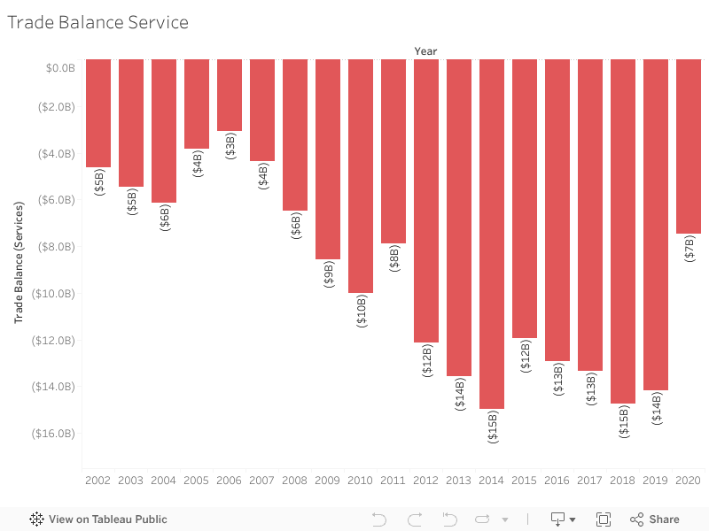
Lebanon’s service sector should be a national strength — tourism, education, banking, and professional services once made the country a regional hub. But when we look beyond assumptions and into the data, a very different story appears: for 21 straight years, Lebanon has been in the red, importing more services than it exports.
From telecoms and travel to banking and consulting, services play a key function in transforming a country’s economic strength. But for Lebanon, the story hidden in the data tells a completely different reality—one of a consistently growing services deficit over the last two decades.
Looking at 20 years of trade data, I examined how Lebanon’s services balance transformed across key economic periods. The story became immediately clear:
For 21 consecutive years, Lebanon has never escaped a services trade deficit, and the gap continues to deepen.
Why This Matters
For more than twenty years, Lebanon has faced a continuing services trade deficit. The country’s imports, including finance, logistics and professional consulting, have consistently exceeded its exports. The ongoing imbalance heightens economic vulnerability and increases Lebanon’s reliance on foreign service suppliers.
Between 2002 and 2022, the trade balance remained consistently negative. During its 2014-2018 peak, the trade balance deficit surpassed $14 billion, revealing how deeply rooted this issue has become.
The visualization below highlights how this deficit has evolved across key periods.
**Interactive Visualization:**
Hover over the bars to see exact values for each year.
**Full View:**
Complete visualization showing Trade Balance Services from 2002-2022.

During the pandemic in 2020, the deficit slightly decreased—mainly due to reduced travel and service utilization. Unfortunately, this improvement is temporary. In 2021 and 2022, the deficit rises again, continuing the very trend Lebanon has struggled with for years.
What This Means
A persistent services trade deficit highlights structural vulnerabilities. It reveals that Lebanon is consistently spending more on imported services than it generates from exports. With time, this imbalance becomes a financial burden that weakens financial stability and increases dependence on external inflows.
The Big Idea
Examining two decades of data highlights how Lebanon’s service trade deficit has continued to expand, revealing Lebanon’s economic vulnerability. The figures are striking on their own, but when presented as a story, the patterns become impossible to overlook.
What Can Lebanon Do?
Reducing the services deficit requires structural changes rather than short-term fixes. Strengthening digital services, tourism, and healthcare exports can create new revenue streams. Supporting export-oriented SMEs — especially those providing regional outsourcing services — can also help Lebanon compete more effectively.
Policy efforts should focus on promoting digital transformation, encouraging service-based startups, and building stronger regional trade partnerships. Over time, these measures can help diversify Lebanon’s export base, reduce dependency on imported services, and move the country toward a more sustainable trade position.
For example, Lebanon’s IT outsourcing sector—especially remote consulting and digital services—has grown naturally since 2020 and can become an export engine if supported through training and regional partnerships.

by mfa88 | Nov 21, 2025 | Visualization
When Tom, a first-time tourist, arrived in Lebanon, he prepared a long list of places he wanted to explore: Beirut for its vibrant nights, Batroun for its beaches, The Cedars in the North for hiking and natural beauty… But as he planned his trip, something stood out: Mount Lebanon barely made it onto his itinerary.
Tom is not the only one. Many tourists overlook Mount Lebanon even though it contains some of the most visited and populated towns in the country.
This led to an important question: If Mount Lebanon has so much to offer, why isn’t it a tourist favorite?
- Mount Lebanon has the most to offer.. on paper:
Mount Lebanon is home to:
- The largest number of towns in Lebanon (381 towns)
- The highest number of cafes, restaurants, hotels and guesthouses
- Many natural and cultural attractions that are spread out throughout its towns.
As the below map shows, 25% of towns in Mount Lebanon have at least one attraction.
So one would naturally expect that Mount Lebanon is one of Lebanon’s top tourism destinations.
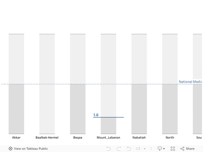
2. Despite These Advantages, Mount Lebanon Underperforms
Mount Lebanon’s median index is below the national median, meaning half of its towns score 1 or less on the tourism index.
3. Access and Public Spaces Matter More Than Attraction Count
To better understand what drivers tourism performance, I examined how infrastructure quality relates to tourism.
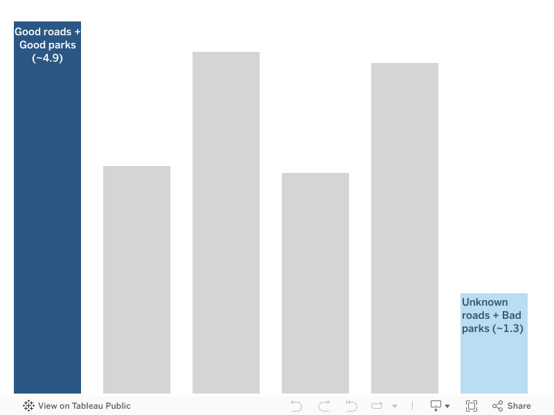
In the below graph, the pattern becomes clear: Good Roads and Good Public Spaces Lead to the Highest Tourism Levels
Towns with:
- Good roads + good parks -> highest tourism indices (~4.9)
- Bad roads + poor parks -> lowest tourism indices (~1.3)
This suggests that tourism thrives when attractions are easy to reach, and public spaces are well maintained.
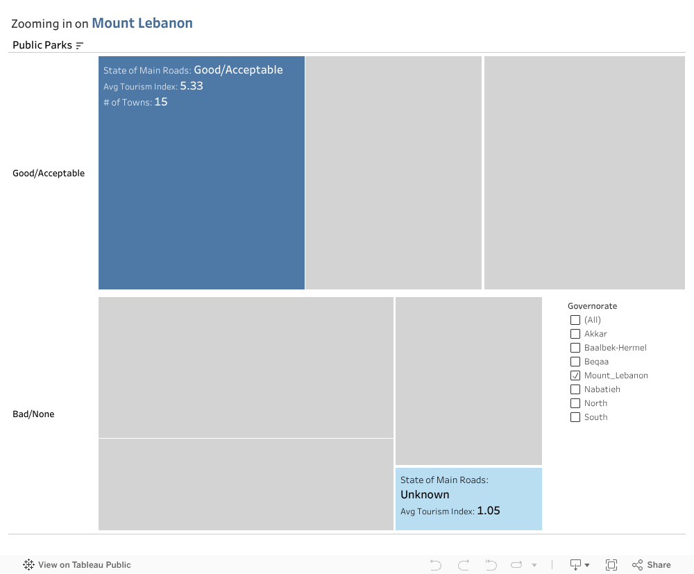
So now if we focus back on Mount Lebanon, we can see that:
- Many towns have bad or unknown road conditions
- Public parks are often missing or poorly maintained (these are the towns scoring above 5 on the tourism index)
This confirms that Mount Lebanon’s low tourism index is driven by poor infrastructure, not a lack of attractions.
4. Conclusion: Improving Tourism Starts With Improving Access
Mount Lebanon already has the attractions it needs. What it’s missing is the infrastructure that allows visitors to reach them easily and enjoy them fully.
5. Recommendations
To unlock its true tourism potential, Mount Lebanon should focus on:
-
- Prioritizing road and park restoration in Mount Lebanon’s key touristic towns
- Investing in accessibility and maintenance rather than only promoting attractions
If these things improve, Mount Lebanon won’t be an afterthought anymore. It will become a place Tom and countless other visitors choose to explore.
Big Idea:
Tourism performs best where attractions are supported by good infrastructure.
If Mount Lebanon wants to improve their tourism index, they should not only depend on having interesting places to visit but also invest in their infrastructure quality, as tourism thrives when attractions are easily accessible, which enhances the overall visitor experience.
by cvs02 | Nov 21, 2025 | Dashboard, Uncategorized, Visualization
Teta Salma lives in a small village in the Hermel District. The nearest clinic is far from her home and opens on an unpredictable schedule, so routine tests are rarely part of her life. She often feels tired but assumes it is simply age catching up with her. During a visit to her daughter in Mount Lebanon, she took her to a nearby medical center for a simple checkup. That day she learned she had diabetes. The condition had been part of her life for years. It had only been discovered because she finally had access.
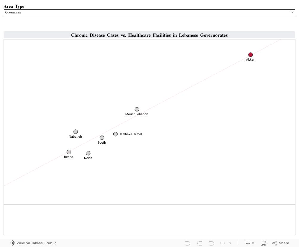
Her experience reflects something that appears across Lebanon when we look at the data. Using the Health Status 2023 and Health Resources 2023 datasets from PKGCube, I compared reported chronic disease cases with the number of healthcare facilities available in each governorate and district. I combined hypertension, cardiovascular disease and diabetes into one chronic disease measure. I then compared these counts with the number of care centers and first aid centers in each region:
The visualization revealed a clear pattern: Regions with stronger reach and more places to get a routine check reported higher counts of chronic disease. Akkar stands out with 390 chronic disease cases and 126 healthcare facilities. Mount Lebanon and Baalbek Hermel show a similar alignment. Areas with limited reach, such as Hermel or the Western Beqaa, showed much lower numbers.
These lower numbers do not necessarily reflect lower illness. They reflect reduced visibility. When people cannot reach a clinic easily, fewer conditions are recorded and many remain unnoticed until symptoms become harder to ignore.
To understand how better reach affects health data, I looked at the experience of Thailand. The country expanded primary care and community screening through its Universal Health Coverage program. Once routine checks became easier to access, more cases of hypertension and diabetes were identified, especially in rural areas. Detection of hypertension increased from 48.9 percent in 2016 to 53.3 percent in 2019, and diabetes detection rose from 67.4 percent to 74.7 percent during the same period. These changes showed how wider access can reveal conditions that were present long before.
This is similar to what we see in Lebanon. When people have access, more of the country’s true chronic disease burden becomes visible. When access is limited, the data looks lighter than reality.
A practical next step for Lebanon is to expand routine screening in districts with fewer facilities. Mobile clinics, community testing days and partnerships with universities or NGOs can bring basic checks closer to the communities that need them. Improved digital record systems can also help track early diagnoses more accurately. Monitoring places like Hermel, Bsharri or the Western Beqaa can show if these efforts are working.
Healthcare access shapes what we know about people’s health. Strengthening that access gives families the chance to understand their conditions earlier and manage them with clarity. It also brings us back to people like Teta Salma. Her diabetes did not begin the day she was screened. It became visible because she finally reached a place where someone could help her.
Supporting more communities in this way can bring hidden conditions to light and build healthier lives across Lebanon.