by zhh08 | Apr 15, 2022 | Dashboard, Generic, Uncategorized, Visualization
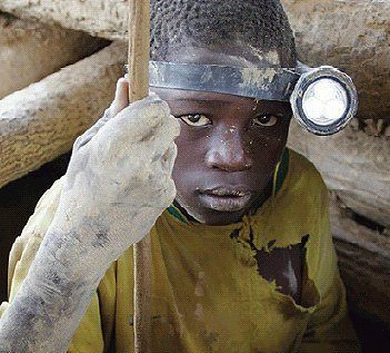
This is Hamisi, an 11 year who has a career as a miner.
Hamisi dropped out of his third year of primary school and left his home village after his father was unable to pay for his uniform and school fees. Although Hamisi’s parents have their own half-acre coffee farm, their income fell sharply because of the decline in the market price for coffee throughout the world. Hamisi works up to 18 hours and earns between 60 cents to $ 1.2 a day.
The health of the children like Hamisi is very poor, as they breathe in the harmful graphite dust found in the mines and have poor nutrition, surviving on 1 meal a day.
Child slavery in big industries such as agriculture and manufacturing is an ongoing issue, and they are slowly being resolved by governments and organizations fighting child labor. Stories such as the ones mentioned above are common scenarios in developing countries where there are large sections of the population who are still deep in poverty.

Facts:
- + 8.4 M in the last 4 years alone. According to a report by the International Labour Organization (ILO) and UNICEF, the number of children in labour has increased to 160 million worldwide.
- 72.1 M are estimated to be in child labour in Africa. 9% of African children are in hazardous work – the highest of all the world’s regions representing 31.5 million.
- 1 in 5 children in Africa are employed against their will in farms and mines.
Recommendations:
- Increase the number of years for compulsory education.
- Create more job opportunities with higher salaries for parents.
- Set a minimum age at which people can legally be employed.

by Lea El Halabi | Apr 15, 2022 | Generic, Visualization
Does a Country’s Borrowing Policy Affect its Population’s Income level?
The Case of Lebanon

DOLLAR? LBP?
WHAT’S THE EXCHANGE RATE TODAY?
DISCOUNTING CHECKS? AT WHAT RATE?
WHAT???? 20%????
THIS MEANS I’M LOSING 80% OF MY MONEY!!!
I WAS DOING OK BUT NOW I CAN BARELY MAKE ENDS MEET…
This has unfortunately been the sad reality that
theLebanese people have been living for since
October of 2019.
WHY?
Because a Banking | Financial | Currency | Crisis
Made a Huge Bubble Burst!

BUT HOW DID WE GET HERE?

Lebanon has had a budget deficit for over 20 years
and has been borrowing from external parties
for as long as we can remember.
So, as Lebanese citizens, we are born indebted.
A country’s national debt affects its population’s income level:
-
Growing debt has a direct effect on economic opportunities
-
If high levels of debt crowd out private investments, workers would have less to jobs do and therefore earn lower wages

Countries with LOWER DEBT exhibit HIGHER INCOME levels per capita.
SO HOW HAS LEBANON’S DEBT BEEN CHANGING OVER TIME?

WHAT CAN WE DO TO MAKE THINGS BETTER?

Potential Solutions include but are not limited to:
-
Supporting Production and Services Sectors leading to more Job Creation and eventually More Wages
-
Improving Trade Agreements leads to more exports which would Reduce Budget Deficits and make the country economically healthier
-
Attracting Foreign Direct Investments by providing a healthy capital market (ex: improving Reporting Practices) which leads to More Investments & More economic opportunities, More Jobs and eventually More wages
IS THERE PROOF?
Countries with Open Trade Policies seem to have higher income levels

Countries with Updated Reporting Practices also have higher income levels

SO, WHAT ARE THE RECOMMENDATIONS?
STOP borrowing from international Agencies
CONTROL High National Debt Levels
Implement Policies to boost the economy


by Layale Bassil | May 7, 2020 | Dashboard, Generic, Visualization
As part of the MSBA 325 Final Project done on Covid-19 and its impact on the World, we have created a time-lapse interactive Covid-19 tracker dashboard containing the following sections:
- A map to show the total confirmed active cases and new cases based on the user’s selection. Every country contains a circular mark, which size is determined by the metric (# of cases) and color is a degradation of orange (9 steps).
- A side by side line+area chart for Cases and Death. With a dynamic label to show the total number increasing with time. This was done by combining a line chart with an area chart, using only one Axis (hiding the right one) to create the below effect.
- A side by side bar chart for Cases and Death. This part shows the top 10 countries with confirmed cases (total and new) and deaths (total and new). A Grand Total has also been added to these charts. A manual sort has been performed on this chart since the total number is by date (as of the max date May 2 2020).
- As for the dashboard parameters, we have added a drop-down to select between Total Cases or New Cases. In addition to the Date control that is used to add the animation to the dashboard and will show the progress of all the dashboard sections by date starting from January 22 till May 2 by default. The user can start from a different start point to monitor the progress.
Click on the below animated image to see the dashboard in action!

Data source: Global Coronavirus (COVID-19) Data (Johns Hopkins)

by fz13 | Apr 30, 2020 | Generic
Visualization is one of the earliest forms of communication that appeared thousands of years ago. It enabled us to tell stories that were preserved from one generation to the next through for example cave painting (image credit).
Data visualization is core to the analytics process. As John Tukey highlighted: “this is my favorite part about analytics: Taking boring flat data and bringing it to life through visualization.”
MSBA students at OSB of AUB are continuously producing great visuals that change our perception of various matters in life.
This blog is meant to aggregate and share a selection of visualizations and dashboards that OSB students create in the MSBA 325 course on data visualization and communication.
Enjoy browsing the site!


