by Jad Rizk | May 5, 2020 | Dashboard, Visualization
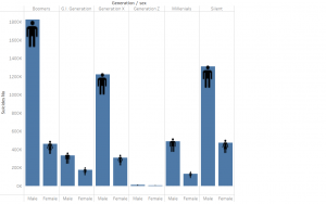
The below storyboard highlights and examines a correlation between the GDP per capita and population age distribution. The visualization shows a comparison between regions and across time. This correlation makes us think more about future problems like pensions, economic growth, child labor, retirement age, and possible social problems. It is worth examining further if there is causality. Are economic changes coming based on age distribution?
The dashboard is interactive. Please feel free to filter, highlight, and discover the data in more depth. The fullscreen setting will allow for a better viewing experience.

by Nourhan Mahmassani | May 5, 2020 | Visualization
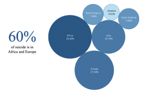
Countries face a huge loss due to unemployment. In order to find a solution for unemployment, we searched for the factors causing it. As shown below, gender discrimination, country’s GDP, distribution of jobs among the economic sectors, and educational level have a huge impact on Unemployment.Above,you can alter the regions you want to analyze from using multiple values drop-down.
In Conclusion:
-As GDP increase the Unemployment rate decrease
-Female Unemployment is higher than the males due to gender discrimination in workplace
-Employment rate is higher in the services sectors which mean that there is no equal job opportunities in between sectors causing higher
unemployment
-If the educational level is more advanced, their is lower unemployment rate
Data Source: https://datacatalog.worldbank.org/dataset/world-development-indicators

by Rosa Azar | May 4, 2020 | Visualization
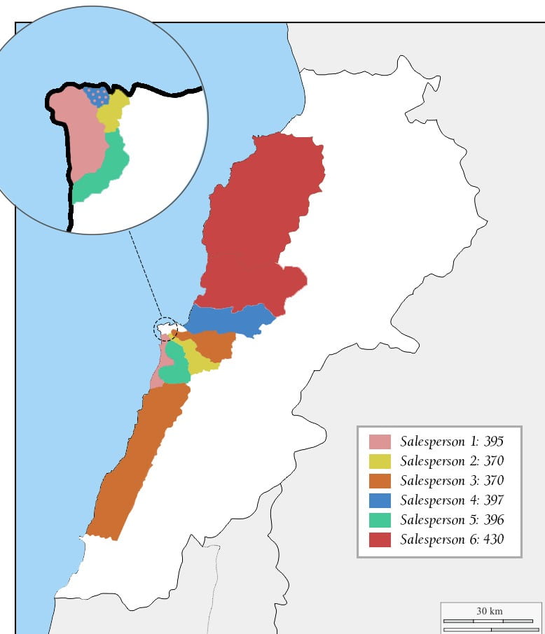
As part of the final project, it was interesting to see the regional allocation of the salesperson. The first visual shows how many visits to the client should be made for each region.

The second visual shows the allocation of the salesperson according to regions as well as the number of visits required. With 2,358 visits to make and with five clients per day, we can say that we will need six salespeople (2358/75) and some will have to see more than five clients per day on some days. This just means at least one day a week they will have to see one or two more existing customers rather than meet with new ones.


by Tarek El khayat | May 4, 2020 | Visualization
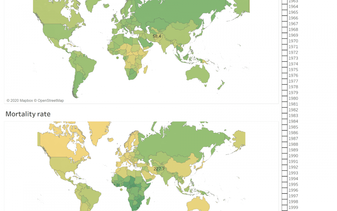
The Dashboard shows the mobile subscription rate around the world between 2013 till 2019 and compare it with the mortality rate. It is clear that the mortality rate is related to another factor and there is no contribution between the increase of mobile subscription and the mortality rate and the mobile is not the direct cause of mortality


