Data Visualization

Blog of the Data Visualization & Communication Course at OSB-AUB

This is my favorite part about analytics: Taking boring flat data and bringing it to life through visualization” John Tukey

Suicide Rates

by | May 4, 2020 | Visualization | 0 comments

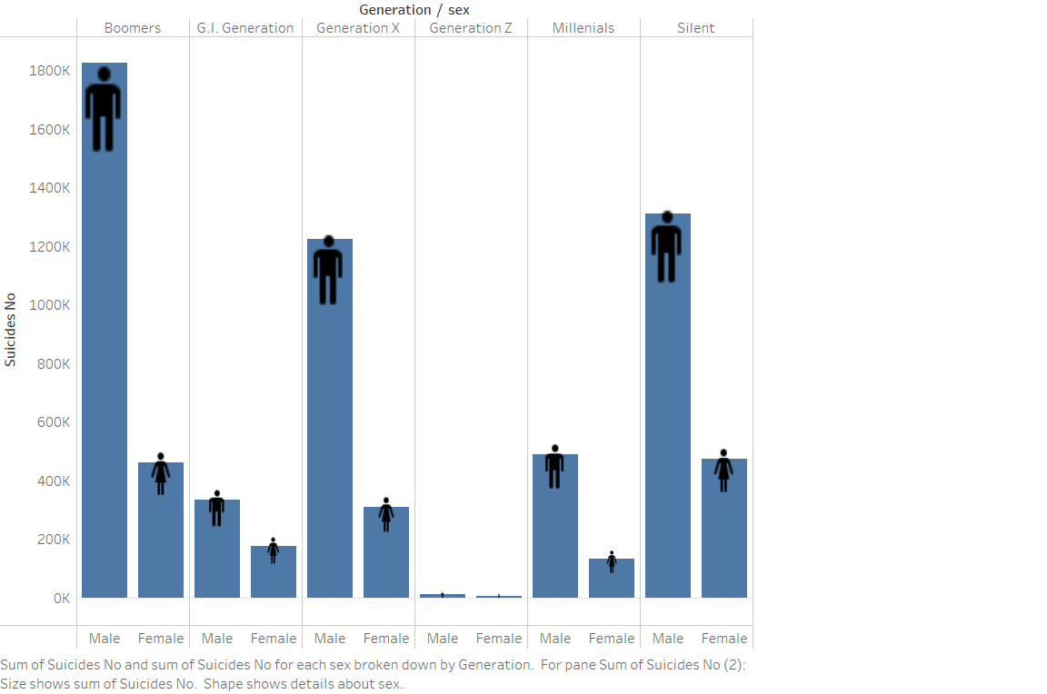
This graph shows the variation of suicide cases across Gender and Generations. We can see that according to the data we have, males from the Boomers generation account for the highest number of suicide cases.

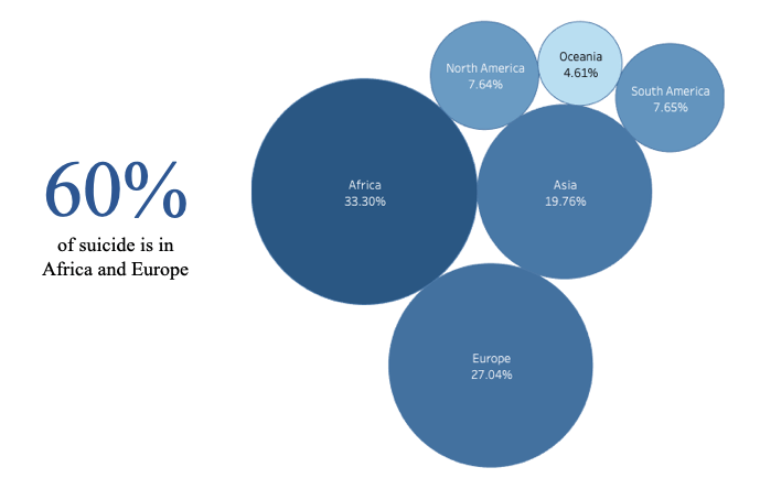
We found that Africa and Europe account for almost 60% of all suicide cases


0 Comments

Submit a Comment

Your email address will not be published. Required fields are marked *