by cvs02 | Nov 21, 2025 | Dashboard, Uncategorized, Visualization
Teta Salma lives in a small village in the Hermel District. The nearest clinic is far from her home and opens on an unpredictable schedule, so routine tests are rarely part of her life. She often feels tired but assumes it is simply age catching up with her. During a visit to her daughter in Mount Lebanon, she took her to a nearby medical center for a simple checkup. That day she learned she had diabetes. The condition had been part of her life for years. It had only been discovered because she finally had access.
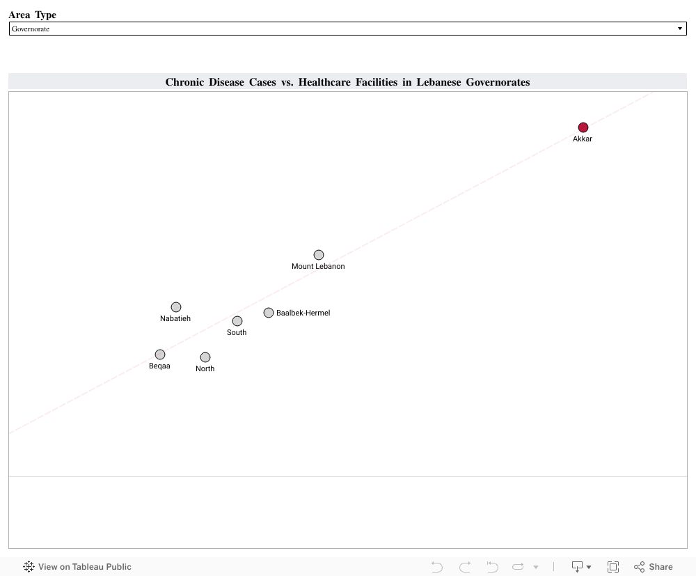
Her experience reflects something that appears across Lebanon when we look at the data. Using the Health Status 2023 and Health Resources 2023 datasets from PKGCube, I compared reported chronic disease cases with the number of healthcare facilities available in each governorate and district. I combined hypertension, cardiovascular disease and diabetes into one chronic disease measure. I then compared these counts with the number of care centers and first aid centers in each region:
The visualization revealed a clear pattern: Regions with stronger reach and more places to get a routine check reported higher counts of chronic disease. Akkar stands out with 390 chronic disease cases and 126 healthcare facilities. Mount Lebanon and Baalbek Hermel show a similar alignment. Areas with limited reach, such as Hermel or the Western Beqaa, showed much lower numbers.
These lower numbers do not necessarily reflect lower illness. They reflect reduced visibility. When people cannot reach a clinic easily, fewer conditions are recorded and many remain unnoticed until symptoms become harder to ignore.
To understand how better reach affects health data, I looked at the experience of Thailand. The country expanded primary care and community screening through its Universal Health Coverage program. Once routine checks became easier to access, more cases of hypertension and diabetes were identified, especially in rural areas. Detection of hypertension increased from 48.9 percent in 2016 to 53.3 percent in 2019, and diabetes detection rose from 67.4 percent to 74.7 percent during the same period. These changes showed how wider access can reveal conditions that were present long before.
This is similar to what we see in Lebanon. When people have access, more of the country’s true chronic disease burden becomes visible. When access is limited, the data looks lighter than reality.
A practical next step for Lebanon is to expand routine screening in districts with fewer facilities. Mobile clinics, community testing days and partnerships with universities or NGOs can bring basic checks closer to the communities that need them. Improved digital record systems can also help track early diagnoses more accurately. Monitoring places like Hermel, Bsharri or the Western Beqaa can show if these efforts are working.
Healthcare access shapes what we know about people’s health. Strengthening that access gives families the chance to understand their conditions earlier and manage them with clarity. It also brings us back to people like Teta Salma. Her diabetes did not begin the day she was screened. It became visible because she finally reached a place where someone could help her.
Supporting more communities in this way can bring hidden conditions to light and build healthier lives across Lebanon.

by jje23 | Nov 21, 2025 | Dashboard, Visualization
If you grew up in Lebanon, you’ve probably heard someone say: “If this illness happened in Beirut, things would’ve been easier.”
I’ve heard it from relatives and friends who had to drive for hours for a simple check-up.
Healthcare in Lebanon has never felt equal, but I always wondered: Is this just a feeling, or is the data telling the same story?
To explore this, I combined two national datasets:
One mapping where chronic diseases and special needs appear across Lebanese towns, and another showing where healthcare facilities are actually located.
- These visuals show that rural regions, especially Akkar, Baalbeck-Hermel, and the North, have the highest share of towns reporting chronic diseases, confirming that Lebanon’s heaviest health burdens fall on its most underserved areas.
- We can see that most healthcare facilities are concentrated in urban Mount Lebanon, creating an imbalance where the regions with the greatest health needs have the least medical infrastructure.
To understand this imbalance more clearly, I looked at disease prevalence side-by-side with the availability of the healthcare resources that matter most for each condition.
The question was simple: when a disease appears in a town, is the right type of care actually nearby?
Therefore, I paired each condition with the resource most relevant to its management, based on clinical practice and literature:
• Hypertension → hospitals
• Diabetes → clinics
• Cardiovascular disease → pharmacies or medical centers
• Special needs → dedicated care centers
Once I paired each condition with the care it requires, a clear imbalance appeared:
• The regions most affected by disease had the least access to the services they needed.
• The regions with lighter disease presence had the strongest concentration of facilities.
A clear example is hypertension vs hospitals:
•Akkar, Baalbeck-Hermel, the North, and parts of the South showed high hypertension presence, yet had some of the lowest hospital capacity.
•Meanwhile, Mount Lebanon, with lower prevalence, had more hospitals than all of them combined.
This is more than an imbalance; it’s an access gap that shapes real health outcomes.
So, what does Lebanon need?
- Targeted decentralization, not more hospitals everywhere.
Rural regions don’t need giant new medical complexes.
They need strategically placed clinics, chronic-disease screening units, hypertension/diabetes corners, and even mobile health programs.
- Allocate resources based on data
Mount Lebanon already has the largest medical footprint.
But Akkar, Baalbeck-Hermel, the North, and the South need urgent investment.
- Build capacity where it matters.
Even a single medical center, diagnostic pharmacy, or special-needs support unit can shift accessibility for hundreds of towns.
- Make data-driven planning routine.
Lebanon produces far more data than most people realize, we just don’t use it.
Dashboards and visual can guide ministries, municipalities, NGOs, donors, and health planners to invest where impact will be highest.
Lebanon doesn’t suffer from a lack of medical knowledge, it suffers from a lack of medical access. And the good news is that access can change.
If resources finally start following the data, rural Lebanon won’t stay medically invisible. The map is clear, now the planning needs to follow.


by gji02 | Nov 20, 2025 | Dashboard, Uncategorized, Visualization
A personal journey into the places we love, the beauty we overlook, and the opportunities we’re losing
Lebanon is a country overflowing with natural beauty, history, culture, and authentic local experiences. A place where even the smallest town holds a story, a scent of zaatar from a bakery at dawn, the echo of church bells or the call to prayer drifting across the valley, the laughter of families gathered near rivers, old souks, and mountain trails.
These moments stay with us.
They shape who we are.
They remind us of a Lebanon that feels peaceful, grounding, and full of life.
But beneath the familiar hotspots we all rush to, there is a deeper truth, a truth rarely captured in brochures or tourism campaigns.
Many Lebanese towns already hold everything a thriving tourism ecosystem needs… except support.
Growing up here, these towns shaped my identity. Their landscapes, their people, their rhythm, all felt alive.
Yet as I grew older, I began to notice something painful:
The towns we love are often the ones left behind.
Where Beauty Lives but Support Does Not
Before looking at individual towns, I started from a broader question:
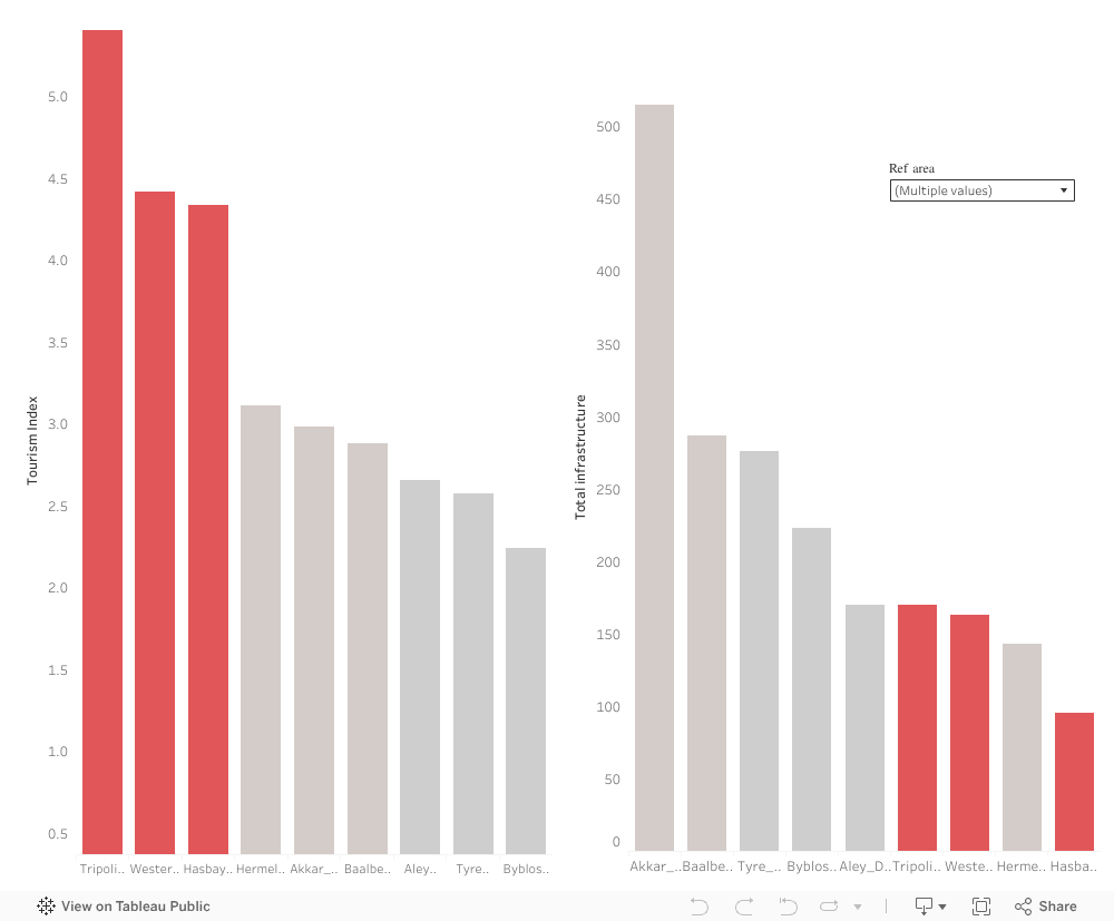
Do the regions of Lebanon with high tourism appeal receive the infrastructure support they need?
As Tourism Index shows how naturally attractive or culturally rich a region is, the Infrastructure Capacity refers to the services that allow tourism to function (cafés, restaurants, accommodations, facilities, etc.)
Some towns rise high on the “Tourism Index”, but fall flat on actual investments.
While many regions score well on tourism attractiveness, their infrastructure such roads, accommodations, public spaces, services, and tourism support systems lag far behind, making it difficult for visitors to stay, explore, and contribute economically.
This mismatch isn’t just a technical imbalance. It reflects a deeper, more emotional reality.
Some towns are seen, while others are not.
Some receive attention, while others remain forgotten.
And the ones left behind are not lacking in beauty, they are lacking in support.
We already see what happens when beauty is supported. Regions like Baabda, Akkar, and Matn, all scoring high on both Tourism Index and infrastructure, thrive simply because they were given the basics. They are the proof of what every overlooked town could become with just a little support.
Beauty and heritage exist everywhere in Lebanon, yet so much of it continues to wait quietly for the support it deserves.
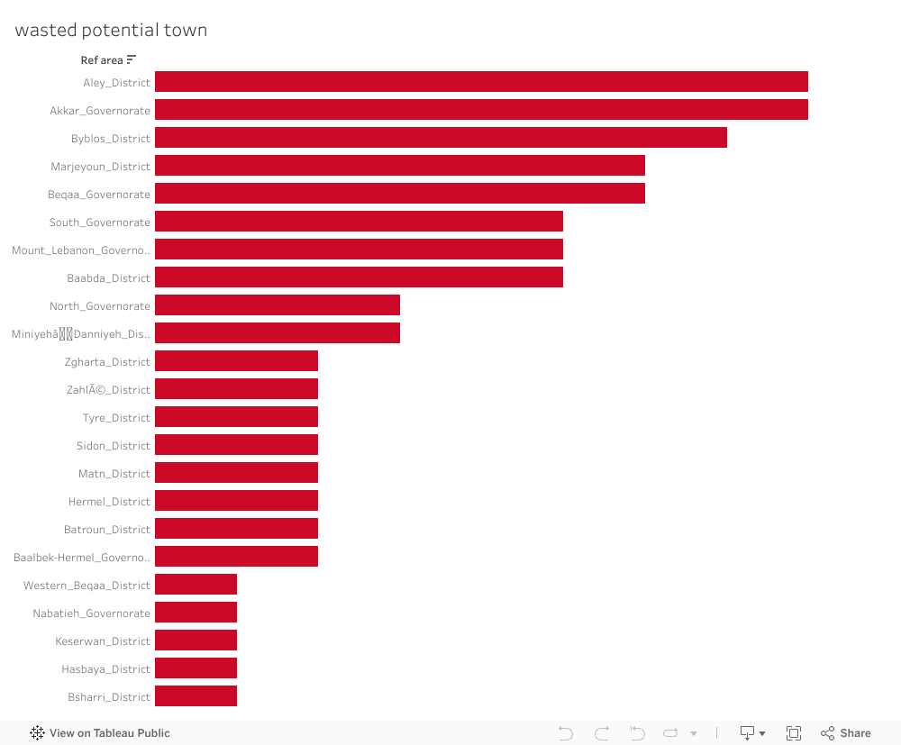
Each bar represents a town that has natural beauty or cultural heritage, but zero visible tourism development. These are places with stories, landscapes, and identity waiting silently for investment.
Over the years some Lebanese towns have received tourism-related initiatives.
But when we look only at towns that already have attractions, a striking pattern appears:
Most of them, despite having natural, cultural, or historical treasures , received no initiatives at all.
No projects;
No funding;
No development;
No strategy;
Just silence.
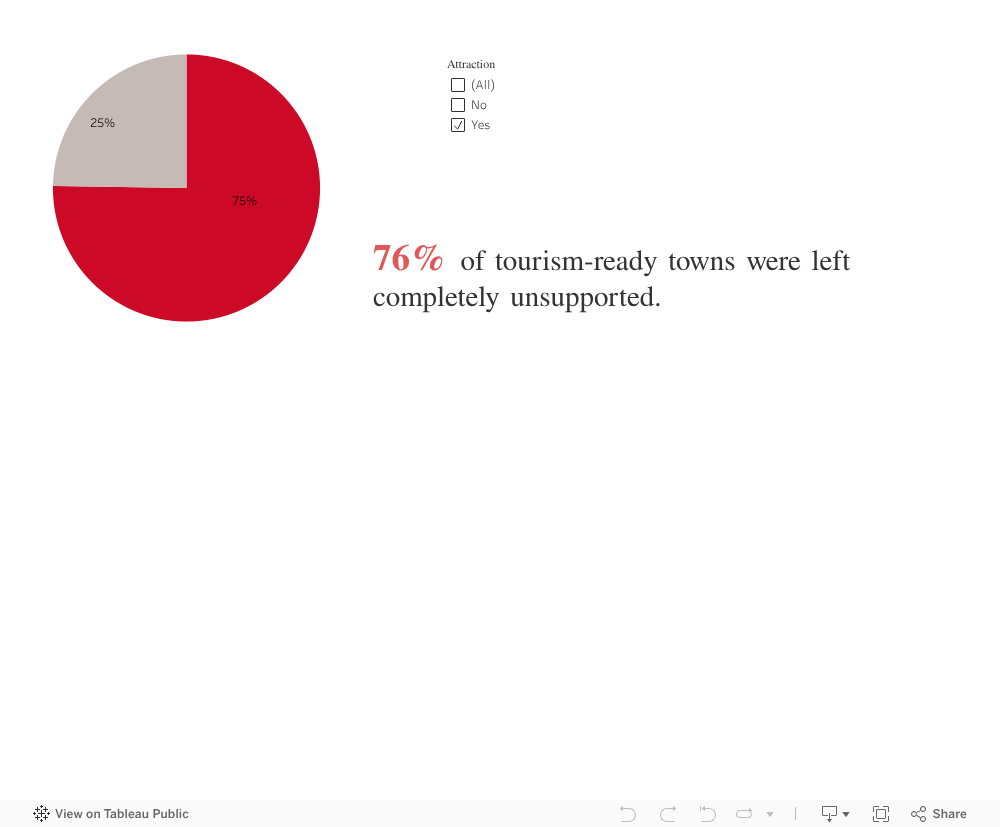
The Hardest Truth: Even the Most Attractive Towns Receive Nothing
Some may argue:
“Maybe those towns don’t have attractions.”
But when we look closely at towns that already possess attractions, the painful truth becomes impossible to deny.
Potential without support becomes a burden. Towns that could thrive remain stuck. Communities that could flourish stay stagnant. And the tourism narrative becomes narrower, excluding places that rightfully belong in it.
The towns most ready to be activated are often the ones completely overlooked.
3 out of 4 received no support. None.
This is not a coincidence.
It is not a gap.
It is a systemic misalignment between where potential exists and where initiatives are delivered.
These are towns where: visitors already come, landscapes already impress, heritage already exists, infrastructure is partially there. Yet development never reaches them.
Looking at the Data as a Lebanese Citizen
When I step back, not as a student, not as an analyst, but as someone who grew up here, the message becomes clear:
-
We have so much beauty, but we overlook it.
-
We have so much potential, but we do not unlock it.
-
We have communities waiting, but no one comes.
-
We have foundations ready, but not activated.
The problem is not the towns.
The problem is the absence of action.
Every chart you saw above points to the same conclusion:
Lebanon’s opportunity is not in discovering new places, it is in believing in the ones we already have.
Imagine what would happen if:
Aley’s cafés received marketing and infrastructure upgrades, Akkar’s hiking trails were formalized Byblos’ surrounding villages received preservation grants Hasbaya’s guesthouses were connected to tourism.
platforms, Baalbek-Hermel’s rural attractions were promoted, Marjeyoun’s landscapes were protected and activated…
These are not dreams. These are realistic, steps, and now we know exactly where we should begin.
Lebanon does not need to invent new beauty.
It simply needs to believe in the beauty it already has.
The potential is real.
The foundations exist.
The opportunity is now.
What we need… is action.
Let’s stop waiting for “better times.”

by tmt19 | Nov 20, 2025 | Dashboard, Team Project, Visualization
Launching La Table is more than opening a restaurant, it’s making a meaningful, long-term investment. With limited savings, choosing the wrong location would turn a dream into a risk. To avoid guessing, I turned to data.
The goal was simple: find a town in Lebanon where visitors (locals and tourists) already show strong interest, yet the restaurant market remains underserved.
Lebanon’s tourism and investment patterns often move in opposite directions. Some towns attract visitors but receive no development, while others receive projects despite having little demand.
For a new restaurant, this imbalance makes it difficult to know where genuine opportunity lies. I needed a location that is not saturated or speculative, but strategically overlooked.
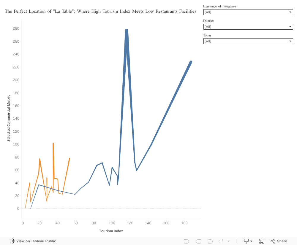
Step 1: Scanning the Chaos for Opportunity – Lebanon as a whole
The national view shows two categories:
High-tourism towns with no initiatives (Blue): attractive but saturated with existing restaurants.
Funded towns with low tourism (Orange): received investments but struggle with attracting visitors.
We’re looking for a true blue diamond: a high-potential (human intuition), high-traffic location (tourism index), with unserved demand (number of restaurants, 0 project initiated).
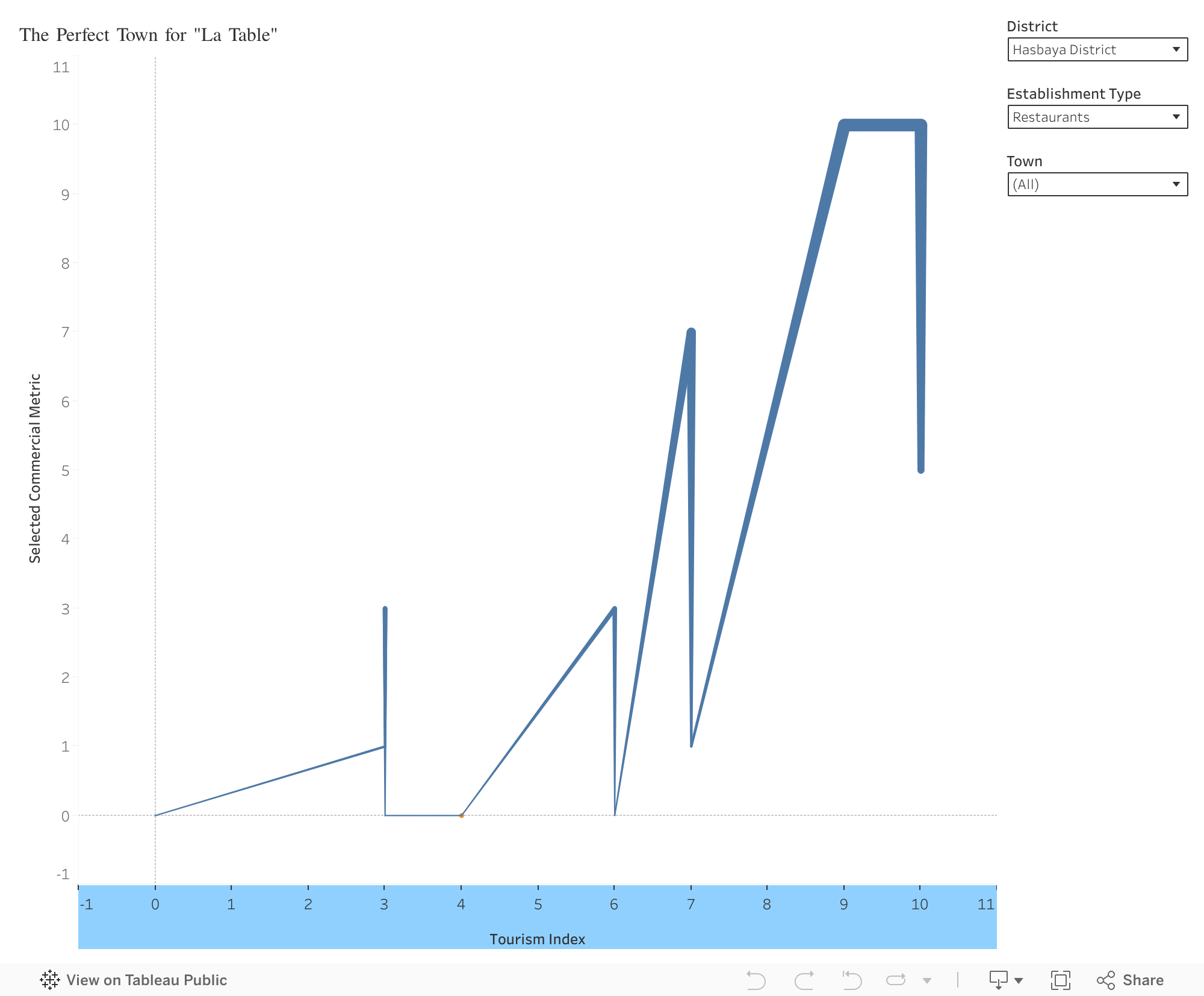
Step 2: The first zoom – Targeting Zgharta
We must narrow the focus from the whole country to a high-potential region. We start by targeting the beautiful Zgharta District.
Safe option: a district away from saturation (low competition) yet rich in natural beauty and tourism interest (mid to high). It becomes the logical next step for deeper exploration.
(Action for Viewer: Please use the District filter and select Zgharta District.)
Step 3: The second zoom – Finding the Restaurant Gap
One town rises above the rest:
Beit Obeid, Zgharta District
- High tourism demand (index: 9).
- Low supply: few restaurants exist (1 restaurant), minimal competition.
- No recent initiatives, meaning the opportunity remains untouched.
Visitors are already coming, but the market has not responded. This is exactly the type of gap a new restaurant should fill.
In Beit Obeid, high demand, low competition, and authentic natural beauty come together, making it a place where La Table can truly belong and elevate the town’s charm. By moving from a national overview to a focused district analysis, the data revealed a location where potential and opportunity meet.
But beyond numbers, choosing Beit Obeid reflects vision, intuition, and respect for place.
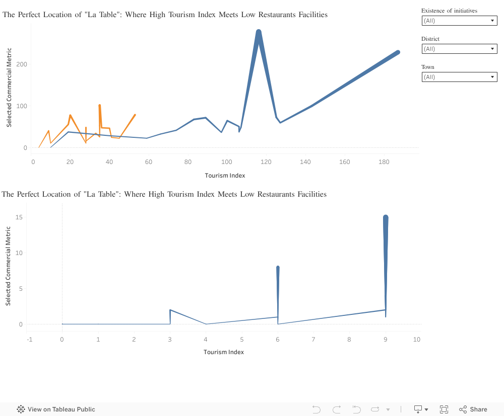
Overall view:

by amo09 | Nov 20, 2025 | Visualization
Livestock is at the centre of Somali livelihoods. For pastoral and agropastoral households, animals function as income and the foundation of daily life. This story uses data from 143 small ruminant producers across Hawd Pastoral, West Golis Pastoral, and Togdheer Agro-Pastoral zones to understand how households participate in markets and what shapes their earnings.
The first insight is clear: shoats (sheep and goats) overwhelmingly dominate household herds, making up more than 95% of all animals. Their fast reproduction, high demand, and fit within Somali grading practices make them the backbone of the livestock economy.
Market participation, however, is not equal across regions. Burao households report the highest livestock sales, while Oodweyne and Sheikh follow at lower levels. These differences point to variations in market access, infrastructure, and trading networks.
Inside households, decision-making plays a key role. Men make most livestock-selling decisions, but households where decisions are made jointly tend to earn more. This suggests that shared decision-making may support better timing of sales. Strengthening women’s involvement in these decisions could therefore improve household welfare.
Income also varies across livelihood zones. Hawd Pastoral households earn the highest revenue, followed by West Golis and Togdheer Agro-Pastoral. Pastoral households often maintain larger shoat herds and rely more heavily on indigenous grading systems, which helps them achieve stronger market outcomes.
Overall, this data shows how Somali families move from herds to income, and how geography, decision-making, and indigenous systems shape economic opportunities. These insights support ongoing efforts to improve market access, empower women, and strengthen local livestock systems for more resilient and sustainable livelihoods.

by ses23 | Nov 19, 2025 | Visualization
We all know that smoking is bad, drinking adds risk, and skipping workouts isn’t ideal.
But what if we could see the financial price of these choices, in dollars, not just diagnoses?
Our project, “The Cost of Health,” does exactly that.
Using a dataset of 100,000 individuals, we visualized how small, everyday behaviours quietly add up to big medical bills.
This story isn’t about judgment, it’s about awareness through data.
The Numbers Behind Everyday Habits:
Smoking: The 30% Surcharge on Health
The data spoke clearly , smokers pay about 30% more every year in medical expenses.
Even former smokers, who may have quit years ago, still carry higher costs.
Quitting improves health, but the financial scars of smoking linger long after the last cigarette.
A reminder that every puff today becomes a price tomorrow.
Alcohol: A Quiet Contributor to Rising Costs
Not all habits seem harmful at first glance, a drink after work, a skipped walk, a few extra pounds.
But the data showed that even these add up:
Every 5-point rise in BMI brought a 7% increase in annual medical costs, and daily drinkers consistently spent more than occasional ones.
Health choices we normalize today become costs we pay tomorrow.
Hospital Visits: The Costliest Habit of All
Among all factors, hospitalization frequency had the strongest impact on spending.
The data showed that individuals hospitalized three or more times per year paid three to four times more in annual healthcare costs.
Each extra hospital stay turns prevention into an even higher price to pay.
Behind this number are thousands of preventable conditions (unmanaged blood pressure, skipped screenings, and delayed doctor visits) that eventually lead to hospitalization. The message is clear: investing in prevention costs far less than paying for treatment later.
BMI: When Weight and Wallet Move Together
Weight turned out to be more than a health number, it’s an economic one too.
For every five-point increase in BMI, annual medical spending rose by about 7%.
Healthy BMI levels (20–25) aligned with noticeably lower costs, while obesity pushed expenses sharply higher.
A few extra points on the scale can mean hundreds more dollars each year.
This is one of the clearest examples of how small daily choices (diet, movement, and routine) ripple into real economic outcomes.
Chronic Illness: The Multiplier Effect
For those living with multiple health conditions, the financial impact is staggering.
Someone managing four chronic diseases pays nearly three times more in yearly healthcare costs than someone without any.
Each hospital visit doesn’t just affect the body, it affects the wallet.
Health, once lost, becomes the most expensive asset to recover.
What About Lebanon?
To bring the story closer to home, we conducted a small survey in Lebanon to understand how people perceive the link between lifestyle and healthcare costs. The responses reflected the same global trends, showing that smoking, excess weight, and frequent hospital visits are seen as major cost drivers.
When asked what could encourage healthier habits, more than half said workplace wellness programs (50.6%) or insurance rewards (49.4%) would motivate them to take better care of their health, more than social media campaigns or community events.
Money talks, even when it comes to health.
This finding connects back to our main insight:
If prevention saves both lives and money, then maybe the most effective awareness strategy isn’t guilt, it’s financial incentive.
Visualizing the Invisible
Our Power BI dashboard was designed not just to show data, but to start a conversation.
Anyone can explore it, filter by gender, smoker status, or work type, and see how lifestyle, health, and costs intertwine.
An interactive way to see how lifestyle choices shape your health costs.
The Story Beneath the Numbers
Behind every data point is a life: a mother managing diabetes, a student stressed and sleepless, a retiree balancing medications and bills.
Numbers can’t capture the full story, but they can reveal patterns that change it.
Our visualization doesn’t tell people what to do.
It simply holds up a mirror:
Your health choices have a price tag. But that also means, you have the power to lower it.