by Jad Rizk | May 5, 2020 | Dashboard, Visualization
The below storyboard highlights and examines a correlation between the GDP per capita and population age distribution. The visualization shows a comparison between regions and across time. This correlation makes us think more about future problems like pensions, economic growth, child labor, retirement age, and possible social problems. It is worth examining further if there is causality. Are economic changes coming based on age distribution?
The dashboard is interactive. Please feel free to filter, highlight, and discover the data in more depth. The fullscreen setting will allow for a better viewing experience.

by Nourhan Mahmassani | May 5, 2020 | Visualization
Countries face a huge loss due to unemployment. In order to find a solution for unemployment, we searched for the factors causing it. As shown below, gender discrimination, country’s GDP, distribution of jobs among the economic sectors, and educational level have a huge impact on Unemployment.Above,you can alter the regions you want to analyze from using multiple values drop-down.
In Conclusion:
-As GDP increase the Unemployment rate decrease
-Female Unemployment is higher than the males due to gender discrimination in workplace
-Employment rate is higher in the services sectors which mean that there is no equal job opportunities in between sectors causing higher
unemployment
-If the educational level is more advanced, their is lower unemployment rate
Data Source: https://datacatalog.worldbank.org/dataset/world-development-indicators

by Tarek El khayat | May 4, 2020 | Visualization
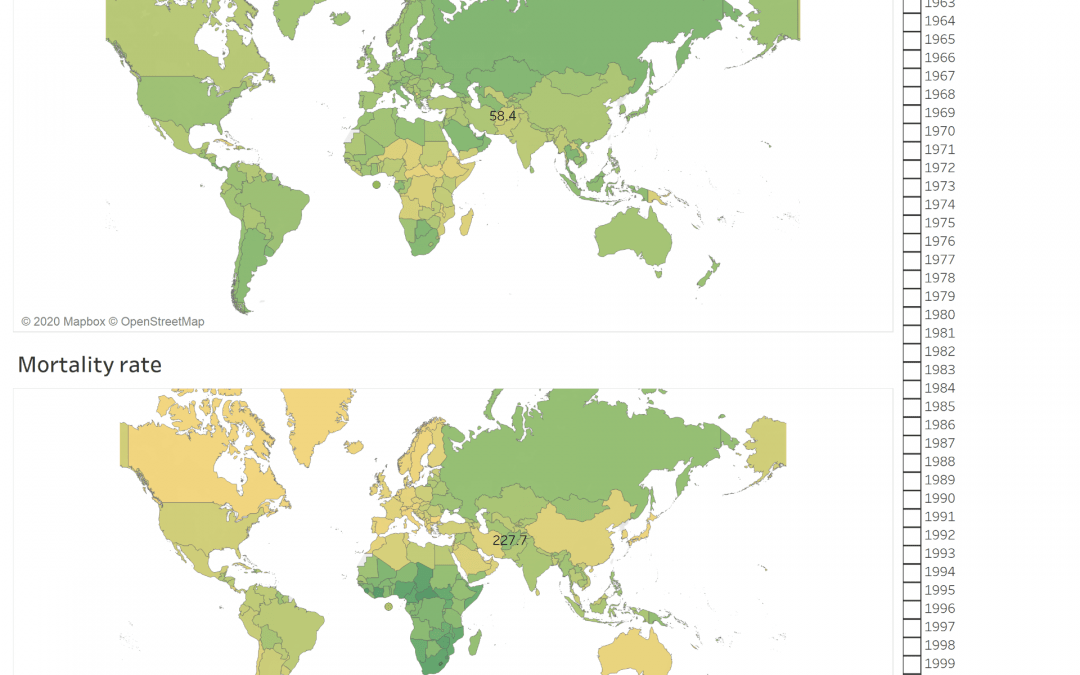
The Dashboard shows the mobile subscription rate around the world between 2013 till 2019 and compare it with the mortality rate. It is clear that the mortality rate is related to another factor and there is no contribution between the increase of mobile subscription and the mortality rate and the mobile is not the direct cause of mortality

by Tarek El khayat | May 4, 2020 | Visualization
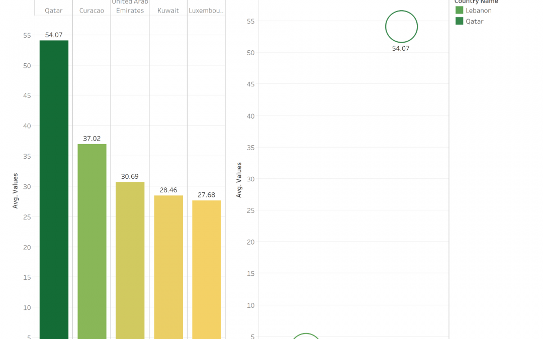
CO2 emission is one of the important factor that is destroying our planet and causing diseases, global warming …
The Graph shows the Top 5 countries with higher CO2 Emission and shows that QATAR take the lead in the world and the Arab region

by Tarek Khalil | May 4, 2020 | Visualization
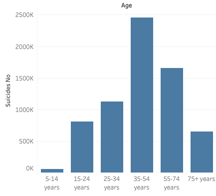
Now a day’s suicide became one of the three main causes of mortality among males and females that are 15 to 44 years old. In addition to that researches showed that Europe and Africa are the continents with the most number of suicide deaths. A study was performed to deeply analyze this topic in these two continents specifically. For this purpose, data was taken from World development index and merged with externally data from credible resources, then visuals were formed using tableau to find relationships between the variables we have and the numbers of suicides in different countries. The results show that the highest age group with suicide numbers are 35-54 years, literature shows that those age groups have the highest responsibilities. Followed by 55-74 years, a possible reason would be that people in this age should reach all their goals maybe if they didn’t, they don’t find themselves worthy of life, or the opposite, the fact that people accomplished all their goals in life and don’t see a point in living anymore.


