Sierra Leone is a small West African nation with a population of roughly 8 million people. Rich in natural beauty, cultural energy, and abundant resources. But behind the country’s potential lies a familiar struggle: an economy still leaning too heavily on a single sector. Agriculture has long been the backbone of national productivity, while mining, industry, and services often struggle to keep pace.
This structural imbalance has made Sierra Leone vulnerable, and nowhere was this more visible than in 2015, when the dual shocks of the Ebola outbreak and a collapse in global iron ore prices sent the economy into a tailspin. So, what exactly is going on beneath the surface? And what would it take to build a more resilient and diverse economy?
Agriculture consistently accounts for 50-63% of the GDP, leaving the nation vulnerable whenever farming seasons fail, prices fluctuate, or crises occur.
Industry is the most unstable sector, swinging wildly between 5% and 22%. And in 2015, it hit its lowest point, just 5% due to:
The Ebola outbreak froze movement and production.
A crash in global iron ore prices is forcing mining operations to shut down.
This year alone has exposed how dependent Sierra Leone’s industrial sector is on external forces.
Hovering between 28–36%, the services sector has been steady but sluggish, unable to compensate for weaknesses elsewhere. Together, these patterns reveal an economy that struggles to withstand shocks because it lacks balance.
A Way Forward: Building a Diversified Economy
If Sierra Leone wants long-term stability, it must diversify, plain and simple. That means:
Strengthening industry
Modernizing agriculture with value addition
Expanding services and digital innovation
The proposed solutions are supported by real-world programs in Sierra Leone, confirming their credibility and feasibility.
World Bank – Sierra Leone Economic Diversification Project
Supports economic diversification beyond agriculture and mining.
Strengthens SMEs, enhances value addition, and improves market access.
Confirms agro-processing, service expansion, and SME support as national priorities.
International Labour Organization – Opportunity Salone Programme
Promotes youth entrepreneurship and job creation.
Supports sustainable SME models and value chain development.
Validates the focus on integrating agriculture with industry.
The solutions are evidence-based, nationally aligned, partner-friendly, and feasible. But the question remains: how can Sierra Leone leverage these programs and data insights to fully unlock its economic potential?
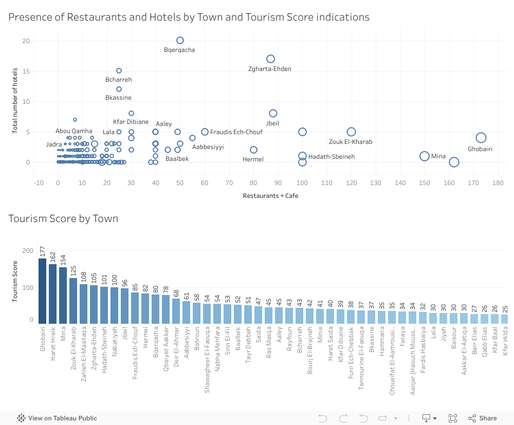
Tourism in Lebanon is often celebrated for its beautiful landscapes, cultural heritage, and vibrant towns. But behind these well known attractions lie a more practical question: which towns are actually equipped to support tourism on a daily basis? To explore this, I created a dashboard comparing Lebanese towns based on the number of restaurants and cafes, the number of hotels, and an overall Tourism Score that ranks towns according to their tourism readiness. Instead of relying on impressions or reputation, the data reveals how tourism infrastructure is truly distributed across the country. The results highlight unexpected leaders, surprising gaps, and a clearer understanding of which towns are prepared to welcome visitors and which ones still lack the necessary services.
Key Insights from the Dashboard
Only a few towns offer a complete tourism ecosystem The scatterplot shows that just a small number of towns have both high numbers of restaurants and cafes and multiple hotels. Towns such as Zgharta–Ehden, Bcharreh, and Bqerqacha stand out because they have a balanced mix of services that can support both short-term and overnight visitors.
Ghobairi and Mina show strong activity but limited overnight capacity On the far right of the scatterplot, Ghobairi and Mina appear with very high numbers of restaurants and cafes but almost no hotels. This suggests strong commercial and visitor activity but mainly in the form of day visits rather than extended stays. Their dense hospitality presence raises their tourism scores even though accommodations are limited.
The Tourism Score reveals unexpected top-ranking towns The Tourism Score bar chart shows that the towns with the highest tourism potential are not always the ones typically associated with tourism. Ghobairi ranks first with a score of 177, followed by Haret Hreik and Mina. Meanwhile, popular tourist towns such as Zahle, Jbeil, and Zgharta–Ehden perform well but do not lead the ranking. This shows that infrastructure, more than reputation, determines tourism readiness.
Most towns have very limited tourism infrastructure A large cluster of points near the origin of the scatterplot shows that most Lebanese towns have fewer than 10 restaurants and almost no hotels. These towns may rely on nearby hubs or seasonal tourism, but they lack the facilities needed to attract or accommodate visitors consistently.
Urban density influences tourism scores more than geography The data suggests that high-scoring towns tend to be commercially dense and urbanized rather than simply scenic or historic. This highlights the importance of services such as dining and accommodation options as the real foundation of tourism potential.
Conclusion
The dashboard reveals that tourism activity in Lebanon is unevenly distributed. A small number of towns dominate because they offer the right mix of infrastructure, while many others, despite natural or cultural advantages, lack the essential services needed to support consistent tourism. These findings point to two opportunities. First, towns rich in natural or cultural attractions but lacking infrastructure could benefit from targeted development. Second, high-scoring, service-dense towns can act as anchors for broader regional tourism strategies. Understanding these patterns through data helps support more balanced tourism development across the country and encourages investment where it can make the most meaningful impact.
Every year, my G11 IB Business students surprise me with strong performance in Paper 1, yet many struggle with Paper 2. I always suspected the finance component was the reason, but until I analyzed the standardized data visually, I didn’t realize how clear the gap truly was.
About the Exams
Paper 1 primarily tests structured responses and conceptual knowledge. Paper 2, on the other hand, is heavily quantitative:
balance sheets
cash flow forecasting
break-even analysis
investment appraisal
Students often describe Paper 2 as “the confusing one.”
The question was: How big is the performance gap? And who needs the most support?
Insight: What the Data Reveals
The redesigned visualization highlights three clear insights:
1. Paper 1 Performance Is Consistent
Most students score between 70%–90%, showing strong understanding of theoretical business concepts.
2. Paper 2 Scores Drop Sharply
When sorted descending, the blue bars reveal a steep decline and several scores below 30%.
3. The Weakness Is Skills-Based, Not Knowledge-Based
Even strong Paper 1 students struggled in Paper 2. This indicates a clear pattern: Students grasp business theory well, but lack confidence in financial reasoning.
Call To Action: Turning Insight into Teaching Strategy
This analysis was not just descriptive; it became prescriptive.
Based on the data, I am implementing:
Weekly finance skills clinic
Step-by-step financial examples
Mini case studies integrating calculations
Targeted support for students below 30%
Low-stakes finance practice sheets
Conclusion
Visualization transformed a vague assumption into a targeted teaching strategy. The data makes the story visible, and the story drives the action.
Thousands of students in Lebanon are underserved by the concentration of educational opportunities in a small number of governorates. Policymakers must make investments in areas that lack public branches, colleges, and educational resources in order to create a more inclusive future.
1. A Landscape of Uneven Learning Opportunities
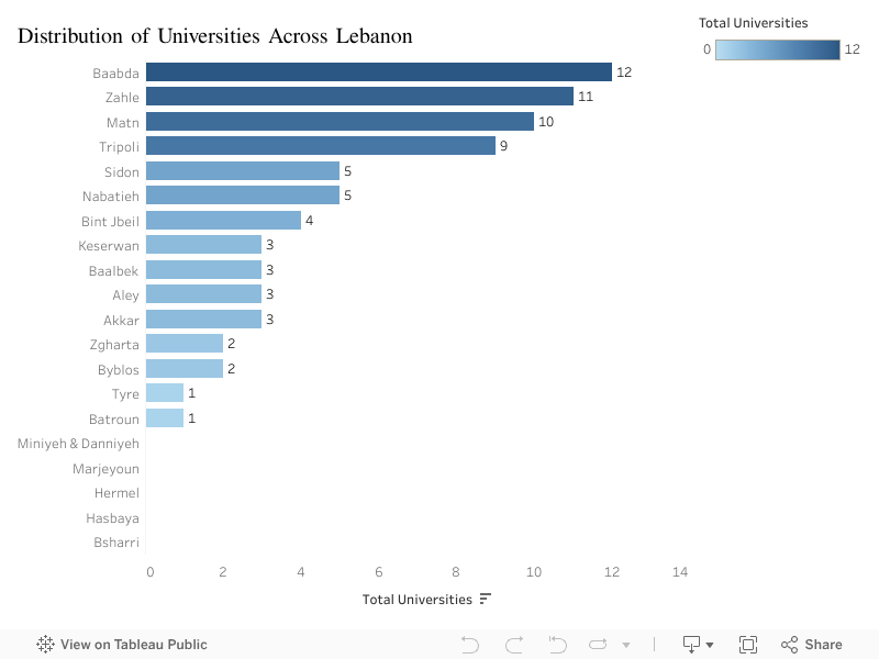
Lebanon’s education system has long been viewed as a regional strength but this strength is not evenly distributed. By mapping universities, Lebanese University (LU) branches, and the availability of educational resources across governorates, a clear pattern emerges: a select few governorates enjoy strong coverage, while others have limited or almost no access.
The visualization shows that:
Baabda, Zahle, and Matn dominate in the number of universities.
Meanwhile, areas like Bsharri, Batroun, Hermel, and Hasbaya have only 1 or zero universities.
This imbalance shapes future opportunities. Where a student is born should not determine how far they can go but right now, it often does.
2. Public Higher Education Is Even More Concentrated
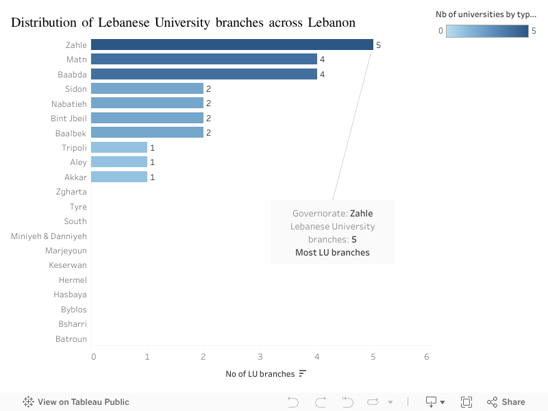
Access to affordable education is even more unequal.
Zahle and Matn lead with 5 and 4 LU branches.
Many areas including Tyre, Akkar, Zgharta, Hasbaya, Hermel have one or no branches.
Several governorates have none at all, forcing students to relocate or drop out.
This reinforces a cycle: private universities cluster in the center, while public universities remain scarce outside major cities.
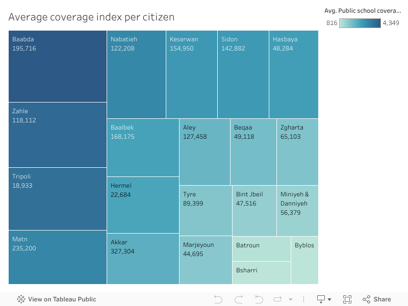
3. The Coverage Index: How Many Citizens Each University Serves?
To measure real accessibility, the coverage index compares each region’s population to the number of universities available.
Here the gap becomes dramatic:
In Baabda and Matn, one university serves fewer than 200,000 people.
In Hermel, Bsharri, and Tripoli, a single university covers more than 300,000 residents.
The message is clear: some regions are overserved, while others are severely underserved.
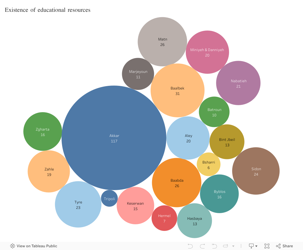
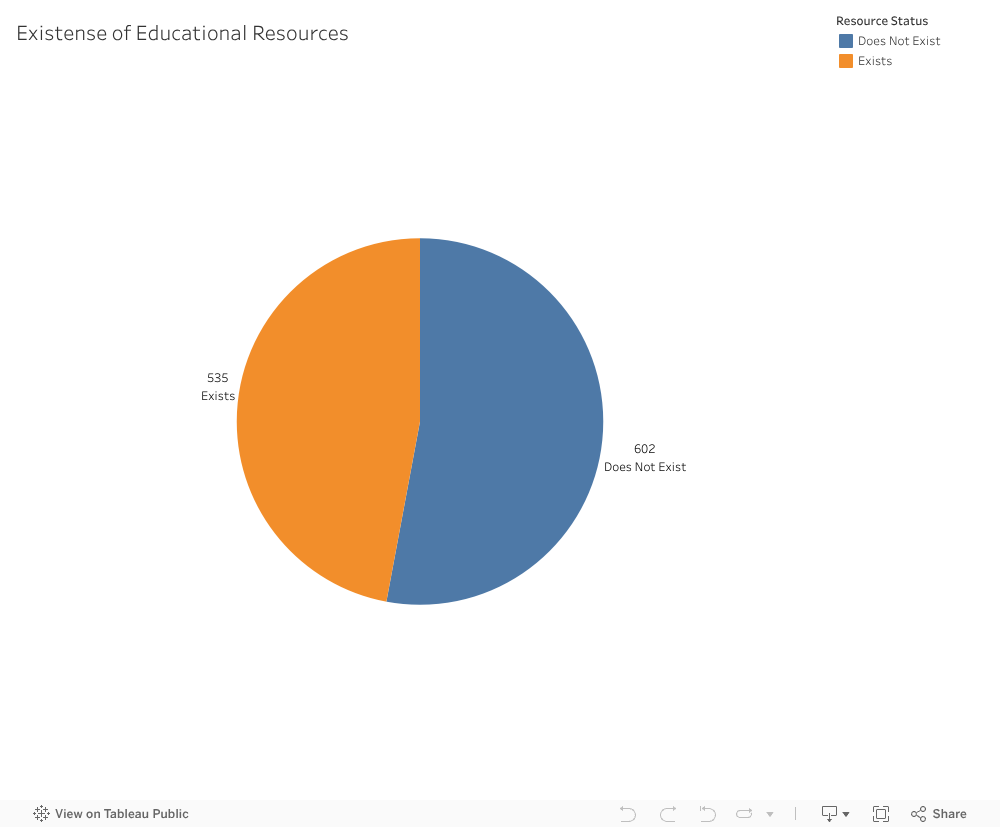
4. Do Educational Resources Exist Where They’re Needed Most?
When we look at the distribution of educational resources—libraries, cultural centers, labs, and learning facilities another pattern emerges:
Akkar, Baalbek, and Baabda have the highest counts.
Remote districts like Bsharri, Hermel, Batroun, and Marjeyoun have almost none.
This highlights a critical insight: some areas have the right infrastructure but lack universities, while others have universities but no supporting learning ecosystem.
5. What This Means for Lebanon
Lebanon’s most significant educational challenge is not quality but fairness. The maps reveal a structural inequality that affects:
university enrollment
student mobility
long-term employment opportunities
economic development in rural areas
By investing in the regions with the lowest coverage and resource availability, Lebanon can create a more inclusive and productive society.
Call to Action
We recommend a targeted educational investment plan for underserved governorates, focusing on:
Opening new LU branches in areas with zero public presence
Strengthening educational resources where population density is high
Supporting private institutions willing to expand beyond major districts
Digital learning infrastructure for remote areas
Education shouldn’t depend on geography. With intentional planning, it doesn’t have to.
In the high-stakes world of real estate and tourism investment, there is a prevailing feeling that the map has already been drawn. We are constantly told that the “smart money” has already moved, that the best locations are taken, and that finding a new opportunity means fighting for scraps in saturated markets. When we look at the industry, we usually see two things: expensive, crowded success stories, or underdeveloped ghost towns that no one wants to visit.
But sometimes, if you look at the data differently, the map changes.
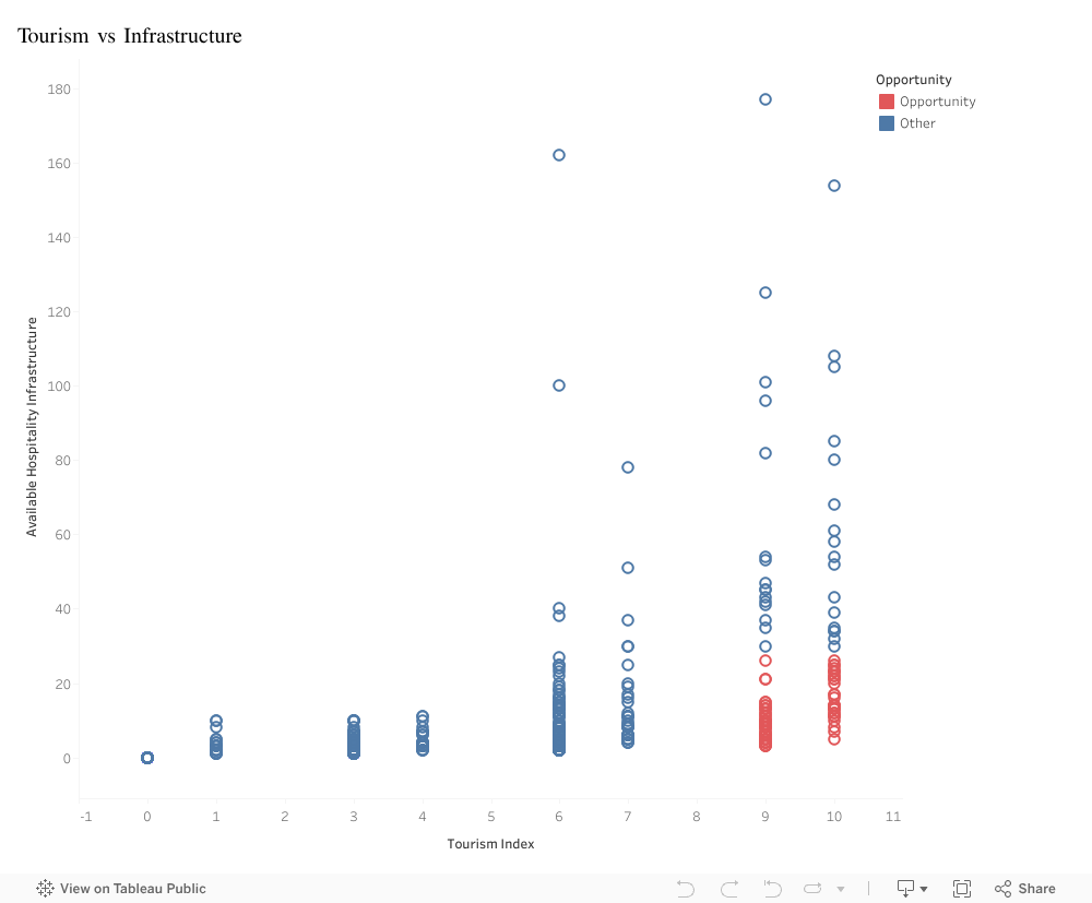
In this visualization, I analyzed the relationship between two critical factors: the Tourism Index (the raw, magnetic appeal of a destination, from natural wonders to historical sites) and Available Hospitality Infrastructure (the actual supply of hotels, restaurants, and services).
At first glance, the sea of blue dots confirms the traditional idea. The data follows a predictable, efficient path. In the top right, you see the famous destinations: high appeal matched by high infrastructure. These are successful, but they are also a dangerous gamble; expensive to enter and fiercely competitive. In the bottom left, you see the opposite: low appeal and low infrastructure. No surprise there.
But as you scan the bottom right of the chart, the pattern fractures.
This is where the red dots appear, and they tell a completely different story. These data points represent towns with a Tourism Index of 9 or 10, world-class destinations that tourists are desperate to visit. Yet, their infrastructure bars are effectively at zero.
This gap represents a massive market failure, and for an investor, a market failure is a goldmine.
These aren’t towns that need marketing; they are towns that need capacity. The demand is already there, waiting for someone to unlock it. By ignoring the crowded top-right corner and focusing on this specific cluster, investors can bypass competition entirely. Building here means you aren’t just another hotel in a crowded city; you are the hotel in a destination people are already fighting to see.
Big Idea
The data reveals a rare and profitable anomaly: a specific cluster of towns with world-class tourist demand but near-zero infrastructure. Investors should pivot away from saturated markets and target these “red dot” locations to secure a first-mover advantage in destinations where demand drastically outstrips supply.