by nha59 | Nov 24, 2025 | Team Project
University isn’t supposed to feel like survival. But for many students, it does.
Ask around on any campus, AUB included, and you’ll hear the same quiet confessions: “I can’t focus anymore,” “I haven’t slept properly in weeks,” “Everything is due at once,” or simply, “I’m tired.” Not the casual kind of tired, but the deep-down kind that mixes pressure, deadlines, expectations, and anxiety all into one heavy load.
Our team wanted to understand this feeling, not through anecdotes alone but through data. And when we dug into two national student stress datasets, the story that emerged was stronger and clearer than any of us expected.
This dashboard is that story.
Why We Started This Project
Stress isn’t just “part of university life.” It shapes how students sleep, think, eat, learn, and show up. And when stress keeps rising semester after semester, it becomes more than a personal issue. It becomes a systemic one.
So we asked ourselves:
- What exactly is driving student stress?
- What does it look like in real numbers?
- And is there something we, as a university community, can actually do about it?
To answer that, we turned hundreds of student responses into an interactive visualization designed to show, clearly, simply, and honestly, what stress looks like across psychological, social, and academic dimensions.
The results were eye-opening.
What the Data Reveals — A Human Story Hidden in Numbers
1. Stress is not just emotional — it affects how students think and function.
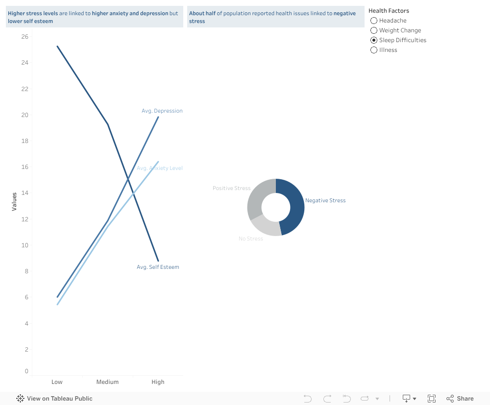
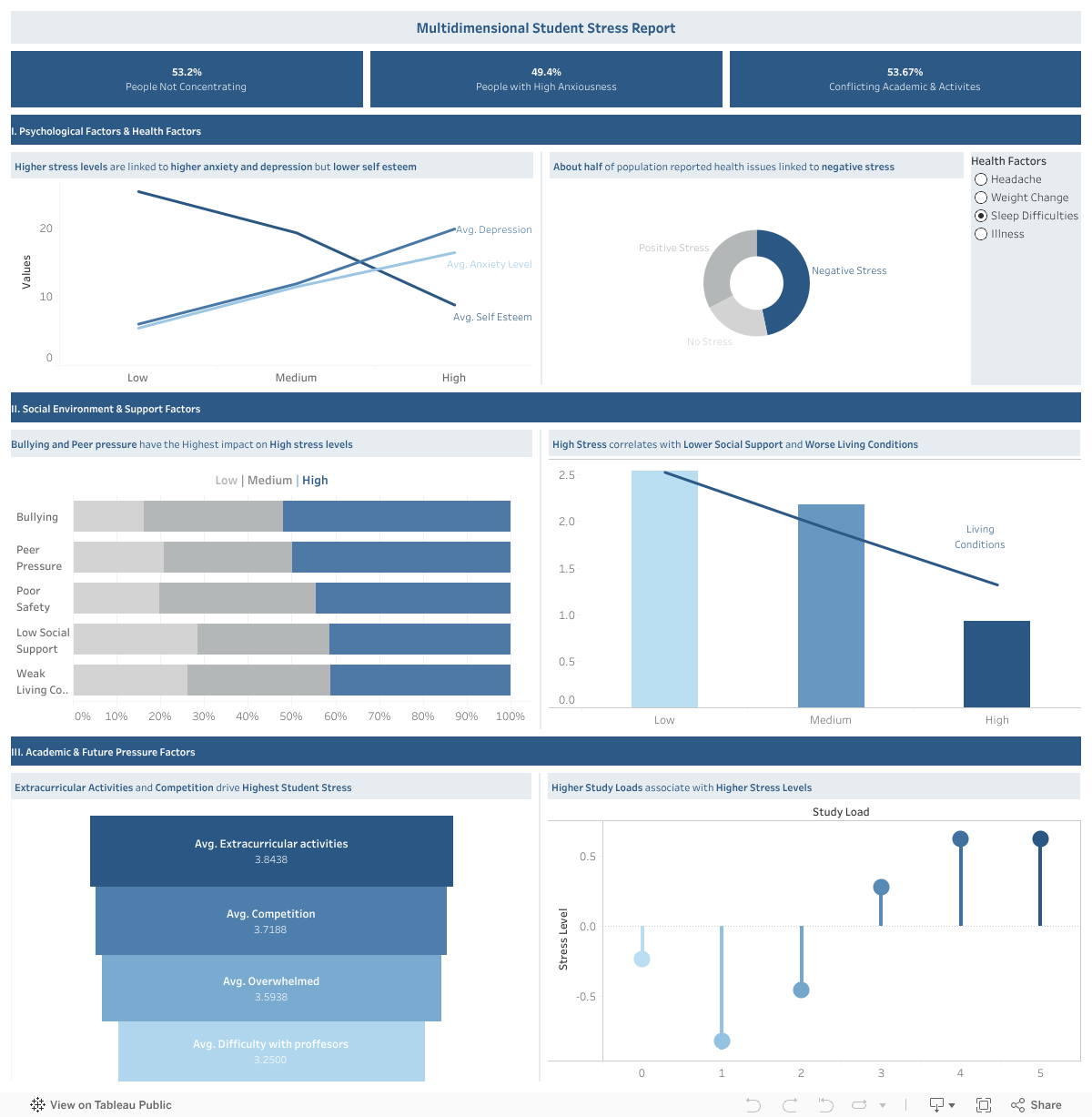
Half of the students in our dataset reported difficulty concentrating (53%), and nearly as many reported high anxiety (49%).
As stress rises, the dashboard shows a sharp rise in anxiety and depression, and a clear drop in self-esteem.
It isn’t just academic pressure — it’s identity-level pressure.
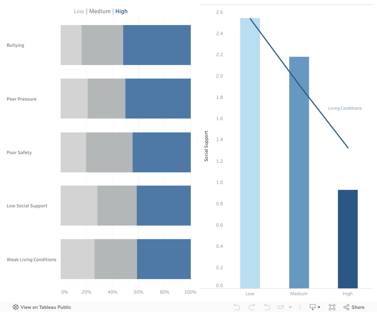
2. Social environment matters more than we think.
One of the most powerful patterns in the dashboard comes from the social and environmental factors:
- Bullying and peer pressure rise sharply with stress
- Low social support strongly correlates with high stress
- Poor living conditions amplify stress far more than expected
Stress doesn’t start in the classroom; it grows in the spaces between classes too — in dorm rooms, social circles, financial challenges, unspoken expectations, and the feeling of being alone when things get overwhelming.
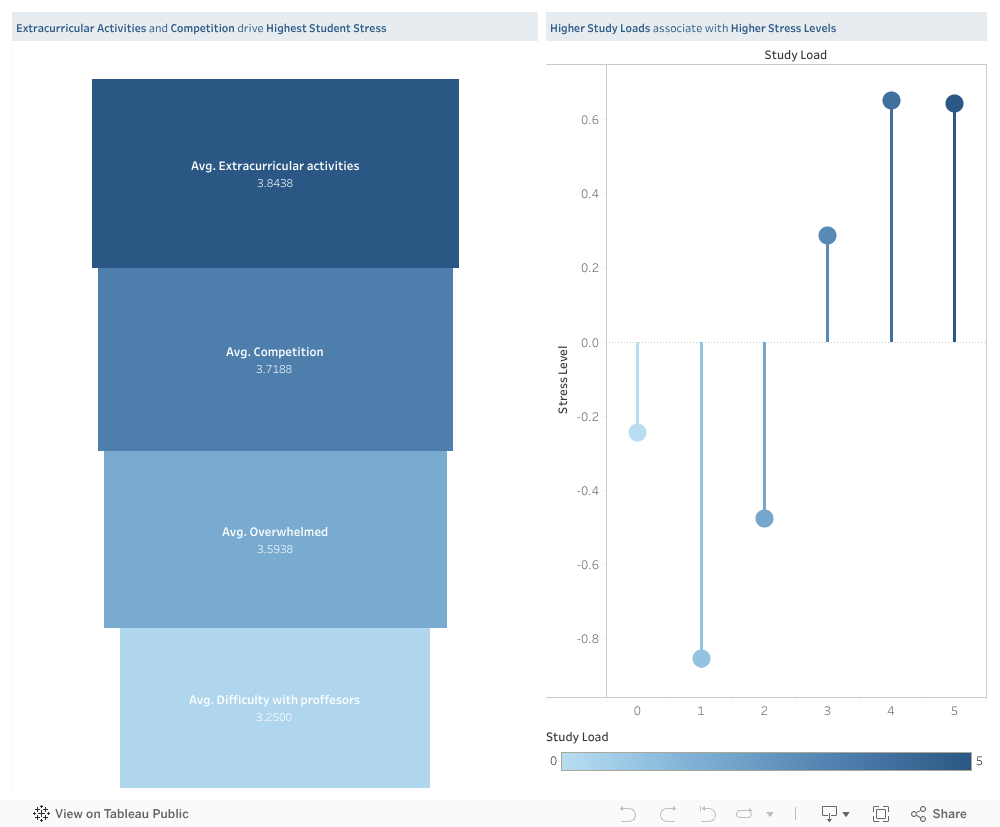
3. Academic load is a major trigger — and not just the amount of work.
The dashboard shows a clear pattern:
- More competition → higher stress
- More difficulty with professors → higher stress
- Feeling overwhelmed → higher stress
- Higher extracurricular activities → highest stress of all
But the real insight is this:
It’s not only how much work students have.
It’s when that work happens.
Deadlines pile up in the same week, tasks overlap, and students end up sacrificing sleep, health, and well-being trying to meet multiple high-stakes demands simultaneously.
This insight became the heart of our solution.
Our Solution: A Shared Academic Load Calendar for AUB
Imagine a semester where:
- Students know what’s coming weeks ahead
- Professors can see when other courses have major deadlines
- Overloaded weeks are immediately flagged
- Departments can plan more fairly
- Stress spikes become predictable — and preventable
Our proposed Shared Academic Load Calendar does exactly that.

It’s a simple idea with a big impact: one place where professors enter deadlines and workload estimates, and a shared, color-coded calendar shows the cumulative load across courses.
For students:
A clear view of their upcoming weeks, no more last-minute shock.
For professors:
A quick way to avoid piling large assessments on the same week as others.
For programs and departments:
A data-backed view of overloaded periods, enabling better planning.
Universities like Sydney, Dundalk Institute of Technology, and Kingston University have already implemented similar systems — and the evidence is clear:
It reduces clustering, improves fairness, and helps students breathe again.
Why This Matters
This project isn’t only about data or dashboards. It’s about the people behind the numbers — the students who push through heavy weeks, juggling stressors we never fully see.
If there’s one message our visualization makes undeniably clear, it’s this:
Student stress is not random, and it’s not inevitable.
It’s structural, and fortunately, structure can be changed.
Our goal is not just to reveal the problem but to spark a conversation about how we can create a healthier, more humane academic environment at AUB.
Because when workload becomes transparent, stress becomes manageable.
When professors coordinate, students gain clarity.
And when data reveals the bottlenecks, universities can fix them.
Explore the Interactive Dashboard
You can interact with the full dashboard here:
Take a minute to explore it — follow the lines, the trends, the colors.
Behind every point is a real student with a real story.
A Final Word
Academic pressure will always exist — but unnecessary pressure doesn’t have to.
If this dashboard can start a conversation…
If the proposed solution can inspire a change…
If one student feels less overwhelmed because their workload is finally balanced…
Then this project has done what it was meant to do.
We owe students more than “you’ll figure it out.”
We owe them structure, transparency, and space to thrive.
And meaningful change begins when we look at the data — and truly listen.

by cae34 | Nov 21, 2025 | Uncategorized
Lebanon is often described as a water-rich country. With hundreds of natural springs feeding rivers, valleys, mountain basins, and dams, it is natural to expect reliable access to clean water. Yet for many households, purchasing water from private suppliers remains a normal part of daily life, even in regions surrounded by natural water sources.
This mismatch raised a simple but important question:
If Lebanon has so many natural springs, why do so many towns still rely on purchased water?
What the Data Shows
The visualization compares two key measures across Lebanon’s governorates:
- The number of natural springs (total, permanent, or seasonal)
- The percentage of towns in each governorate that rely on purchased water
You can interact with the chart using filters to:
-
Explore specific governorates
-
Switch between total, permanent, or seasonal springs
-
Show or hide the purchased-water trend line
A Surprising Pattern
At first sight, we might expect places with many springs to rely less on purchased water.
But the data reveals a different story.
-
Akkar and Mount Lebanon appear consistently water-rich across all spring types (total, permanent, and seasonal) yet roughly a quarter of their towns still rely on purchased water. This shows that even governorates with abundant natural sources do not always provide reliable public access.
-
Beqaa, despite having far fewer springs than Akkar and Mount Lebanon, records the highest reliance on purchased water, with more than a third of its towns depending on private suppliers. This makes Beqaa a clear example of how limited natural springs and weak distribution amplify each other.
-
Baalbek-Hermel, South Lebanon, and Nabatieh have moderate to low numbers of springs, yet many of their towns continue to use purchased water as well. Even where seasonal or permanent springs exist, public networks often cannot capture or distribute them effectively.
- Interestingly, the North, which has the lowest number of springs in every category, relies less on purchased water than water-abundant governorates like Akkar and Mount Lebanon. This contrast reinforces the idea that the challenge is not simply about how much natural water a region has, but how well that water is managed, delivered, and made accessible to households.
The pattern is clear:
Water availability and water access are not aligned.
In other words, Lebanon doesn’t have a water availability problem. It has a water accessibility problem.
Why This Gap Exists
The visualization points to a structural mismatch: the regions with the most springs are not always the regions with the best water service. Broader assessments of Lebanon’s water sector help explain why:
-
Many springs are located far from population centers
-
Distribution networks are fragmented or old
-
Seasonal springs are not always integrated into supply systems
-
Even permanent springs may not be connected to public pipelines
This means that households may live only a few kilometers from a natural spring yet still lack regular public water service, pushing them toward purchased water, especially in summer or during shortages.
Why This Matters
Understanding this mismatch reshapes the way we think about Lebanon’s water challenges:
-
The problem is not simply “water scarcity”
-
The problem is also about distribution, planning, and infrastructure
Investing in better transport systems, modernizing networks, and capturing more of the existing springs could significantly reduce households’ dependence on purchased water.
Conclusion
Lebanon is not a water-poor country!
It is a country where natural abundance doesn’t translate into reliable access.
By exploring where springs are located versus where purchased water is still heavily relied upon, this visualization highlights a critical opportunity:
Lebanon doesn’t need more natural water.
It needs better ways to deliver the water it already has.
Understanding this mismatch is only the first step. Lebanon needs a water system that can collect, distribute, and deliver its natural resources to the communities that depend on them. Improving planning, strengthening networks, and making better use of existing springs can significantly reduce the country’s reliance on purchased water.
So the real question going forward is this: how can Lebanon turn the water it already has into water people can actually count on?

by zss17 | Nov 21, 2025 | Visualization
Lebanon’s service sector should be a national strength — tourism, education, banking, and professional services once made the country a regional hub. But when we look beyond assumptions and into the data, a very different story appears: for 21 straight years, Lebanon has been in the red, importing more services than it exports.
From telecoms and travel to banking and consulting, services play a key function in transforming a country’s economic strength. But for Lebanon, the story hidden in the data tells a completely different reality—one of a consistently growing services deficit over the last two decades.
Looking at 20 years of trade data, I examined how Lebanon’s services balance transformed across key economic periods. The story became immediately clear:
For 21 consecutive years, Lebanon has never escaped a services trade deficit, and the gap continues to deepen.
Why This Matters
For more than twenty years, Lebanon has faced a continuing services trade deficit. The country’s imports, including finance, logistics and professional consulting, have consistently exceeded its exports. The ongoing imbalance heightens economic vulnerability and increases Lebanon’s reliance on foreign service suppliers.
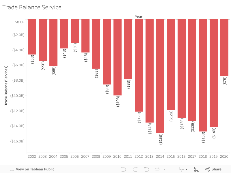
Between 2002 and 2022, the trade balance remained consistently negative. During its 2014-2018 peak, the trade balance deficit surpassed $14 billion, revealing how deeply rooted this issue has become.
The visualization below highlights how this deficit has evolved across key periods.
**Interactive Visualization:**
Hover over the bars to see exact values for each year.
**Full View:**
Complete visualization showing Trade Balance Services from 2002-2022.

During the pandemic in 2020, the deficit slightly decreased—mainly due to reduced travel and service utilization. Unfortunately, this improvement is temporary. In 2021 and 2022, the deficit rises again, continuing the very trend Lebanon has struggled with for years.
What This Means
A persistent services trade deficit highlights structural vulnerabilities. It reveals that Lebanon is consistently spending more on imported services than it generates from exports. With time, this imbalance becomes a financial burden that weakens financial stability and increases dependence on external inflows.
The Big Idea
Examining two decades of data highlights how Lebanon’s service trade deficit has continued to expand, revealing Lebanon’s economic vulnerability. The figures are striking on their own, but when presented as a story, the patterns become impossible to overlook.
What Can Lebanon Do?
Reducing the services deficit requires structural changes rather than short-term fixes. Strengthening digital services, tourism, and healthcare exports can create new revenue streams. Supporting export-oriented SMEs — especially those providing regional outsourcing services — can also help Lebanon compete more effectively.
Policy efforts should focus on promoting digital transformation, encouraging service-based startups, and building stronger regional trade partnerships. Over time, these measures can help diversify Lebanon’s export base, reduce dependency on imported services, and move the country toward a more sustainable trade position.
For example, Lebanon’s IT outsourcing sector—especially remote consulting and digital services—has grown naturally since 2020 and can become an export engine if supported through training and regional partnerships.

by crr08 | Nov 20, 2025 | Uncategorized
Unequal Support: When Small Numbers Hide Real Lives
This is Jane, a 27-year-old Ethiopian domestic worker living in Akkar.
Last month, when she got sick, she had no access to community aid, legal protection, or medical support.
She waited four days before anyone could help her—not because support didn’t exist, but because in Akkar there are too few immigrant workers to be considered a priority.
Jane’s struggle is not personal—it’s structural.
Immigrant workers in Lebanon are not distributed evenly across the country, and when population numbers are small, support systems disappear.
Small communities become invisible, unheard, and unprotected.
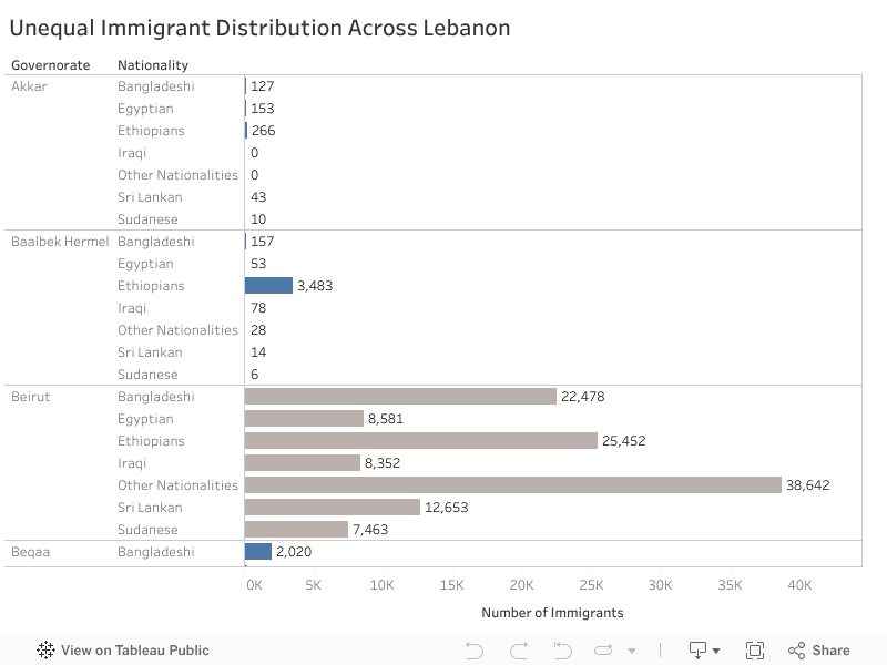
Below is the distribution of immigrant workers across Lebanon by nationality and governorate.
Everything in blue represents a community with fewer than 10,000 workers, meaning low visibility and often no access to essential support.
While Beirut hosts extremely large populations — for example 38,642 workers labeled “Other Nationalities” and 25,452 Ethiopians—governorates like Akkar host only 266 Ethiopians and 127 Bangladeshis.
Yet behind every small number is a real human life.
If We Do Nothing
If nothing changes, workers like Jane will continue to suffer in silence.
Low-population regions will remain overlooked, and inequality will deepen — not because help doesn’t exist, but because help isn’t distributed fairly.
What Can We Do?
Solution 1—Mobile Clinics
Mobile clinics are medical vans that travel to underserved regions to deliver basic healthcare.
They bring support to people who cannot safely or affordably reach Beirut.
During COVID-19, NGOs in Lebanon successfully used mobile medical units to reach remote areas — proving that mobility overcomes geographic inequality.
Solution 2—Rotating Outreach Teams
Teams of legal advisors, translators, and social workers rotate across governorates weekly, providing education, protection, and emergency help.
This approach already works in Jordan, where outreach teams support Syrian refugees in dispersed rural camps without needing permanent offices.
Solution 3—Minimum-Support Policies
A national guarantee ensuring every governorate receives a basic level of support, regardless of population size.
Just as Lebanon provides schools, electricity, and hospitals to small villages, immigrant workers deserve equal dignity and safety.
Findings & Recommendation
Support should not depend on population size — dignity must be universal.
Lebanon should adopt minimum-support policies, expand mobile and rotating services, and ensure that no worker is invisible.
Jane deserves to be seen. Every worker does.

by amo09 | Nov 20, 2025 | Visualization
Livestock is at the centre of Somali livelihoods. For pastoral and agropastoral households, animals function as income and the foundation of daily life. This story uses data from 143 small ruminant producers across Hawd Pastoral, West Golis Pastoral, and Togdheer Agro-Pastoral zones to understand how households participate in markets and what shapes their earnings.
The first insight is clear: shoats (sheep and goats) overwhelmingly dominate household herds, making up more than 95% of all animals. Their fast reproduction, high demand, and fit within Somali grading practices make them the backbone of the livestock economy.
Market participation, however, is not equal across regions. Burao households report the highest livestock sales, while Oodweyne and Sheikh follow at lower levels. These differences point to variations in market access, infrastructure, and trading networks.
Inside households, decision-making plays a key role. Men make most livestock-selling decisions, but households where decisions are made jointly tend to earn more. This suggests that shared decision-making may support better timing of sales. Strengthening women’s involvement in these decisions could therefore improve household welfare.
Income also varies across livelihood zones. Hawd Pastoral households earn the highest revenue, followed by West Golis and Togdheer Agro-Pastoral. Pastoral households often maintain larger shoat herds and rely more heavily on indigenous grading systems, which helps them achieve stronger market outcomes.
Overall, this data shows how Somali families move from herds to income, and how geography, decision-making, and indigenous systems shape economic opportunities. These insights support ongoing efforts to improve market access, empower women, and strengthen local livestock systems for more resilient and sustainable livelihoods.