
Netflix – Facts and Figures
It will be interesting to explore what all insights can be obtained from a Netflix dataset.
“This is my favorite part about analytics: Taking boring flat data and bringing it to life through visualization” John Tukey
It will be interesting to explore what all insights can be obtained from a Netflix dataset.

Females in the Arab World are always faced with discriminatory situations in a ‘professional environment’. From personal questions in an interview to on-the-job obstacles, something always has to remind us of who we are and how anchored we are to it. It is not very different around the world, however, females have only recently started to break through the notions of the ‘working man’, proving that the only professional difference between them is inside the minds of those who believe it exists.
When I started exploring the World Development Indicators data on Tableau, I could not but stop at the Employment to Population Ratio. So I developed a dashboard visualized below.

As seen on the map, there are big differences in Female Employment to Population Ratios around the world. Looking deeper into the ratios of 2 adjacent but very different cultures, the European Union and Arab Countries – the line graphs to the right -, we can notice the difference in the gaps between female and male ratios. While the Male Employment to Population Ratio is almost the same across both areas, there is a big difference in the female’s numbers, of course affecting the total ratios.
I believe the needed change starts in education – not only that of little girls who need to be equipped by the time they can join the workforce, but also of societies to be welcoming, and supportive of those girls. Many forces enter in this journey, in many cases education is an unaffordable luxury, which is why the intrusion of governments and NGOs is highly needed.
The featured image is from Aptology.
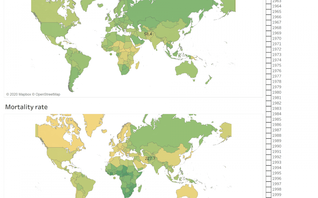
The Dashboard shows the mobile subscription rate around the world between 2013 till 2019 and compare it with the mortality rate. It is clear that the mortality rate is related to another factor and there is no contribution between the increase of mobile subscription and the mortality rate and the mobile is not the direct cause of mortality
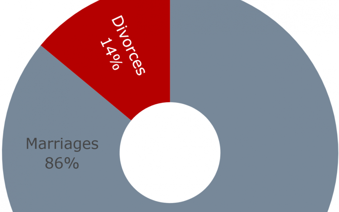
Moral of the Story: divorce rate in Lebanon on the rise (increased by 101% for the past 10 years)! So please protect your marriages!
Data source (Vital Data 1999-2019: Births, Deaths, Marriages, Divorces): Open Data Lebanon.