by bmb19 | Nov 16, 2025 | Team Project, Visualization
Living on two bills
Electricity is supposed to be invisible: you flip a switch and get light. In Lebanon, it’s something you plan your whole day around.
Most residents now live with two parallel systems in their heads: EDL hours and generator hours. You learn which appliances you’re allowed to use at 2 pm versus 2 am, when to rush a shower, when to switch off the AC because you’re scared of the next bill. Behind every meter, there’s a family trying to stretch one salary across food, rent, school, and an electricity bill that never really feels under control.
Situational Analysis — What people are living inside
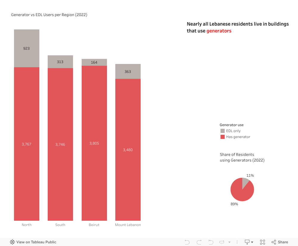
On paper, almost every home in Lebanon is connected to electricity. Urban households report virtually no physical disconnection from the grid, and rural areas are close behind.
In reality, the public utility, EDL, only manages to cover around two-thirds of national demand; the rest is picked up by private diesel generators at much higher prices.
Tariffs on the public grid stayed frozen for decades while fuel costs and the lira’s collapse pushed the real cost of each kilowatt-hour far above what people are billed, leaving EDL dependent on large state subsidies and struggling to offer 24/7 power. Families respond the only way they can, by constantly switching between EDL and generators, trimming usage where possible, and sacrificing comfort during heat waves and cold snaps.
Almost Everyone Lives with a Generator
It is very rare in Lebanon to find a building that relies only on EDL. Across Beirut, Mount Lebanon, the North and the South, almost 90% of all residents now live in buildings that have a generator contract.
For a typical family, that doesn’t just mean backup power; it means a second bill, a second set of rules, and a constant low-level anxiety about fuel prices, ampere limits, and surprise increases.
Where you live and how you’re supplied decide your bill
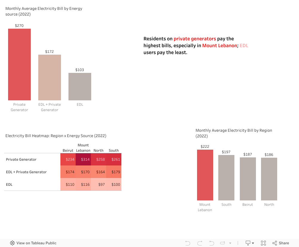
Generator users pay the most, and some regions are hit harder than others. Private-generator buildings in Mount Lebanon show the highest monthly bills, while households relying only on EDL pay noticeably less for similar basic needs. There are tough choices to make: parents deciding whether to keep the heater on for one more hour, or students studying under dimmer lights to save a little this month.
Same consumption, very different bills
Actual bills are well above the simple baseline almost everywhere. Even when buildings use roughly the same amount of electricity, generator users sit higher on the chart than EDL users. Two families living in similar-sized apartments, using similar appliances, can end the month with completely different bills, just because one building relies more on diesel. The system doesn’t only charge you for how much you use; it charges you for how broken your supply chain is.
Old buildings and weak envelopes quietly punish people
Older, poorly insulated residential buildings come with the highest bills. Poor or average insulation traps heat and cold in all the wrong ways, forcing families to run AC units, space heaters, and dehumidifiers longer just to reach a basic level of comfort. Newer or better-insulated buildings show noticeably lower bills, but most of the housing stock doesn’t fall into the good category.
Energy storage (batteries) helps residents survive outages and shift some usage, but it only reduces the bill a little bit—it doesn’t fix leaky windows, thin walls, or a climate that’s getting more extreme. People are effectively paying a penalty for living in older buildings they rarely had the power to choose or upgrade.
Call for action
What we found is pretty clear: residents in Mount Lebanon are billed the highest for roughly the same comfort, but no region is really okay. Whether it’s Beirut, the North, the South, or Mount Lebanon, most households are dealing with the same mix of unstable EDL hours, heavy generator reliance, and buildings that leak heat and cool air. The patterns in the data all point to the same thing: your bill is shaped more by where you live and how your building is supplied than by how careful you are with turning things off.
So, here’s the ask. At home, focus on the wins you actually control. Run heavy loads in EDL hours, when possible, keep ACs and heaters serviced, and seal the obvious leaks around windows and doors. In your building, don’t carry it alone, coordinate with neighbors or the committee to push for clearer generator terms and small shared upgrades instead of random individual fixes. At a wider level, we should start by helping the people who are hurting the most: families in older, generator-dependent buildings in every region, with support to improve their homes and with fairer electricity prices. The data shows exactly who is paying the highest bills, so we can stop acting like everyone is affected in the same way.

by Sara Dabbous | May 7, 2020 | Dashboard, Visualization
Since I started working in the healthcare sector I’ve always been interested in knowing more about this industry. As such, while exploring the WDI Data I studied several healthcare indicators and it turns out – Lebanon is doing better than we thought! I was intrigued to know what’s beyond those indicators, and luckily I found a detailed dataset about Primary Health Care Centers in Lebanon on The Humanitarian Data Exchange, I was surprised to know we had this many centers.
Could this visualization be a sign of a sound healthcare system ?
Did this awareness in healthcare aid us in containing the Covid-19?
Do you think there is a better future for the healthcare system for Lebanon, or will it be worst?
Personally, I am optimistic..
So here are some things I didn’t know:
- There are 174 Operational Primary Healthcare Centers in Lebanon
- There are 25 PHC funded by UNHCR
- There are 100 PHC that provide subsidized services.
- Nabatieh has 0 operational PHCs.
- The North governorate has the highest number of operational PHC: 36

In this dashboard, I prepared – using Tableau – a map that shows the different Operational PHC locations in Lebanon filtered by UNHCR Funding. Alongside it, is a bar chart showing the percentage of operational PHC in each Governorate. Finally, at the bottom, you can find a stacked bar chart representing the number of operational PHC per governorate, highlighting those who offer subsidized services.

by Ghufran Haidar | May 5, 2020 | Dashboard, Visualization
The following dashboard gives a complete image of the vital statistics in Lebanon starting year 1999 till the year 2018. It can be seen that the number of births has increased over the past few years by approximately 74 percent (top visual). However, during the same period, the number of deaths has increased slightly. The drastic increase in the number of births and yet slight increase in death rate call for further analysis of factors contributing to this improvement such as economic indicators, health care system and other relevant factors. What is worth noting, however, is that the number of divorces have doubled during the same time period. In comparison, the number of marriages has slightly increased between the years 1999 – 2018.
The following dashboard further shows a break down of these four variables (births, deaths, marriages, and divorces) by city and year. Beirut, the capital of Lebanon, has maintained the lowest number of births throughout the years (1999 – 2018). Interestingly, however, North Lebanon has had the highest number of vitals across all four variables throughout the same time period. Bekaa, on the other hand, had a relatively high marriage and divorce rate.
On a separate note, Lebanon has maintained an equal number of births and deaths across both genders throughout the same period (1999 – 2018).
Note that the dashboard is highly interactive. To maximize your experience, please view in full-screen and use filters by year and city as well as highlight by city.
by Layale Bassil | Apr 30, 2020 | Dashboard, Visualization
This dashboard contains several interactive visualizations about the “Vital Statistics in Lebanon” for the period 1999 till June 2019. The user can use the dashboard to get insights about the following Vital Stats: Births, Deaths, Marriages, and Divorce.
The user can select the desired measure and some provided filters like year-slider, Mohafaza, etc. in order to generate desired visuals!
Below is a list of available charts:
- Vital Statistics – Consolidated: this is a consolidated interactive chart. It gives the user the needed flexibility to select the x-axis and the y-axis from the four possible indicators (deaths, births, marriages, and divorce) and the gender (female, male) where applicable. By mousing over the points in the scatter plot on the left, the line graphs on the right update based on the point that you are hovering over.
- Yearly Vital Statistics Change (%) in Lebanon: the user can see the yearly percent change for the different measures (births, deaths, marriages, divorces) by gender and Mohafaza.
- Total Births/Deaths: an interactive bar chart to show the total number of births and deaths by gender and Mohafaza.
- Total Marriages/Divorces: an interactive stacked bar chart to show the total number of marriages and divorces by Mohafaza.
- Marriages/Divorces Progress: another interactive scatter plot that shows the progress on divorce with respect to marriages categorized by Mohafaza. The user has the option to select only one year or see the progress over all the years.
- Divorce Rate with respect to Marriage: this interactive bar chart shows the divorce rate (%) with respect to marriages by Mohafaza. The user has the option to select only one year or see the progress over all the years.
Moral of the Story: divorce rate in Lebanon on the rise (increased by 101% for the past 10 years)! So please protect your marriages!
Data source (Vital Data 1999-2019: Births, Deaths, Marriages, Divorces): Open Data Lebanon.