What If Your Best-Selling Item Is Actually a Loss?
In Japan, it is common for businesses to rely on the belief that well-crafted, reliable products can sell themselves without heavy marketing. One small online furniture shop followed this philosophy closely, focusing on quality materials, clean design, and dependable service rather than advertising campaigns.
The approach worked.
Orders were steady, reviews were positive, and most furniture categories- including chairs, shelves, bookcases, and storage units- consistently generated profit. By all traditional indicators, the business was healthy.
Yet something remained unusual: despite growing revenue, overall profit growth was slower than expected. The business was performing well, but its profitability did not scale proportionally with sales. This discrepancy prompted a closer look into where exactly profit was coming from, and where it might be slipping away.
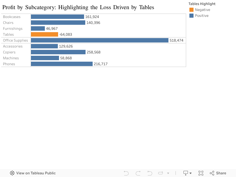
To investigate the issue, a visualization was created to compare profit across all product subcategories. The results were striking. Almost every bar on the chart showed positive profit. Except one.
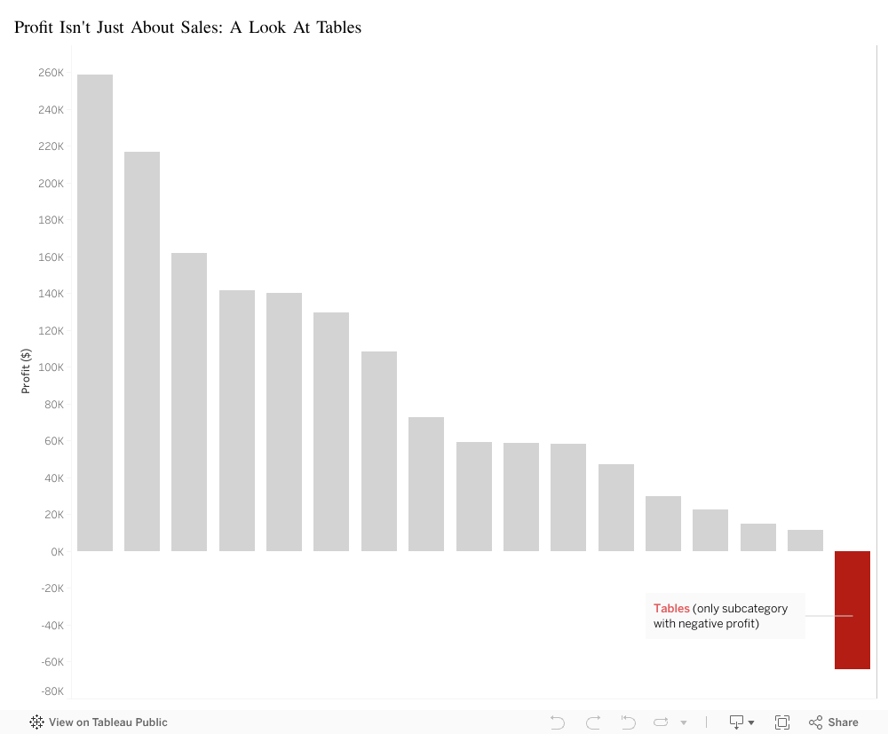
Tables: -$64,083.
The only unprofitable subcategory in the entire catalog.
- They required two delivery workers due to their size and weight
- They were difficult to deliver in most Japanese apartments with narrow hallways and small elevators
- They consumed significant warehouse space because of their bulky shape
- They were more prone to scratches or delivery damage, leading to replacements and refunds
- Table packaging was redesigned to better withstand delivery
- A modest oversized-item surcharge was added to reflect true handling costs
- Warehouse organization was adjusted to reduce movement and handling time
This finding was particularly surprising because tables were not low-demand items; in fact they were bestsellers. From a revenue standpoint, tables performed extremely well.
However, when analyzed beyond the point of sale, the underlying issue became clear. Tables carried significantly higher operational costs than any other category:
In short, tables were profitable at the moment of sale but unprofitable everywhere after the sale.
The business was not struggling because demand was weak- it was struggling because one high-demand product quietly erased a portion of the gains made by every other category.
Recognizing this pattern allowed the company to take targeted action to correct the issue. Several operational improvements were introduced:
These adjustments helped the business align its operational costs with its revenue, restoring profit balance across the catalog.
The visualization ultimately highlighted a broader lesson:
A product can be popular, well-reviewed, and frequently purchased- yet still unprofitable if its hidden costs exceed what it brings in.
Revenue alone does not determine success. Understanding the full journey of a product, from warehouse to delivery, is essential for sustaining a healthy business.