Looking at a super store data, managers are highly interested to have a clear view about their product lines and their relation to profits and losses.
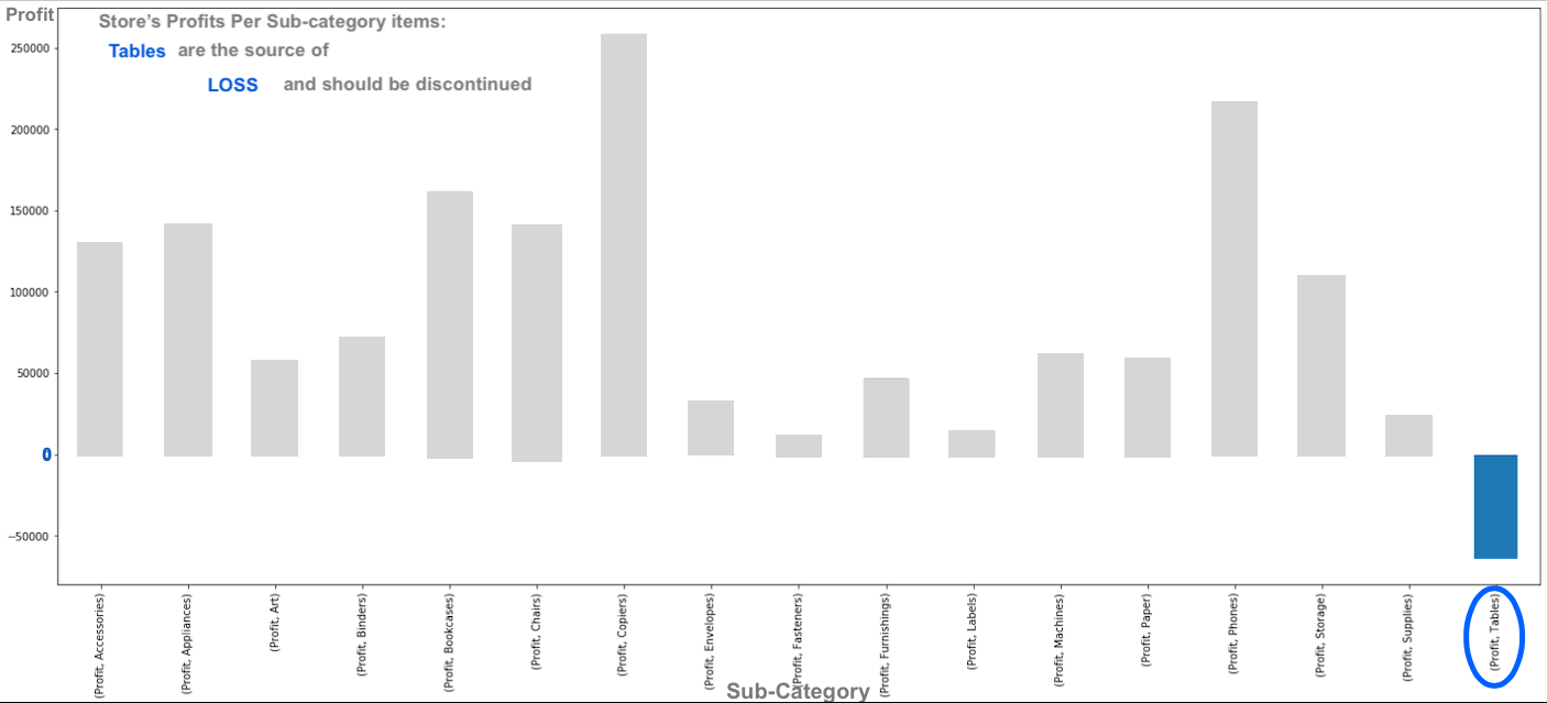
For this reason a visualization of profits per product subcategories highlights the areas where high losses occur. This graph reflects the profits that each sub-category of items generates. It is clear that for this store, tables are losing and they are generating losses instead of profits. For this reason it is recommended to discontinue selling tables and Focus on other items generating high profits such as Copies and phones.

0 Comments