
by Ghufran Haidar | May 5, 2020 | Dashboard, Visualization
The following dashboard gives a complete image of the vital statistics in Lebanon starting year 1999 till the year 2018. It can be seen that the number of births has increased over the past few years by approximately 74 percent (top visual). However, during the same period, the number of deaths has increased slightly. The drastic increase in the number of births and yet slight increase in death rate call for further analysis of factors contributing to this improvement such as economic indicators, health care system and other relevant factors. What is worth noting, however, is that the number of divorces have doubled during the same time period. In comparison, the number of marriages has slightly increased between the years 1999 – 2018.
The following dashboard further shows a break down of these four variables (births, deaths, marriages, and divorces) by city and year. Beirut, the capital of Lebanon, has maintained the lowest number of births throughout the years (1999 – 2018). Interestingly, however, North Lebanon has had the highest number of vitals across all four variables throughout the same time period. Bekaa, on the other hand, had a relatively high marriage and divorce rate.
On a separate note, Lebanon has maintained an equal number of births and deaths across both genders throughout the same period (1999 – 2018).
Note that the dashboard is highly interactive. To maximize your experience, please view in full-screen and use filters by year and city as well as highlight by city.

by Jad Rizk | May 5, 2020 | Dashboard, Visualization
The below storyboard highlights and examines a correlation between the GDP per capita and population age distribution. The visualization shows a comparison between regions and across time. This correlation makes us think more about future problems like pensions, economic growth, child labor, retirement age, and possible social problems. It is worth examining further if there is causality. Are economic changes coming based on age distribution?
The dashboard is interactive. Please feel free to filter, highlight, and discover the data in more depth. The fullscreen setting will allow for a better viewing experience.
by Nourhan Mahmassani | May 5, 2020 | Visualization
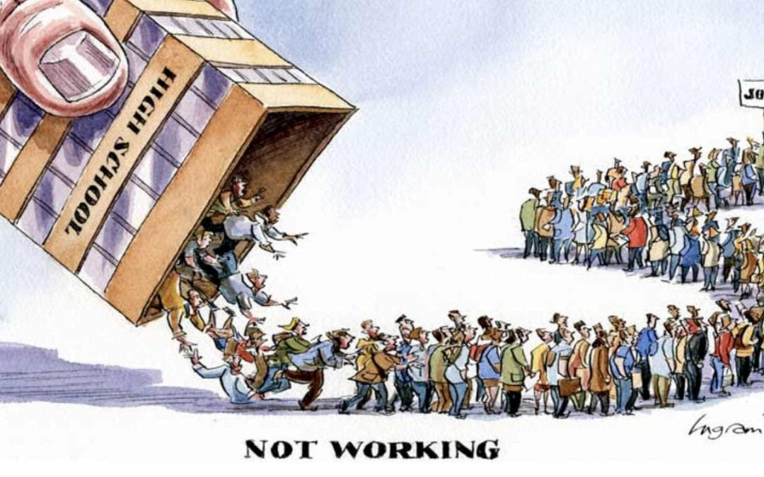
Countries face a huge loss due to unemployment. In order to find a solution for unemployment, we searched for the factors causing it. As shown below, gender discrimination, country’s GDP, distribution of jobs among the economic sectors, and educational level have a huge impact on Unemployment.Above,you can alter the regions you want to analyze from using multiple values drop-down.
In Conclusion:
-As GDP increase the Unemployment rate decrease
-Female Unemployment is higher than the males due to gender discrimination in workplace
-Employment rate is higher in the services sectors which mean that there is no equal job opportunities in between sectors causing higher
unemployment
-If the educational level is more advanced, their is lower unemployment rate
Data Source: https://datacatalog.worldbank.org/dataset/world-development-indicators
by Youssef Daouk | May 4, 2020 | Visualization
This visualization shows the comparison of the dependency ratios of old age as well as children between several middle eastern countries.
It is seen that the child dependency ratio is not that high in Lebanon, but we chose to focus more on the old-age dependency. As seen in the visualization above, Old age dependency in Lebanon is 10.08, which is neither the best nor the worse in comparison to others in the region. But the good thing is that the elderly are still active in the economy, this can help boost the economic state in Lebanon if treated properly.
by Sara Dabbous | May 4, 2020 | Visualization
Best viewed on a computer screen!