If you grew up in Lebanon, you’ve probably heard someone say: “If this illness happened in Beirut, things would’ve been easier.”
I’ve heard it from relatives and friends who had to drive for hours for a simple check-up.
Healthcare in Lebanon has never felt equal, but I always wondered: Is this just a feeling, or is the data telling the same story?
To explore this, I combined two national datasets:
One mapping where chronic diseases and special needs appear across Lebanese towns, and another showing where healthcare facilities are actually located.
These visuals show that rural regions, especially Akkar, Baalbeck-Hermel, and the North, have the highest share of towns reporting chronic diseases, confirming that Lebanon’s heaviest health burdens fall on its most underserved areas.
We can see that most healthcare facilities are concentrated in urban Mount Lebanon, creating an imbalance where the regions with the greatest health needs have the least medical infrastructure.
To understand this imbalance more clearly, I looked at disease prevalence side-by-side with the availability of the healthcare resources that matter most for each condition.
The question was simple: when a disease appears in a town, is the right type of care actually nearby?
Therefore, I paired each condition with the resource most relevant to its management, based on clinical practice and literature:
• Hypertension → hospitals
• Diabetes → clinics
• Cardiovascular disease → pharmacies or medical centers
• Special needs → dedicated care centers
Once I paired each condition with the care it requires, a clear imbalance appeared:
• The regions most affected by disease had the least access to the services they needed.
• The regions with lighter disease presence had the strongest concentration of facilities.
A clear example is hypertension vs hospitals:
•Akkar, Baalbeck-Hermel, the North, and parts of the South showed high hypertension presence, yet had some of the lowest hospital capacity.
•Meanwhile, Mount Lebanon, with lower prevalence, had more hospitals than all of them combined.
This is more than an imbalance; it’s an access gap that shapes real health outcomes.
So, what does Lebanon need?
Targeted decentralization, not more hospitals everywhere.
Rural regions don’t need giant new medical complexes.
They need strategically placed clinics, chronic-disease screening units, hypertension/diabetes corners, and even mobile health programs.
Allocate resources based on data
Mount Lebanon already has the largest medical footprint.
But Akkar, Baalbeck-Hermel, the North, and the South need urgent investment.
Build capacity where it matters.
Even a single medical center, diagnostic pharmacy, or special-needs support unit can shift accessibility for hundreds of towns.
Make data-driven planning routine.
Lebanon produces far more data than most people realize, we just don’t use it.
Dashboards and visual can guide ministries, municipalities, NGOs, donors, and health planners to invest where impact will be highest.
Lebanon doesn’t suffer from a lack of medical knowledge, it suffers from a lack of medical access. And the good news is that access can change.
If resources finally start following the data, rural Lebanon won’t stay medically invisible. The map is clear, now the planning needs to follow.
Access to healthcare in Lebanon depends on one simple but critical factor: where you live. But until you visualize the distribution of facilities across the country, it’s hard to truly see how unequal that access is.
I started this project by aggregating six types of health facilities — hospitals, clinics, medical centers, pharmacies, labs and radiology centers, and first-aid centers — across all districts using the PKGCube Health Resources dataset. After cleaning and restructuring the data, one pattern immediately stood out: Lebanon’s map of healthcare is far from balanced.
To understand this more clearly, I built a district-level visualization and redesigned it using explanatory design principles. And once the noise was removed, the picture became unmistakable.
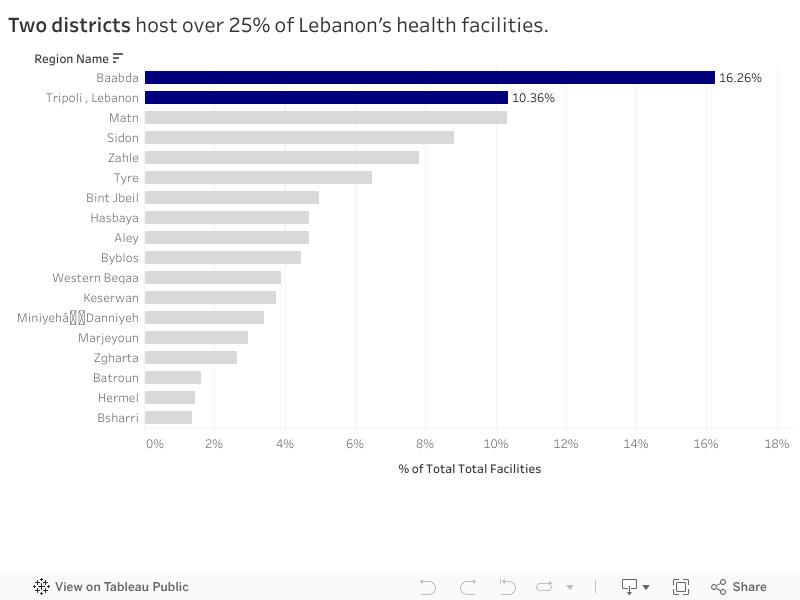
The Key Insight
Two districts — Baabda and Tripoli — hold more than a quarter of all health facilities in the entire country. Just two.
Meanwhile, at the opposite end, districts like Hermel and Bsharri combined account for less than 3%.
In a country with major infrastructure gaps and uneven population distribution, this imbalance has consequences:
It shapes how far people travel to access care.
It affects waiting times, congestion, and referral patterns.
And in crisis situations, it determines who gets help quickly and who doesn’t.
The redesigned visualization highlights this story intentionally. The top two districts are shown in strong blue, while the rest of the country fades into context. No clutter, no distractions — the contrast lets the insight speak for itself.
What It Means
This distribution doesn’t automatically mean Baabda and Tripoli are “over-resourced” or that Hermel and Bsharri are “neglected.” Counts are not the same as capacity, staffing, or service quality.
But the numbers do reveal something important: If health planning is meant to be equitable, we can’t treat all districts as if they start from the same baseline.
Policymakers and NGOs could use these insights to:
Prioritize new facility investment in low-share districts
Support underserved areas with mobile clinics or telehealth units
Track whether the distribution becomes more or less concentrated over time
What Comes Next
This visualization is a starting point. The next step is to connect the facility distribution with:
District-level population
Accessibility and travel time
Facility capacity indicators
That is when the story becomes more than a map — it becomes a tool for planning.
For now, the message is simple: Lebanon’s health infrastructure is unevenly distributed, and two districts carry a disproportionate share of the country’s access.
“ When it comes to health, your ZIP code matters more than your genetic code ” – Dr. Tony B. Iton
The Healthcare Scene in Lebanon
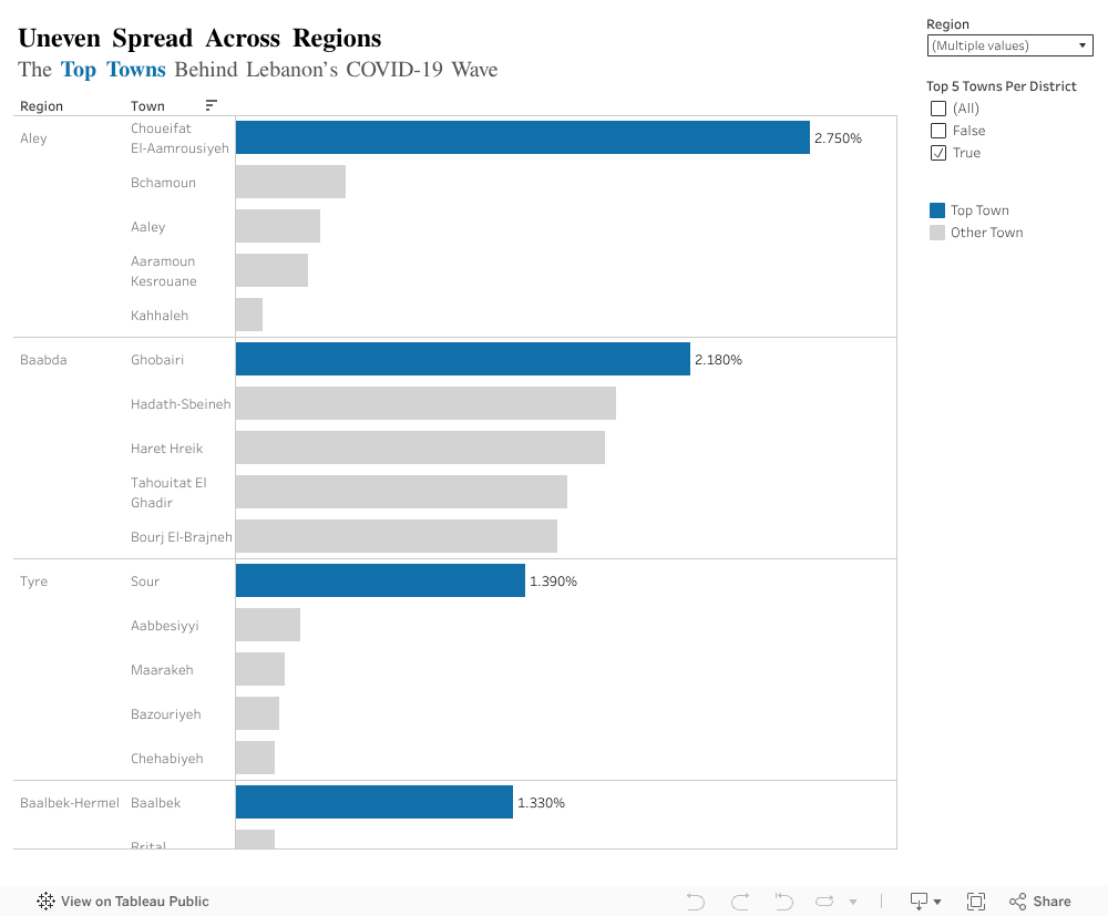
Rami spent the majority of his life in Aley, Choueifat El Aamrousiyeh, a quiet town where people know each other all throughout the area. When Covid-19 began spreading in Lebanon, he assumed that his location would be relatively safe in terms of health implications. After all, the news was primarily focused on Beirut.
During peak months, Rami started hearing about his neighbors testing positive at a pace he certainly did not expect. Meanwhile, his cousin Leila, who lives close by in Kahhaleh, hardly knew anyone infected. They were both in the same region, but faced entirely different risks.
Rami’s worry and stress levels grew a lot, especially for his elderly parents with chronic conditions. If Covid spread in his town at a fast pace, would they be able to get help in time? Would testing and vaccination centers be available in close proximity to where they live? Would nearby hospitals be overwhelmed with full capacities?
Leila and Rami’s experiences reflect what many Lebanese families endure. Two households in the same region, but different towns, had completely different stress levels regarding the readiness of healthcare emergency responses.
Health Patterns in Lebanon: What the Data Reveals
We tend to think of public health at the regional level, but covid behaved more so at a town level per region. This exposed imbalances that are not usually explored. Top town per region with the highest contribution to the total national case count revealed unexpected results:
In Aley (region), Choueifat Aamrousiyeh alone accounted for 2.75% of all cases in the country.
In Baalbek-Hermel, Baalbek alone stood out with 1.33%, which is much higher than surrounding towns.
The remaining regions showed similar patterns: one or two towns carried the majority of cases.
What Does This Mean Exactly?
People like Rami, who happen to live in a high risk town, experienced a completely different pandemic from people in towns just a few kilometers away. This is likely to repeat in the future if another major healthcare crisis hits the country.
Moving Forward, What Can Be Done?
Prioritize hotspot towns: testing centers, clinics, and awareness campaigns should start where case data shows concentration, not where population is highest.
Build local readiness plans: Instead of generic region level plans, towns with higher infection percentages need specific preparation steps (rapid testing, temporary isolation centers, and community awareness).
Use data driven action plans: Covid case percentages help identify where outbreaks are likely to happen again. If regions plan smarter, hospitals and clinics face less chaos.
Strengthen communication and public awareness: Towns with consistently high rates should receive ongoing health messaging to prevent repeat scenarios.
The Key Takeaway
By understanding how Covid-19 was not distributed proportionately across towns, we can finally design smarter, more effective responses. This applies not only to pandemic/epidemics, but to any future public health threat in Lebanon.
In Lebanon, access to healthcare can change drastically with geography. A person in Tripoli can find a clinic or pharmacy on nearly every corner, while someone in Hermel or Zahleh might travel hours for the same care.
Using data obtained from the AUB Linked Open Data Portal, I explored how healthcare facilities are distributed across more than 1,100 Lebanese towns. The goal was to understand whether medical services are spread evenly across the country or concentrated in only a few locations.
Uneven Access Across Towns
The data reveals a clear imbalance. Healthcare services are heavily centralized in urban areas, particularly Tripoli, Saida, and Haret Hreik, which together host the largest share of Lebanon’s medical facilities.
Tripoli alone has more than 230 healthcare establishments, while dozens of smaller towns have fewer than 20 facilities, and some have none at all.
This concentration means that people living in rural and inland areas often need to travel long distances for even basic medical services, while urban hospitals and clinics struggle with overcrowding and high patient loads.
It highlights a system where location determines opportunity, where healthcare is available not based on need, but on proximity to major cities.
What Kinds of Facilities Exist?
When we look at the types of healthcare facilities, pharmacies and clinics dominate the landscape. They make up the majority of Lebanon’s healthcare infrastructure, far outnumbering hospitals and specialized centers.
While pharmacies and small clinics ensure access to medication and consultations, hospitals and diagnostic centers are much fewer, especially outside major cities. This shows a healthcare system that leans more on treatment through medication than on preventive or emergency care.
Balancing the Map: How Geography Shapes Access
Together, these findings reveal how geography continues to shape healthcare opportunities in Lebanon. The concentration of facilities in urban centers not only affects access but also contributes to inequalities in health outcomes. Urban residents have quicker access to doctors, specialists, and emergency units, while rural populations often rely on limited local clinics or travel hours to reach adequate care.
These patterns underline the urgent need for balanced healthcare investment. Rural areas require new clinics, laboratories, and emergency units that bring services closer to people’s homes. Improving healthcare equity is not only a matter of infrastructure, it’s about ensuring that every Lebanese citizen, regardless of location, can access timely, reliable care.
Final Reflection
This analysis shows how data visualization can make inequality visible. By mapping and quantifying healthcare access, we can move beyond perception and use data to guide smarter, fairer policy decisions. Ultimately, every dataset tells a story, and in this one, the message is clear:
“Health should not depend on your zip code.”
Tags: healthcare, Lebanon, inequality, data visualization, open data, AUB
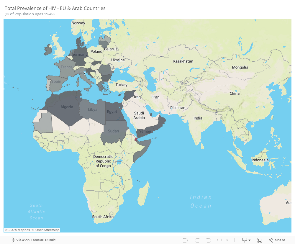
HIV persists as a noteworthy communicable disease in Europe and a substantial risk in the Arab world, posing a significant health challenge. This infection is associated with considerable healthcare costs for treatment and care, a noteworthy mortality rate, and a reduction in life expectancy. The virus specifically attacks the immune system, resulting in a persistent and severe illness with an extended incubation period before symptoms manifest.
The average prevalence from 2005 to 2021 reveals notable trends. While some Arab countries, like Saudi Arabia, UAE, and Iraq, do not consistently report HIV statistics, the available data highlights the prevalence of the disease in Arab countries situated in Africa. In contrast, European countries, particularly Portugal, Latvia, France, and Italy, exhibit higher prevalence rates.
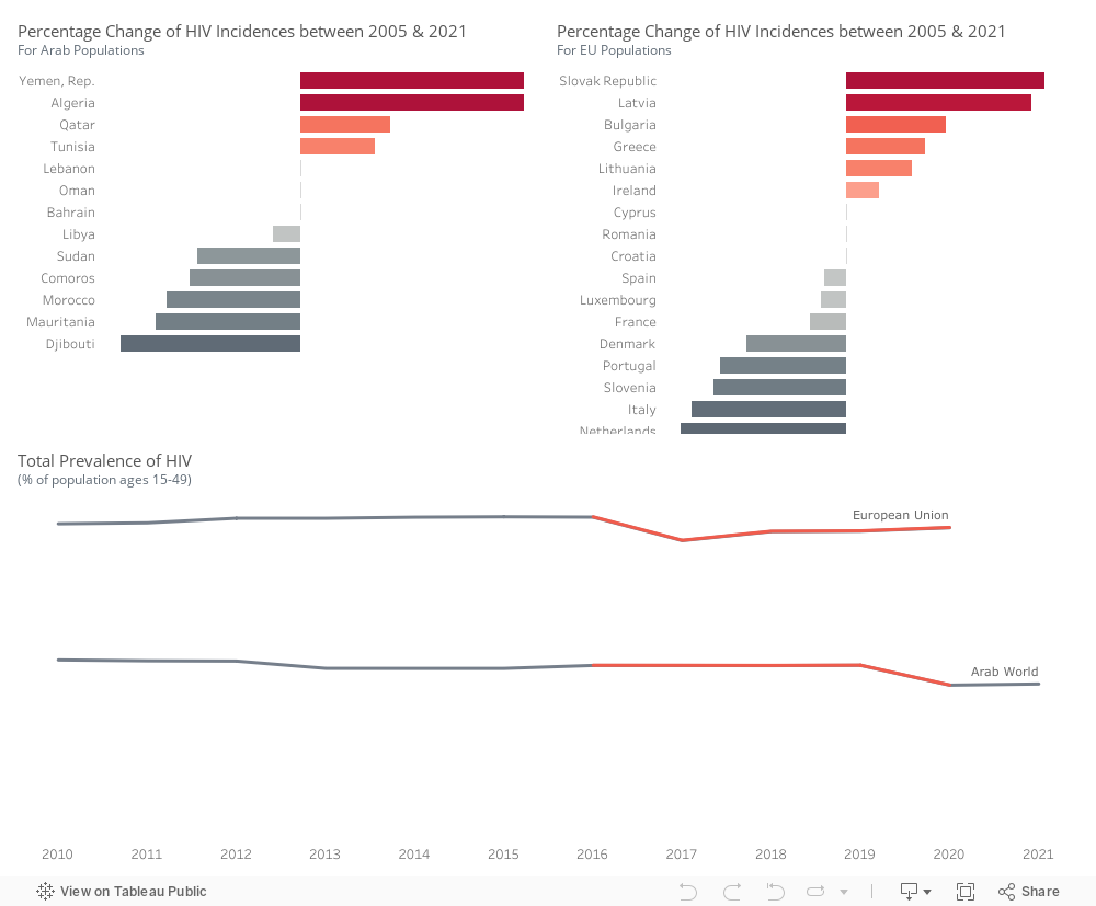
Within the Arab world, there is an upward trend in the percentage of HIV incidences in Yemen, Algeria, Qatar, and Tunisia. Conversely, Djibouti, Mauritania, Morocco, Comoros, Sudan, and Libya exhibit a decline in HIV incidence rates.
Within the Euro area, there is an increase in HIV incidences observed in Slovakia, Latvia, Bulgaria, Greece, Lithuania, and Ireland. However, a decrease is noted in the Netherlands, Italy, Slovenia, Portugal, Denmark, France, Luxembourg, Spain, and Croatia.
HIV prevalence is higher in European Union countries compared to Arab countries. There was an incline in Arab countries around 2020, while in the European Union, the trend experienced a decrease in 2017, followed by a slight upward movement.
We will be focusing on these countries in the following visuals.
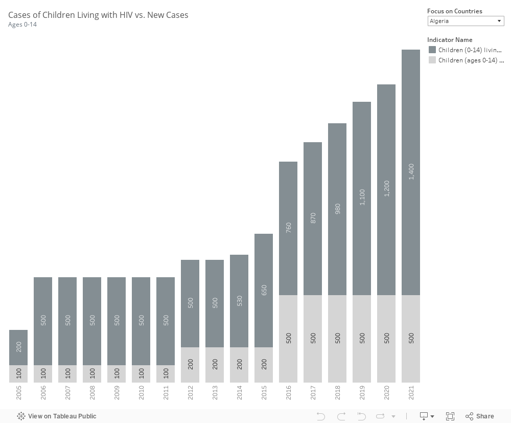
Most countries do not report parameters related to children living with HIV and newly infected children. However, the available data indicates that in Algeria and Morocco, both the number of children infected and the number of new cases are on the rise. In contrast, Djibouti has successfully decreased these numbers, as has Mauritania.
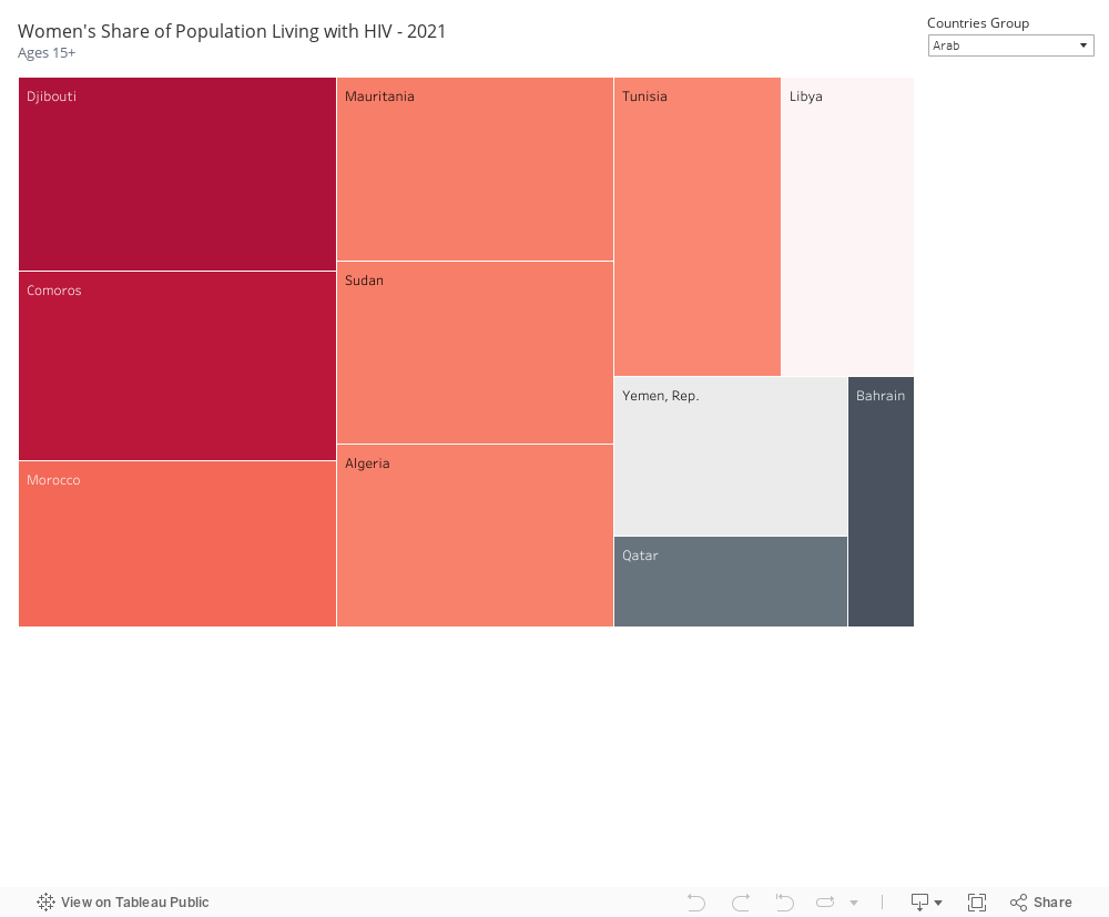
In our selected focus countries, notable instances of HIV infection among the female population are observed. Within Arab countries, Djibouti, Comoros, Mauritania, Sudan, Morocco, Algeria, and Tunisia exhibit a high prevalence. Similarly, in EU countries, France, Portugal, Latvia, Ireland, Luxembourg, and Italy show a high number of females infected with HIV.
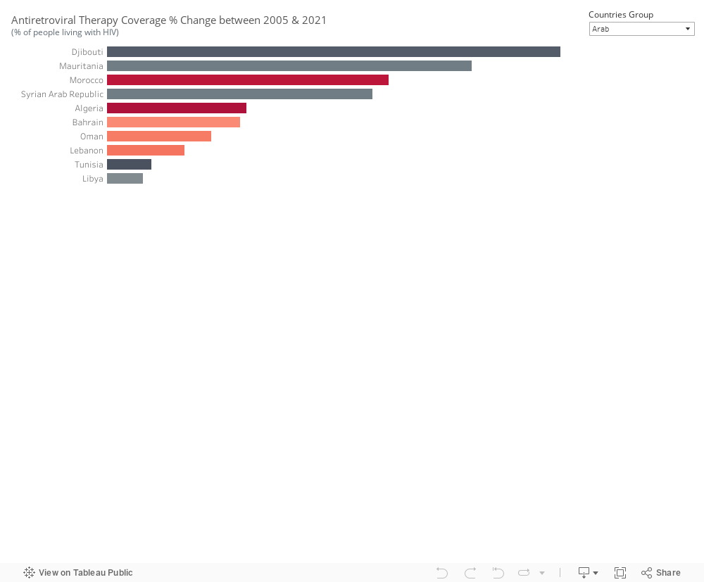
Antiretroviral therapy coverage has seen an increase since 2005 in Djibouti, Mauritania, and Morocco within the Arab world, as well as in Latvia and Bulgaria. The effectiveness of the treatment is reflected in the declining incidence cases observed. However, in Algeria, despite an increase in treatment coverage, the number of incidents continues to rise. A similar situation is noted in Slovenia, suggesting that the treatment alone may not be sufficient to curb the spread of HIV.
Information pertaining to condom use and protected sex is currently unavailable, emphasizing the need to gather this specific dataset.
In conclusion, Europe & the Arab World are far from meeting global HIV targets. Annual new HIV infections from AIDS-related illness are on the rise. While treatment can contribute to reducing the prevalence of HIV in a country, it is just one aspect of a comprehensive approach. Relying solely on treatment is inadequate. Nations should prioritize addressing other impactful factors, including:
Implementing prevention programs that effectively reach key populations in substantial numbers.
Making special efforts to enhance and extend HIV testing and treatment initiatives.
Increasing engagement with the younger demographic.
Enforcing effective policies such as mandatory testing for work or residence permits, mandatory testing for marriage, and criminalizing activities such as sex work and drug use or possession for personal use.