How Data Visualization Revealed the Real Issues Behind the Instability in the Performance of ChocoStory
Launched in 2018 in Verdun (Beirut), ChocoStory quickly gained popularity: a prime location, strong foot traffic, and the owners’ network. The store combines walk-in chocolate items products with experiences like chocolate workshops and a museum.
However, when we first examined ChocoStory’s performance, one thing was immediately clear: growth wasn’t steady. Sales would surge, only to drop sharply right after, and this pattern kept repeating every year.
That raised a key question. Why did the business grow in some periods but lose momentum just as quickly? This pointed to structural issues rather than simple seasonality.
Our approach is simple but powerful: use data to understand how market dynamics, customer preferences, and internal costs shape ChocoStory’s inconsistent performance. We used a series of visuals that helped us walk through the timeline and understand what was affecting the numbers.
Understanding the Swings in Performance
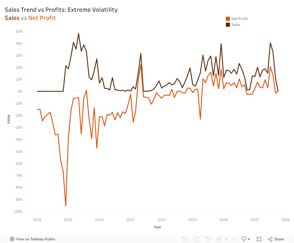
The first step was mapping both sales and net profit from their opening in 2018 until the present.
This revealed a cycle of volatility that repeats year after year, showing how heavily the business relied on peak seasons. Net profits follow the exact same pattern as Sales, almost like a shadow, just consistently lower. Profitability relied entirely on sales peaks rather than efficient operations, meaning any drop in demand immediately pushed the company into a loss.
How External Events Influenced the Numbers
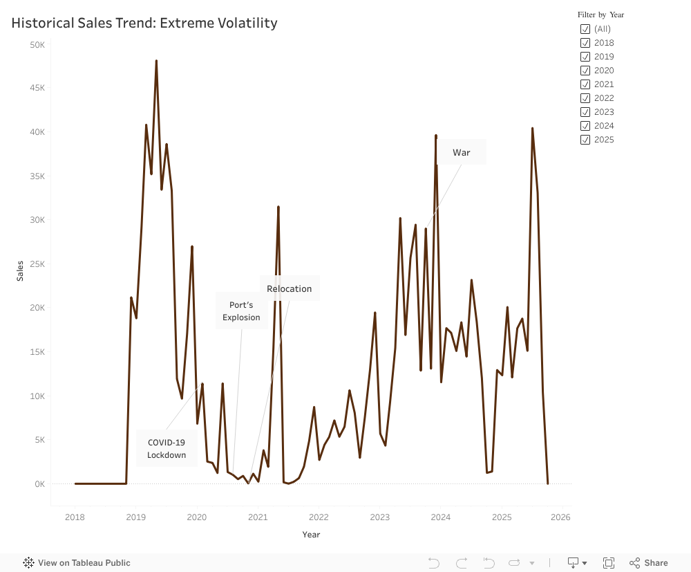
Looking across the years, it became clear that ChocoStory’s performance was closely tied to what was happening around it.
The early period was steady, but the situation changed fast.
Covid-19: Foot traffic reliance backfires; digital gap hurts.
Port Explosion: Supply chain chaos; no quick adaptation.
Disruptions will happen, but their impact depends on how equipped the business is to handle them. Too often, ChocoStory reacted slowly or only partially.
What the Cost Structure Revealed
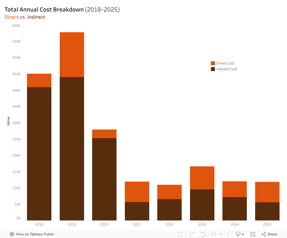
At first glance, ChocoStory’s expenses looked normal, but when they were broken down into the direct and indirect costs stacked barchart, a different reality emerged. Before 2021, direct costs (workshop materials, chocolate ingredients, packaging, etc.) were relatively stable. Indirect costs, however (rent, utilities, electricity, etc.), fluctuated heavily, with not enough revenues to break even.
The total expenses vs net profit line chart showcased two lines behaving in a symmetrical pattern. When expenses rose, profits dropped. Likewise, when expenses fell, profits increased. This approximate symmetry highlighted a deeper issue: ChocoStory had almost no safety margin. With indirect costs absorbing such a large share of total expenses, the business was operating with a net profit loss. It was only after the 2021 relocation that the gap between the lines narrowed down, and ChocoStory began breaking even. However, they were unable to sustain an upward profit trend beyond break even.
4. Rethinking the Product Portfolio
ChocoStory offers a wide range of chocolate items. There are 206 products, compared to just 28 service offerings.
At first glance, this creates the impression of a product-led business, assuming they generate enough profits compared to operational weight. Yet, comparing the revenue generated by each proves otherwise:
Based on that chart, it becomes clear that products generated around LBP 4.5B only, while services reach LBP 11B. The highest revenue contributors were the services (workshops and museum) indicating that ChocoStory operates more as an experience-driven destination and less like a traditional chocolate shop.
Visibility and Online Presence
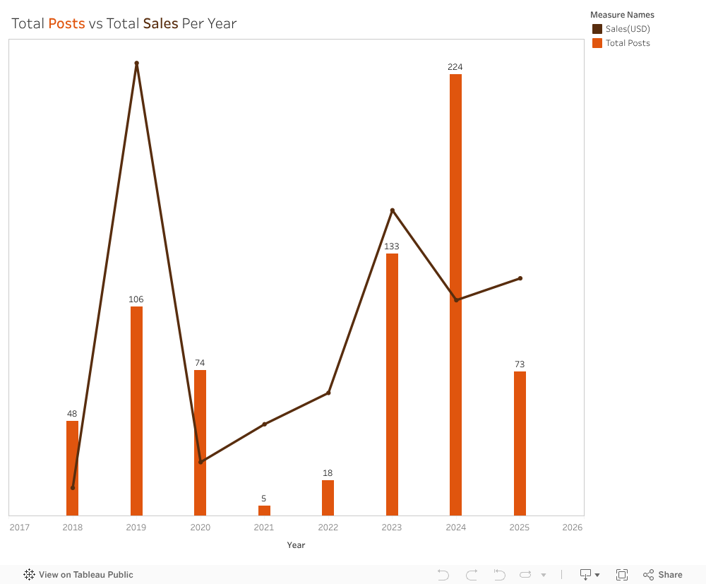
We reviewed the platforms because visibility on social media affects how easily customers find and engage with the business. We looked at posting activity across Instagram, Facebook, and Threads from 2018 to 2025 and compared yearly posts with yearly sales. Activity varied widely. In 2021, only five posts were published during the relocation period, which aligned with the lowest sales in the dataset. Posting increased again in 2023 and peaked in 2024, but sales did not return to 2019 levels, when posting was more moderate. We also noted that ChocoStory was not active on TikTok, despite it being a major discovery platform for local experiences.
Our wider analysis showed a clear gap in engagement by content type. A workshop-and-museum video reached more than 784,000 views, while a seasonal product post received 37 likes. This showed that experience-focused content resonated far more than product photos. Taken together, the results suggest that visibility shifted across the years, and that content type mattered more than posting frequency.
A Clearer Path Forward
ChocoStory’s main challenge isn’t the chocolate, it’s not understanding its customers. Our team recommended concentrating on the audiences that naturally fit the workshop experience, especially children between 4 and 14. Schools and camps can create a steady flow of visits throughout the year. Simplifying the product list can reduce operational strain and help redirect attention to the experiences that matter most.
During our visit, the ChocoStory team confirmed that these insights aligned with their own observations. They plan to reduce the number of products, strengthen communication around the workshops, and develop a more structured marketing plan.
This analysis showed how much can be learned from placing data into clear visuals. Trends that look confusing in raw numbers become understandable once they are visualized. ChocoStory faced several disruptions from outside events, but many challenges also came from how the business was structured. With a clearer view of what drives performance, the company can now build on its strengths and create more stable growth.
What if the hours children spend scrolling every day are quietly shaping how anxious they feel — and even how well they perform in school?
Using a cross-sectional dataset of Lebanese students aged 8–14, this analysis explores the relationship between daily screen time, anxiety, gender, outdoor play, and academic performance.
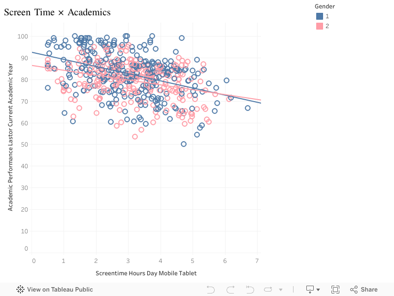
1. How Much Screen Time Do Children Get?
Most students spend 2–4 hours/day on mobile or tablet devices, but a noticeable group reaches 5–7 hours. This suggests a segment exposed to high digital consumption.
2. Anxiety Levels Are Widely Spread
Anxiety scores range from 10 to 100, with most students clustering around 40–55. A significant minority shows severe anxiety.
3. More Screen Time = More Anxiety
A clear positive correlation emerges:
As screen time increases, anxiety rises across both boys and girls.
This relationship remains strong even when controlling for age.
4. Gender Differences Are Small but Present: Girls show slightly higher anxiety and slightly higher screen time. But the trend lines for both genders are almost identical — meaning screen time, not gender, is the main driver.
5. Anxiety Reduces Academic Performance: Students with higher anxiety tend to have lower academic scores, with a noticeable decline past anxiety scores of 60.
6. Screen Time Reduces Academic Performance (Slightly): More screen time is associated with lower grades, although the effect is weaker compared to anxiety.
7. Outdoor Play Offers a Small Protective Effect: More outdoor playing hours slightly reduce anxiety, suggesting a helpful intervention.
Conclusion
Across the dataset, a consistent pattern emerges:
More screen time → higher anxiety → weaker academic performance.
Encouraging even small reductions in daily screen use — or adding more outdoor time — can help protect children’s mental well-being.
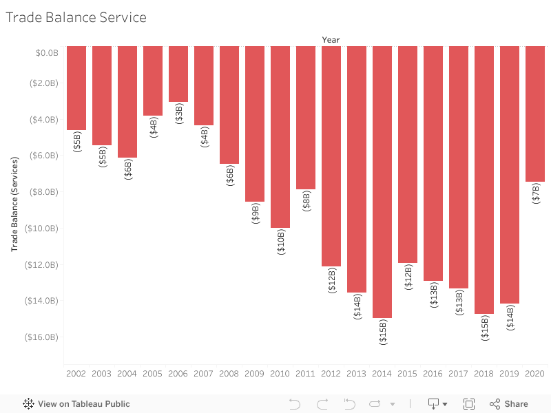
Lebanon’s service sector should be a national strength — tourism, education, banking, and professional services once made the country a regional hub. But when we look beyond assumptions and into the data, a very different story appears: for 21 straight years, Lebanon has been in the red, importing more services than it exports.
From telecoms and travel to banking and consulting, services play a key function in transforming a country’s economic strength. But for Lebanon, the story hidden in the data tells a completely different reality—one of a consistently growing services deficit over the last two decades.
Looking at 20 years of trade data, I examined how Lebanon’s services balance transformed across key economic periods. The story became immediately clear:
For 21 consecutive years, Lebanon has never escaped a services trade deficit, and the gap continues to deepen.
Why This Matters
For more than twenty years, Lebanon has faced a continuing services trade deficit. The country’s imports, including finance, logistics and professional consulting, have consistently exceeded its exports. The ongoing imbalance heightens economic vulnerability and increases Lebanon’s reliance on foreign service suppliers.
Between 2002 and 2022, the trade balance remained consistently negative. During its 2014-2018 peak, the trade balance deficit surpassed $14 billion, revealing how deeply rooted this issue has become.
The visualization below highlights how this deficit has evolved across key periods.
**Interactive Visualization:**
Hover over the bars to see exact values for each year.
**Full View:**
Complete visualization showing Trade Balance Services from 2002-2022.
During the pandemic in 2020, the deficit slightly decreased—mainly due to reduced travel and service utilization. Unfortunately, this improvement is temporary. In 2021 and 2022, the deficit rises again, continuing the very trend Lebanon has struggled with for years.
What This Means
A persistent services trade deficit highlights structural vulnerabilities. It reveals that Lebanon is consistently spending more on imported services than it generates from exports. With time, this imbalance becomes a financial burden that weakens financial stability and increases dependence on external inflows.
The Big Idea
Examining two decades of data highlights how Lebanon’s service trade deficit has continued to expand, revealing Lebanon’s economic vulnerability. The figures are striking on their own, but when presented as a story, the patterns become impossible to overlook.
What Can Lebanon Do?
Reducing the services deficit requires structural changes rather than short-term fixes. Strengthening digital services, tourism, and healthcare exports can create new revenue streams. Supporting export-oriented SMEs — especially those providing regional outsourcing services — can also help Lebanon compete more effectively.
Policy efforts should focus on promoting digital transformation, encouraging service-based startups, and building stronger regional trade partnerships. Over time, these measures can help diversify Lebanon’s export base, reduce dependency on imported services, and move the country toward a more sustainable trade position.
For example, Lebanon’s IT outsourcing sector—especially remote consulting and digital services—has grown naturally since 2020 and can become an export engine if supported through training and regional partnerships.
A personal journey into the places we love, the beauty we overlook, and the opportunities we’re losing
Lebanon is a country overflowing with natural beauty, history, culture, and authentic local experiences. A place where even the smallest town holds a story, a scent of zaatar from a bakery at dawn, the echo of church bells or the call to prayer drifting across the valley, the laughter of families gathered near rivers, old souks, and mountain trails.
These moments stay with us. They shape who we are. They remind us of a Lebanon that feels peaceful, grounding, and full of life.
But beneath the familiar hotspots we all rush to, there is a deeper truth, a truth rarely captured in brochures or tourism campaigns.
Many Lebanese towns already hold everything a thriving tourism ecosystem needs… except support.
Growing up here, these towns shaped my identity. Their landscapes, their people, their rhythm, all felt alive.
Yet as I grew older, I began to notice something painful:
The towns we love are often the ones left behind.
Where Beauty Lives but Support Does Not
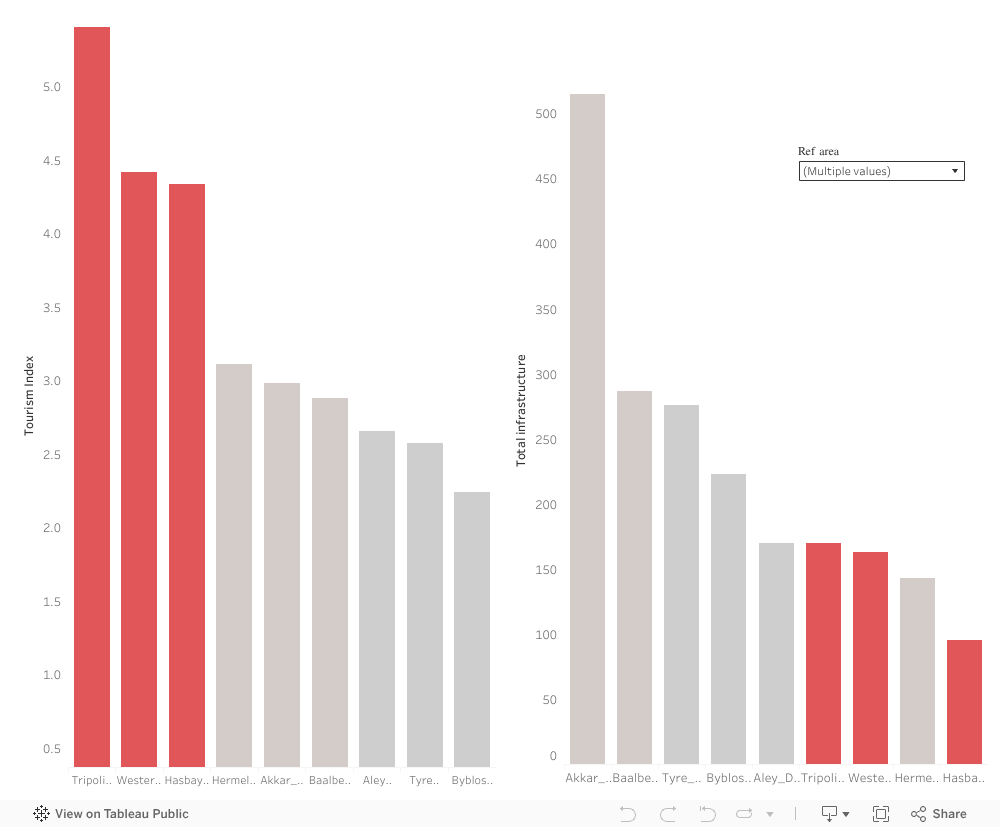
Before looking at individual towns, I started from a broader question:
Do the regions of Lebanon with high tourism appeal receive the infrastructure support they need?
As Tourism Index shows how naturally attractive or culturally rich a region is, the Infrastructure Capacity refers to the services that allow tourism to function (cafés, restaurants, accommodations, facilities, etc.)
Some towns rise high on the “Tourism Index”, but fall flat on actual investments.
While many regions score well on tourism attractiveness, their infrastructure such roads, accommodations, public spaces, services, and tourism support systems lag far behind, making it difficult for visitors to stay, explore, and contribute economically.
This mismatch isn’t just a technical imbalance. It reflects a deeper, more emotional reality.
Some towns are seen, while others are not. Some receive attention, while others remain forgotten.
And the ones left behind are not lacking in beauty, they are lacking in support.
We already see what happens when beauty is supported. Regions like Baabda, Akkar, and Matn, all scoring high on both Tourism Index and infrastructure, thrive simply because they were given the basics. They are the proof of what every overlooked town could become with just a little support.
Beauty and heritage exist everywhere in Lebanon, yet so much of it continues to wait quietly for the support it deserves.
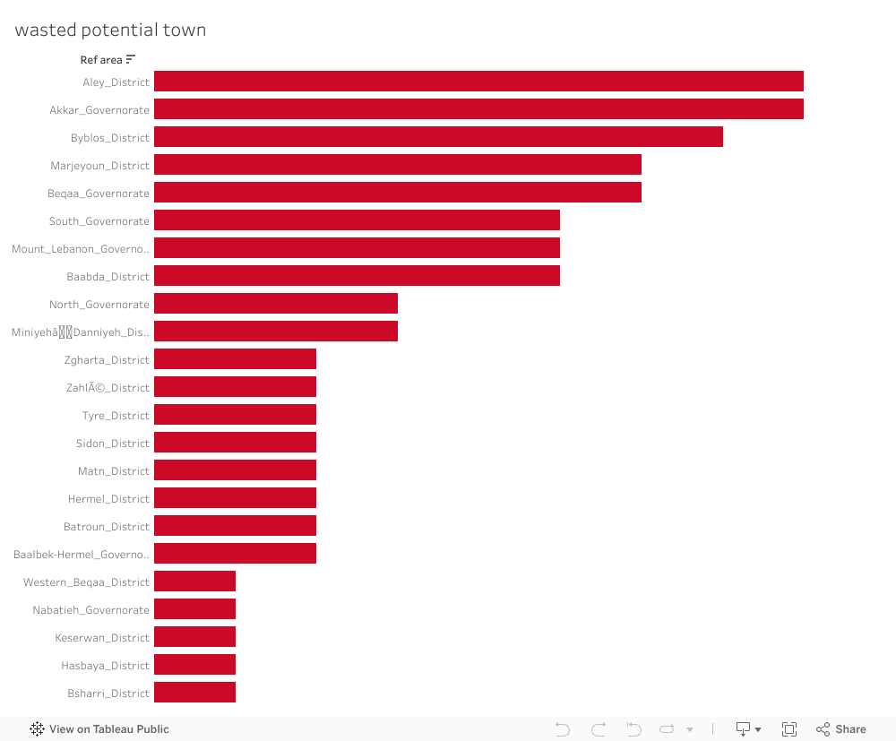
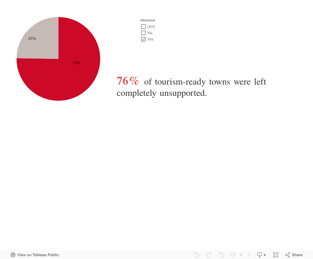
Each bar represents a town that has natural beauty or cultural heritage, but zero visible tourism development. These are places with stories, landscapes, and identity waiting silently for investment.
Over the years some Lebanese towns have received tourism-related initiatives. But when we look only at towns that already have attractions, a striking pattern appears:
Most of them, despite having natural, cultural, or historical treasures , received no initiatives at all.
No projects;
No funding;
No development;
No strategy;
Just silence.
The Hardest Truth: Even the Most Attractive Towns Receive Nothing
Some may argue: “Maybe those towns don’t have attractions.”
But when we look closely at towns that already possess attractions, the painful truth becomes impossible to deny.
Potential without support becomes a burden. Towns that could thrive remain stuck. Communities that could flourish stay stagnant. And the tourism narrative becomes narrower, excluding places that rightfully belong in it.
The towns most ready to be activated are often the ones completely overlooked.
3 out of 4 received no support. None.
This is not a coincidence. It is not a gap.
It is a systemic misalignment between where potential exists and where initiatives are delivered.
These are towns where: visitors already come, landscapes already impress, heritage already exists, infrastructure is partially there. Yet development never reaches them.
Looking at the Data as a Lebanese Citizen
When I step back, not as a student, not as an analyst, but as someone who grew up here, the message becomes clear:
We have so much beauty, but we overlook it.
We have so much potential, but we do not unlock it.
We have communities waiting, but no one comes.
We have foundations ready, but not activated.
The problem is not the towns.
The problem is the absence of action.
Every chart you saw above points to the same conclusion:
Lebanon’s opportunity is not in discovering new places, it is in believing in the ones we already have.
Imagine what would happen if:
Aley’s cafés received marketing and infrastructure upgrades, Akkar’s hiking trails were formalized Byblos’ surrounding villages received preservation grants Hasbaya’s guesthouses were connected to tourism.
platforms, Baalbek-Hermel’s rural attractions were promoted, Marjeyoun’s landscapes were protected and activated…
These are not dreams. These are realistic, steps, and now we know exactly where we should begin.
Lebanon does not need to invent new beauty. It simply needs to believe in the beauty it already has.
The potential is real. The foundations exist. The opportunity is now. What we need… is action.
Every year, my G11 IB Business students surprise me with strong performance in Paper 1, yet many struggle with Paper 2. I always suspected the finance component was the reason, but until I analyzed the standardized data visually, I didn’t realize how clear the gap truly was.
About the Exams
Paper 1 primarily tests structured responses and conceptual knowledge. Paper 2, on the other hand, is heavily quantitative:
balance sheets
cash flow forecasting
break-even analysis
investment appraisal
Students often describe Paper 2 as “the confusing one.”
The question was: How big is the performance gap? And who needs the most support?
Insight: What the Data Reveals
The redesigned visualization highlights three clear insights:
1. Paper 1 Performance Is Consistent
Most students score between 70%–90%, showing strong understanding of theoretical business concepts.
2. Paper 2 Scores Drop Sharply
When sorted descending, the blue bars reveal a steep decline and several scores below 30%.
3. The Weakness Is Skills-Based, Not Knowledge-Based
Even strong Paper 1 students struggled in Paper 2. This indicates a clear pattern: Students grasp business theory well, but lack confidence in financial reasoning.
Call To Action: Turning Insight into Teaching Strategy
This analysis was not just descriptive; it became prescriptive.
Based on the data, I am implementing:
Weekly finance skills clinic
Step-by-step financial examples
Mini case studies integrating calculations
Targeted support for students below 30%
Low-stakes finance practice sheets
Conclusion
Visualization transformed a vague assumption into a targeted teaching strategy. The data makes the story visible, and the story drives the action.