If you’ve spent any time in the startup world, you’ve probably heard the usual explanations for failure:
“We ran out of money.” “Bad timing.” “Wrong hire.” “Investors didn’t understand us.”
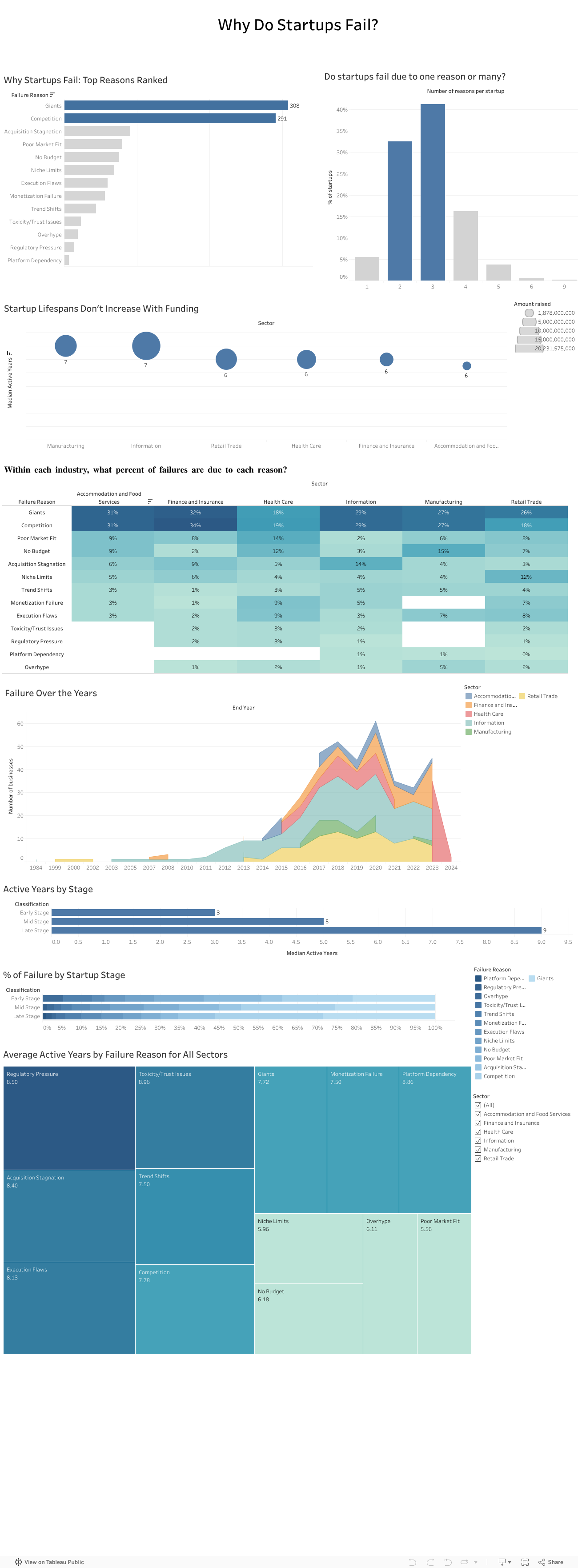
These reasons sound familiar because founders repeat them all the time. But when my team and I analyzed a dataset of more than 400 failed startups across multiple industries, a very different picture started to appear. The story of failure turned out to be much bigger than isolated mistakes or unlucky timing. It was deeper, more structural, and surprisingly predictable.
Failure rarely comes from one reason
One thing became clear very fast: startups almost never collapse because of a single issue. Most fail through a chain of events that build on one another.
In our dataset, about 40 percent of companies had three interconnected reasons behind their collapse. Sometimes a weak market fit slowed revenue and created cash pressure that left the company exposed to competitors. Other times overspending made the startup dependent on fundraising until investor sentiment shifted and the runway disappeared.
Either way, failure unfolded like a sequence of falling dominoes rather than one dramatic moment.
Competition quietly kills more startups than anything else
Across all sectors, competition was one of the most common reasons for shutdowns. And not just any competition. It was usually large, established players with strong distribution, deeper pockets, and loyal customers.
Nearly one in four failures mentioned competitive pressure. This confirmed what many founders experience but rarely quantify: good ideas often die quickly when the market is already controlled by powerful incumbents.
We tend to focus on product quality, team strength, and execution. Yet sometimes the biggest factor is simply how crowded or hostile the market is.
Your industry shapes how you fail
Another pattern that stood out was how differently failure plays out across sectors:
Healthcare startups struggled with regulation, slow adoption, and “no budget” barriers.
Tech and information startups were hit by rapid shifts in trends.
Retail and food startups faced thin margins, intense competition, and saturation.
So failure is not random. It is shaped by the environment each founder steps into from day one.
More funding does not mean a longer life
One of the most surprising findings was how little funding influenced survival. When we compared total money raised with lifespan, the relationship was almost flat.
Most startups survived five and a half to seven years, regardless of how much capital they had. Funding buys time, but it does not fix deeper problems like:
weak demand
slow adoption
dominant competitors
a misaligned business model
poor retention
This challenges a core belief in the startup world: raising more money does not automatically increase your chance of survival. The data simply did not support that.
What investors told us confirmed everything
To understand how investors themselves view these patterns, we surveyed 13 investment professionals. Their insights mirrored our data:
Competition was seen as the highest-risk factor.
Many felt the ecosystem lacked visibility and reliable signals.
They relied heavily on external sources to compensate.
Their top priorities were long-term growth and expansion potential.
Investors knew the risks, but they didn’t always have the tools to measure them consistently.
We also presented our findings to a company
To avoid analyzing the data in isolation, we presented our work to an investment company. Their feedback was striking. They struggled with the same issues many founders face, including unpredictable competition, unclear early-stage signals, and limited data visibility.
Our analysis helped them name challenges they had sensed for years but couldn’t articulate. It showed that this problem is not just academic. It is experienced daily in the ecosystem.
Where we go from here
The findings point to one clear conclusion: startups do not just need better products or stronger teams. They need a more realistic understanding of the terrain they are entering.
A stronger evaluation model would include:
Deeper market and competition analysis This means going beyond optimistic TAM slides and focusing on concentration levels, switching costs, and competitive power.
Sector-specific risk profiles Every industry has its own patterns, barriers, and threats.
Stage-appropriate evaluation Early-stage risk is not the same as late-stage risk.
A consistent and simple competition risk score Something investors can use to compare opportunities objectively.
This type of framework is completely feasible with public data and existing tools. What matters is applying it early and consistently.
Final takeaway
Startups do not fail because founders are not capable or hardworking. They fail because they often walk into markets they were never equipped to survive in.
If founders and investors begin paying as much attention to market structure as they do to product and passion, the startup ecosystem could look very different. And maybe fewer great teams would disappear not because they failed, but because the game they tried to play was stacked against them from the start.
For most people, it’s ChatGPT. It’s familiar, it’s accessible, and honestly?
It just feels like the obvious choice.
But here’s the thing:your favorite AI might beholding you back.
Whether you’re a student writing a research paper, a professional generating code, or someone trying to make sense of complex data, you probably stick with the AI you know best. But AI models aren’t created equal. Each one has strengths and weaknesses. Some excel at creative writing. Others crush it at code generation. And some are better at processing dense technical documents. Yet despite these differences, we keep using the same model for every task, hoping it’ll magically perform well across the board.
Spoiler: it doesn’t.
The Problem: One Tool for Every Job
What our Dataset Revealed?
We analyzed performance benchmarks from 5,000 AI agents spanning 10 major models across multiple task categories, code generation, text processing, decision-making, creativity, problem-solving, and more. We’re talking about real performance data: accuracy scores, execution times, success rates, the works. And what we found completely changed how we think about AI selection.
“Best Model for Code Generation”
Shows GPT-4o leading, followed by LLaMA-3 and Claude-3.5
Other models like Falcon-180B lag significantly behind
Key takeaway: If you’re coding with anything but the top performers, you’re working harder than you need to
“Best Model for Text Processing”
LLaMA-3 dominates this category
The ranking completely changes from code generation
Key takeaway: The “best” AI changes depending on what you’re doing
The AI that’s best at writing your Python function isn’t necessarily the best at summarizing your research paper. And yet, most of us use the same model for both.
The Truth: No Single AI Rules Them All
Your Tasks, Your Choice
Here’s the insight that changes everything: each AI model performs differently depending on the task. When we measured accuracy across 11 task categories, Code Generation, Decision Making, Research & Summarization, Communication, Learning & Adaptation, Text Processing, Creative Writing, Planning & Scheduling, Data Analysis, and Problem Solving, we discovered something crucial:
There is no single best model for all tasks.
GPT-4o might lead in one category. Claude-3.5 dominates another. LLaMA-3 excels somewhere else entirely. The “best” AI is completely task dependent.
If No Single Model Wins at Everything
What’s the Solution?
We built it for you.
Introducing the Agentic LLM Recommender, your personal AI matchmaker that takes the guesswork out of model selection.
Instead of wondering which AI to use or defaulting to the same tool out of habit, our recommender does the thinking for you. Simply tell it what task you need to accomplish, specify your priorities (cost, privacy, deployment environment, complexity), and it instantly recommends the AI model that will perform best for your specific situation, backed by the same performance data you just explored.
Ready to Find Your Perfect AI Match?
Stop settling for “good enough” and start using the right AI for every task.
Try the Agentic LLM Recommender Now
Answer a few quick questions about your task and discover which AI model will give you the best results.
Whether you’re coding, writing, analyzing, or deciding… find out which AI is actually optimized for what you need.
Lebanon’s economic collapse has slowly reshaped everyday life, but nowhere has the crisis felt more personal than in the price of food. For years, Lebanese households lived with relatively stable costs, where a grocery list looked more or less the same from one month to the next. But as the currency began losing value, that balance shattered, and the cost of essential goods started rising in ways no one could ignore.
To understand just how severe this shift was, I looked at the Consumer Price Index (CPI) from 2000 to 2024 – specifically comparing Food CPI with the General CPI. The visualization embedded below helps reveal the full story behind the surge.
For almost two decades, both lines lie nearly flat. Prices were predictable. Inflation existed, but it was slow and manageable. Then, around 2019-2020, everything changed. As the Lebanese pound depreciated, overall inflation began climbing steadily. But food prices did not simply follow that upward trend – they broke away entirely and started rising at a much steeper, more dramatic rate.
In the highlighted portion of the visualization, the gap between the two lines grows quickly and aggressively. General CPI increases significantly, but Food CPI skyrockets. This divergence reflects more than numbers: it captures the moment when essential goods became unaffordable for many families. Imported food items, already sensitive to exchange-rate fluctuations, adjusted more slowly at first and then surged as sellers fully priced goods in dollars. What used to be routine purchases suddenly became financial shocks, forcing households to change diets, reduce quantities, or shift to cheaper alternatives.
This widening gap explains why the crisis is felt most intensely in the supermarket aisle. Food, being a daily necessity, exposes the full weight of inflation in a way other categories cannot. The data reveals that while inflation affected every part of life, it was food prices that redefined the crisis for Lebanese people.
Understanding this pattern is crucial because it highlights where intervention is most needed. Transparent pricing, stable exchange rate mechanisms, and stronger support for local production can reduce vulnerability to future shocks. The visualization makes one thing clear: when food prices rise much faster than everything else, the impact is immediate, widespread, and deeply human.
Lebanon’s inflation story is still unfolding, but recognizing how and why food prices broke away from the general trend is an important step toward rebuilding stability. The gap in the chart is more than a statistical difference – it represents the lived reality of households trying to keep up with a crisis that reshaped even the most basic necessities.
For years, Lebanon appeared to be defying gravity. As we rebuilt from the civil war, our external debt climbed steadily, reaching over $70 billion. But look closely at the blue line in the chart below.
Our reserves (the blue line) seemed to keep pace with our debt (the red line). This created a sense of security; for every dollar we owed, we seemed to have a dollar in the vault. But this correlation was an illusion. The reserves weren’t built on productivity; they were built on the very debt we were accumulating. We were borrowing to pay the interest on what we had already borrowed.
The Turning Point (2018–2019)
The story takes a dark turn in 2018. Notice the divergence in the first chart: Debt continued its upward march, hitting nearly $80 billion, while reserves began a steep decline. The “leakage” had begun. Money was flowing out faster than it could come in.
But where was the money coming from, and why did it stop?
The Tap Runs Dry
The bar chart below reveals the culprits behind the crash. For nearly a decade, commercial banks (the green bars) were the engines of this debt machine, pouring billions into the system.
Then came the shock. In 2019, the green bars didn’t just shrink—they flipped. Commercial bank lending turned negative, representing a massive contraction and capital flight. At the same time, the bond market (orange bars), which had been a steady source of cash, flatlined.
Conclusion
The data tells a tragic 3-minute story: A decade of debt-fueled growth created a fragile bubble. When the banks pulled the plug in 2019, the illusion shattered, leaving a nation with $70 billion in debt and a reserve tank running on empty. As we look to the future, any recovery plan must start by acknowledging these red and green bars—the undeniable accounting of a system that consumed itself.
You inhale 22,000 breaths a day. How clean are they?
Air pollution is invisible, yet it is one of the most harmful elements we are exposed to every day. A major contributor to this pollution is PM2.5 — fine particulate matter that measures 2.5 micrometres or smaller. These particles are small enough to reach deep into the lungs and enter the bloodstream, posing serious risks to heart and respiratory health. PM2.5 levels are measured in micrograms per cubic metre (µg/m³), the global standard for assessing air quality.
In this analysis, I explored how Lebanon compares to its neighbouring countries and to global regions from 2009 to 2019. The findings tell a decade-long story of stagnation and persistent pollution.
Lebanon vs its Neighbors: A Decade of Stagnation
Over the past decade, Lebanon’s PM2.5 concentration has fluctuated between 23 and 25 µg/m³. While these values place Lebanon below Syria and Turkey, they remain significantly above Cyprus, which consistently records some of the cleanest air in the region. Jordan, though varying slightly year to year, also remains well above safe limits.
Despite these differences, all five countries share one concerning trend: no noticeable improvement over ten years. Lebanon’s air has remained essentially unchanged, offering no signs of meaningful progress in pollution reduction.
How the Middle East Compares to the World
When placing Lebanon’s situation into a broader context, a clearer imbalance emerges. The Eastern Mediterranean region, which includes Lebanon, records an average PM2.5 concentration of 43.33 µg/m³—almost nine times higher than the WHO annual guideline of 5 µg/m³. Only South-East Asia performs slightly worse.
Regions such as Europe and the Americas fall between 12 and 15 µg/m³, much closer to safer exposure levels. This highlights a stark contrast: the Middle East is one of the most polluted regions in the world, and Lebanon sits within this larger environmental challenge.
Why This Matters
A decade with no improvement in air quality means long-term exposure to harmful particles. PM2.5 is linked to respiratory diseases, cardiovascular complications, and reduced life expectancy. Lebanon’s stagnant pollution levels—paired with its region’s exceptionally high averages—underline the need for stronger environmental policies, emission control strategies, and long-term monitoring.
Conclusion
You inhale 22,000 breaths every day. If the data tells us anything, it is that the air behind those breaths is far from clean. Lebanon’s pollution levels remain elevated, unchanged, and embedded within a regional landscape that struggles with some of the highest PM2.5 levels globally. Understanding these patterns is a first step toward addressing them.
The Long Climb: How External Debt Built Lebanon’s Financial Cliff
Lebanon’s economic crisis didn’t erupt suddenly in 2019. It built up slowly—quietly—over years of borrowing. Every year added a little more pressure until the numbers turned from warning signs into weight, and that weight eventually buckled the country’s financial foundations.
To understand how early the signals appeared, I visualized Lebanon’s external debt from 2002 to 2022, using data from The World Bank. This dataset captures Lebanon’s total external debt (in USD) year by year—essentially recording the country’s financial pulse over two decades.
What the Data Reveals
When we look at the timeline, a clear pattern emerges:
2002–2006: A steady but noticeable escalation.
2008–2011: Debt doubles within a decade, marking the first major alarm.
2015–2018: A sharp spike pushes debt levels to their peak (≈ $80B).
A second visualization examining year-over-year changes shows the most dramatic jumps happened in the mid-2000s and again just before the collapse, highlighting long-term structural vulnerability.
Why These Trends Matter
Lebanon’s external debt did not explode overnight—it grew in phases, accelerated by structural weaknesses, and slowed only briefly. The crisis was not a sudden event; it was a pattern, visible long before it reached bank withdrawals, street protests, and currency freefall.
When visualized clearly, the message becomes unmistakable:
The crisis wasn’t unexpected.
It was written in the data years before it became visible in daily life.