by wge06 | Nov 28, 2025 | Uncategorized
Beyond the Waiting Room: Revealing “Invisible” Patients of an NGO
By: Nivine Manasfi, Wissam El Sabeh, Yasmina El Dirani, Hussein Charafeddine, and Perla Abou Rjeily
In humanitarian aid, success is often measured by volume. For the Imam Sadr Foundation (ISF), 31,430 patient visits over two years suggested a thriving system. However, our deep-dive analysis revealed that aggregate numbers were hiding a “silent crisis” of missing patients.
To understand why these groups were missing, we didn’t just look at the records—we asked the community. Here is how our impact survey validated the data and shaped our solutions.

1. The Gender Gap: It’s About Work, Not Health
Data showed a stark imbalance: 67% of patients were female, while only 33% were male. Our survey revealed the structural cause:
The Fix: We proposed launching “Evening Clinics” (5 PM – 8 PM) to capture the working demographic that the current schedule excludes.

2. The Mental Health Stigma
Despite high trauma levels in the region, Syrian refugees accounted for near-zero mental health visits. The survey confirmed that stigma is the primary barrier:
-
62% of patients cited “privacy and secrecy” as the main reason they avoid seeking mental health support.
-
Integrating mental health screenings into general medical visits was the 3rd highest requested service improvement.
The Fix: By integrating mental health checks into standard intake forms, clinics can bypass the “psychotherapy” label that scares patients away.

3. Neglecting Prevention
Preventive services (like vaccination and dental) made up less than 1% of total visits. However, the survey proved this isn’t due to a lack of interest:
The Fix: The demand exists. We recommended strengthening the preventive infrastructure and using doctors, rather than just nurses, to drive awareness during standard consults.
Conclusion
Analyzing the dataset turned “records” into insights, but the survey turned that insights into action. By shifting our focus from volume of visits to equity, we proved that true healthcare success isn’t just about how many people you serve—it’s about ensuring no one is left invisible.

by rmg18 | Nov 25, 2025 | Dashboard, Team Project, Visualization
Why Startups Really Fail
If you’ve spent any time in the startup world, you’ve probably heard the usual explanations for failure:
“We ran out of money.”
“Bad timing.”
“Wrong hire.”
“Investors didn’t understand us.”
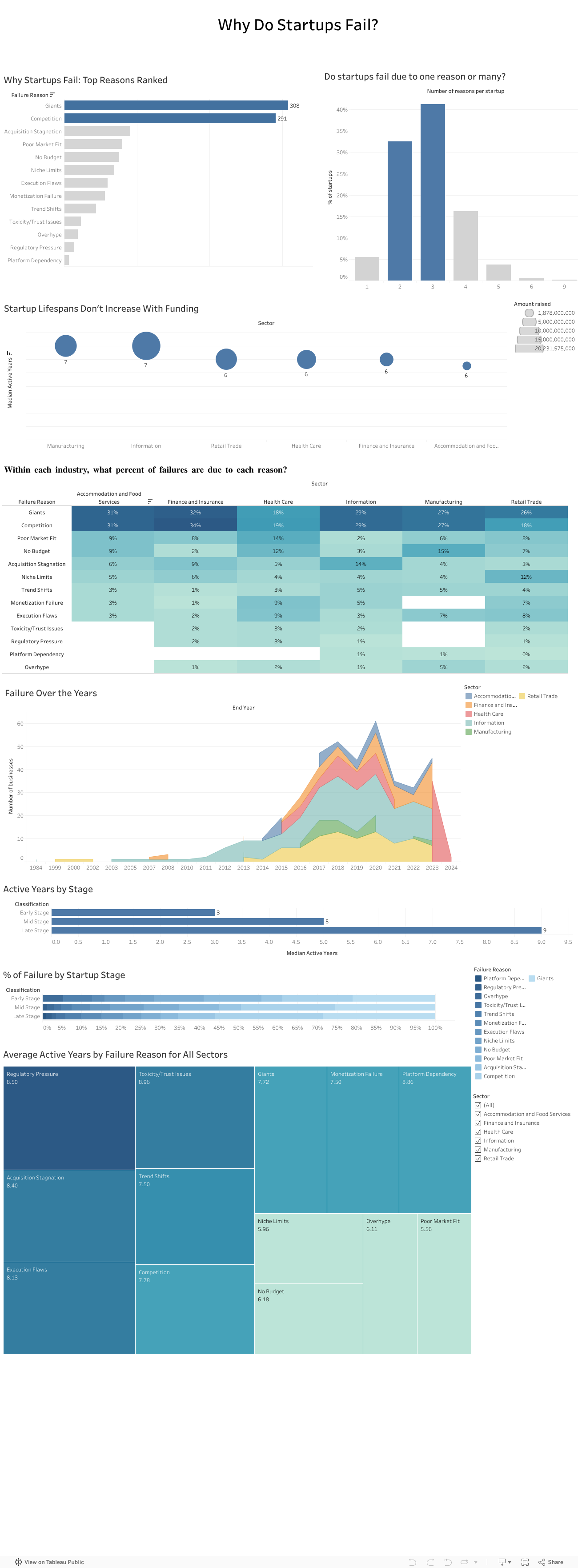
These reasons sound familiar because founders repeat them all the time. But when my team and I analyzed a dataset of more than 400 failed startups across multiple industries, a very different picture started to appear. The story of failure turned out to be much bigger than isolated mistakes or unlucky timing. It was deeper, more structural, and surprisingly predictable.
Failure rarely comes from one reason
One thing became clear very fast: startups almost never collapse because of a single issue. Most fail through a chain of events that build on one another.
In our dataset, about 40 percent of companies had three interconnected reasons behind their collapse. Sometimes a weak market fit slowed revenue and created cash pressure that left the company exposed to competitors. Other times overspending made the startup dependent on fundraising until investor sentiment shifted and the runway disappeared.
Either way, failure unfolded like a sequence of falling dominoes rather than one dramatic moment.
Competition quietly kills more startups than anything else
Across all sectors, competition was one of the most common reasons for shutdowns. And not just any competition. It was usually large, established players with strong distribution, deeper pockets, and loyal customers.
Nearly one in four failures mentioned competitive pressure. This confirmed what many founders experience but rarely quantify: good ideas often die quickly when the market is already controlled by powerful incumbents.
We tend to focus on product quality, team strength, and execution. Yet sometimes the biggest factor is simply how crowded or hostile the market is.
Your industry shapes how you fail
Another pattern that stood out was how differently failure plays out across sectors:
-
Healthcare startups struggled with regulation, slow adoption, and “no budget” barriers.
-
Tech and information startups were hit by rapid shifts in trends.
-
Retail and food startups faced thin margins, intense competition, and saturation.
So failure is not random. It is shaped by the environment each founder steps into from day one.
More funding does not mean a longer life
One of the most surprising findings was how little funding influenced survival. When we compared total money raised with lifespan, the relationship was almost flat.
Most startups survived five and a half to seven years, regardless of how much capital they had. Funding buys time, but it does not fix deeper problems like:
This challenges a core belief in the startup world: raising more money does not automatically increase your chance of survival. The data simply did not support that.
What investors told us confirmed everything
To understand how investors themselves view these patterns, we surveyed 13 investment professionals. Their insights mirrored our data:
-
Competition was seen as the highest-risk factor.
-
Many felt the ecosystem lacked visibility and reliable signals.
-
They relied heavily on external sources to compensate.
-
Their top priorities were long-term growth and expansion potential.
Investors knew the risks, but they didn’t always have the tools to measure them consistently.
We also presented our findings to a company
To avoid analyzing the data in isolation, we presented our work to an investment company. Their feedback was striking. They struggled with the same issues many founders face, including unpredictable competition, unclear early-stage signals, and limited data visibility.
Our analysis helped them name challenges they had sensed for years but couldn’t articulate. It showed that this problem is not just academic. It is experienced daily in the ecosystem.
Where we go from here
The findings point to one clear conclusion: startups do not just need better products or stronger teams. They need a more realistic understanding of the terrain they are entering.
A stronger evaluation model would include:
- Deeper market and competition analysis
This means going beyond optimistic TAM slides and focusing on concentration levels, switching costs, and competitive power.
- Sector-specific risk profiles
Every industry has its own patterns, barriers, and threats.
- Stage-appropriate evaluation
Early-stage risk is not the same as late-stage risk.
- A consistent and simple competition risk score
Something investors can use to compare opportunities objectively.
This type of framework is completely feasible with public data and existing tools. What matters is applying it early and consistently.
Final takeaway
Startups do not fail because founders are not capable or hardworking. They fail because they often walk into markets they were never equipped to survive in.
If founders and investors begin paying as much attention to market structure as they do to product and passion, the startup ecosystem could look very different. And maybe fewer great teams would disappear not because they failed, but because the game they tried to play was stacked against them from the start.

by tmt19 | Nov 24, 2025 | Team Project, Uncategorized
How Data Visualization Revealed the Real Issues Behind the Instability in the Performance of ChocoStory
Launched in 2018 in Verdun (Beirut), ChocoStory quickly gained popularity: a prime location, strong foot traffic, and the owners’ network. The store combines walk-in chocolate items products with experiences like chocolate workshops and a museum.
However, when we first examined ChocoStory’s performance, one thing was immediately clear: growth wasn’t steady. Sales would surge, only to drop sharply right after, and this pattern kept repeating every year.
That raised a key question. Why did the business grow in some periods but lose momentum just as quickly? This pointed to structural issues rather than simple seasonality.
Our approach is simple but powerful: use data to understand how market dynamics, customer preferences, and internal costs shape ChocoStory’s inconsistent performance. We used a series of visuals that helped us walk through the timeline and understand what was affecting the numbers.
- Understanding the Swings in Performance
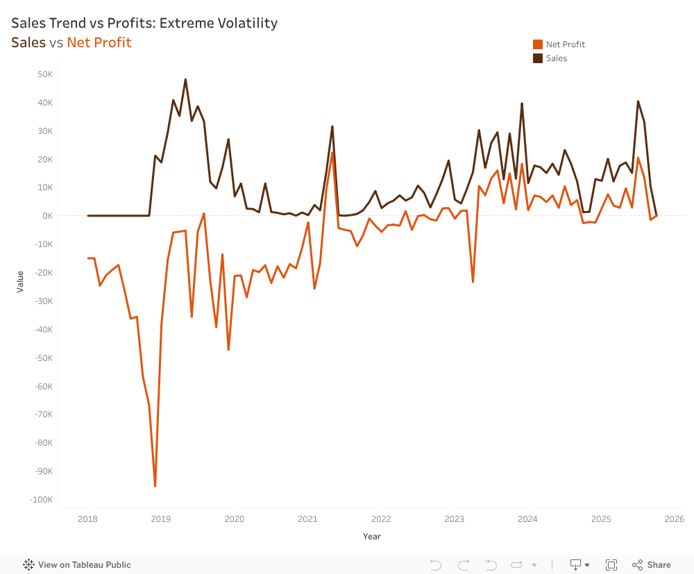
The first step was mapping both sales and net profit from their opening in 2018 until the present.
This revealed a cycle of volatility that repeats year after year, showing how heavily the business relied on peak seasons. Net profits follow the exact same pattern as Sales, almost like a shadow, just consistently lower. Profitability relied entirely on sales peaks rather than efficient operations, meaning any drop in demand immediately pushed the company into a loss.
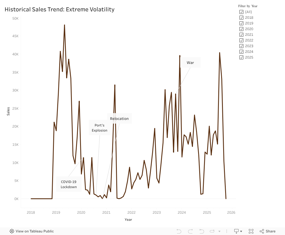
- How External Events Influenced the Numbers
Looking across the years, it became clear that ChocoStory’s performance was closely tied to what was happening around it.
- The early period was steady, but the situation changed fast.
- Covid-19: Foot traffic reliance backfires; digital gap hurts.
- Port Explosion: Supply chain chaos; no quick adaptation.
- Relocation: Short-term dip. strong rebound; smart move.
- War 2023: Instability returns; resilience tested.
Disruptions will happen, but their impact depends on how equipped the business is to handle them. Too often, ChocoStory reacted slowly or only partially.
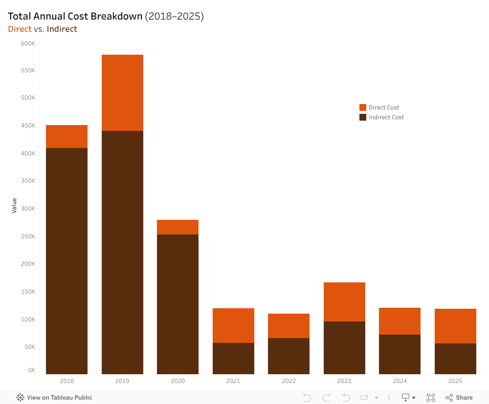
- What the Cost Structure Revealed
At first glance, ChocoStory’s expenses looked normal, but when they were broken down into the direct and indirect costs stacked barchart, a different reality emerged. Before 2021, direct costs (workshop materials, chocolate ingredients, packaging, etc.) were relatively stable. Indirect costs, however (rent, utilities, electricity, etc.), fluctuated heavily, with not enough revenues to break even.
The total expenses vs net profit line chart showcased two lines behaving in a symmetrical pattern. When expenses rose, profits dropped. Likewise, when expenses fell, profits increased. This approximate symmetry highlighted a deeper issue: ChocoStory had almost no safety margin. With indirect costs absorbing such a large share of total expenses, the business was operating with a net profit loss. It was only after the 2021 relocation that the gap between the lines narrowed down, and ChocoStory began breaking even. However, they were unable to sustain an upward profit trend beyond break even.
4. Rethinking the Product Portfolio
ChocoStory offers a wide range of chocolate items. There are 206 products, compared to just 28 service offerings.
At first glance, this creates the impression of a product-led business, assuming they generate enough profits compared to operational weight. Yet, comparing the revenue generated by each proves otherwise:
Based on that chart, it becomes clear that products generated around LBP 4.5B only, while services reach LBP 11B. The highest revenue contributors were the services (workshops and museum) indicating that ChocoStory operates more as an experience-driven destination and less like a traditional chocolate shop.
- Visibility and Online Presence
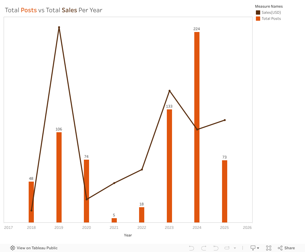
We reviewed the platforms because visibility on social media affects how easily customers find and engage with the business. We looked at posting activity across Instagram, Facebook, and Threads from 2018 to 2025 and compared yearly posts with yearly sales. Activity varied widely. In 2021, only five posts were published during the relocation period, which aligned with the lowest sales in the dataset. Posting increased again in 2023 and peaked in 2024, but sales did not return to 2019 levels, when posting was more moderate. We also noted that ChocoStory was not active on TikTok, despite it being a major discovery platform for local experiences.
Our wider analysis showed a clear gap in engagement by content type. A workshop-and-museum video reached more than 784,000 views, while a seasonal product post received 37 likes. This showed that experience-focused content resonated far more than product photos. Taken together, the results suggest that visibility shifted across the years, and that content type mattered more than posting frequency.
A Clearer Path Forward
ChocoStory’s main challenge isn’t the chocolate, it’s not understanding its customers. Our team recommended concentrating on the audiences that naturally fit the workshop experience, especially children between 4 and 14. Schools and camps can create a steady flow of visits throughout the year. Simplifying the product list can reduce operational strain and help redirect attention to the experiences that matter most.
During our visit, the ChocoStory team confirmed that these insights aligned with their own observations. They plan to reduce the number of products, strengthen communication around the workshops, and develop a more structured marketing plan.
This analysis showed how much can be learned from placing data into clear visuals. Trends that look confusing in raw numbers become understandable once they are visualized. ChocoStory faced several disruptions from outside events, but many challenges also came from how the business was structured. With a clearer view of what drives performance, the company can now build on its strengths and create more stable growth.

by lea10 | Nov 24, 2025 | Team Project, Visualization
We all have our go-to AI.
For most people, it’s ChatGPT. It’s familiar, it’s accessible, and honestly?
It just feels like the obvious choice.
But here’s the thing: your favorite AI might be holding you back.
Whether you’re a student writing a research paper, a professional generating code, or someone trying to make sense of complex data, you probably stick with the AI you know best. But AI models aren’t created equal. Each one has strengths and weaknesses. Some excel at creative writing. Others crush it at code generation. And some are better at processing dense technical documents. Yet despite these differences, we keep using the same model for every task, hoping it’ll magically perform well across the board.
Spoiler: it doesn’t.
The Problem: One Tool for Every Job
What our Dataset Revealed?
We analyzed performance benchmarks from 5,000 AI agents spanning 10 major models across multiple task categories, code generation, text processing, decision-making, creativity, problem-solving, and more. We’re talking about real performance data: accuracy scores, execution times, success rates, the works. And what we found completely changed how we think about AI selection.
“Best Model for Code Generation”
- Shows GPT-4o leading, followed by LLaMA-3 and Claude-3.5
- Other models like Falcon-180B lag significantly behind
- Key takeaway: If you’re coding with anything but the top performers, you’re working harder than you need to
“Best Model for Text Processing”
- LLaMA-3 dominates this category
- The ranking completely changes from code generation
- Key takeaway: The “best” AI changes depending on what you’re doing
The AI that’s best at writing your Python function isn’t necessarily the best at summarizing your research paper. And yet, most of us use the same model for both.
The Truth: No Single AI Rules Them All
Your Tasks, Your Choice
Here’s the insight that changes everything: each AI model performs differently depending on the task. When we measured accuracy across 11 task categories, Code Generation, Decision Making, Research & Summarization, Communication, Learning & Adaptation, Text Processing, Creative Writing, Planning & Scheduling, Data Analysis, and Problem Solving, we discovered something crucial:
There is no single best model for all tasks.
GPT-4o might lead in one category. Claude-3.5 dominates another. LLaMA-3 excels somewhere else entirely. The “best” AI is completely task dependent.
If No Single Model Wins at Everything
What’s the Solution?
We built it for you.
Introducing the Agentic LLM Recommender, your personal AI matchmaker that takes the guesswork out of model selection.
Instead of wondering which AI to use or defaulting to the same tool out of habit, our recommender does the thinking for you. Simply tell it what task you need to accomplish, specify your priorities (cost, privacy, deployment environment, complexity), and it instantly recommends the AI model that will perform best for your specific situation, backed by the same performance data you just explored.
Ready to Find Your Perfect AI Match?
Stop settling for “good enough” and start using the right AI for every task.
Try the Agentic LLM Recommender Now
Answer a few quick questions about your task and discover which AI model will give you the best results.
Whether you’re coding, writing, analyzing, or deciding… find out which AI is actually optimized for what you need.
Your favorite AI got you here.
The right AI will get you further.

by kfk16 | Nov 24, 2025 | Team Project
Remote and hybrid work have transformed the modern workplace. After the pandemic normalized virtual collaboration, employees and companies embraced flexibility as the new standard. Surveys in 2024 and 2025 show that over 95% of workers prioritize remote or hybrid arrangements, often valuing flexibility even more than salary increases. But beneath the convenience and autonomy of at-home work, a more complicated reality is emerging. Flexibility does not always guarantee improved well-being. In fact, for many, it comes with hidden psychological and behavioral costs that organizations rarely acknowledge. Drawing on a dataset of 8,000 employees representing diverse industries and experience levels, this project investigates how work arrangement Remote, Hybrid, or Onsite shapes employee mental health, work habits, stress levels, and productivity. The results reveal a striking paradox: while remote work offers meaningful advantages, it also introduces new risks that can significantly undermine well-being when not properly supported.
Remote Work: Freedom on the Surface, Strain Beneath It
At first glance, remote work appears to be the ideal solution for work–life integration. Without commutes and with flexible scheduling, remote employees theoretically gain more personal time and autonomy. However, the data tells a different story. Remote workers consistently reported the highest levels of stress, isolation, overwork, and dissatisfaction, despite the very flexibility that was supposed to reduce these pressures.
Finding 1: Remote Employees Work More Hours and Feel the Least Balanced

The dataset shows a significant gap in weekly working hours across arrangements:
Remote: 47.8 hours
Onsite: 41.6 hours
Hybrid: 40.2 hours
Remote workers are effectively performing an extra full workday every two weeks. This pattern is a classic example of boundary erosion, where the absence of physical separation between home and work leads to unstructured, extended workdays.
Work life balance scores reinforce this:
Remote: 2.36
Onsite: 2.97
Hybrid: 3.63
Remote workers report the worst balance, while hybrid employees report the best.
Finding 2: Remote Workers Experience Far Higher Stress
Stress levels differed dramatically across groups:
50% of fully remote employees report high stress
Only approximately 20-21% of onsite and hybrid employees report high stress
Remote workers are 2.5 times more likely to be highly stressed.
Finding 3: Mental Health Conditions Peak Among Remote Workers
Beyond stress, employees were asked whether they experienced anxiety, depression, burnout, or no conditions.
The results were stark:
Remote: 84.5% reported at least one mental health condition
Onsite: 67.5%
Hybrid: 53%
Remote employees were far more likely to experience psychological strain especially anxiety and depression while hybrid workers reported the healthiest outcomes across the board.
Finding 4: Remote Workers Are More Isolated and Less Healthy
Social connection is a major predictor of mental health and here remote workers struggle significantly:
Isolation rating:
Remote: 3.54
Onsite: 2.82
Hybrid: 2.43
Nearly 28% of remote workers rated isolation as “extremely high” (5/5), compared to negligible rates for others.
Physical well-being also diverged:
29% of remote workers reported no regular physical activity
55% of hybrid workers exercised daily, compared to 27% of remote workers
Remote staff reported slightly worse sleep quality as well
Finding 5: Satisfaction and Productivity Are Lowest for Remote Workers
Despite the popularity of remote work as a preference, those actually working remotely express the lowest satisfaction:
Only 19% of fully remote workers are satisfied
50% are unsatisfied
59% of hybrid workers report satisfaction
Productivity changes follow the same pattern:
46% of remote workers reported productivity decreases
Only 20-22% of onsite and hybrid employees reported decreases
46% of hybrid employees reported productivity increases the best outcome of any group
Hybrid work consistently delivers both performance and well-being advantages.
Finding 6: Employer Support Matters and Remote Workers Get the Least
A key moderating factor is company support for remote work:
Remote employees rated employer support 2.47/5
Onsite and hybrid rated support 3.0-3.55
Among remote workers:
Those with access to mental health resources showed lower stress and higher satisfaction
45% reported receiving no employer support, creating a major well-being gap

Recommendations: Designing Remote Work for Real Well-Being
Based on the patterns in the data, organizations should prioritize:
- Boundary Protection
- Mental Health Support
- Reducing Isolation
- Manager Training
Conclusion: Flexibility Needs Structure
Remote work is not inherently harmful but without structure, boundaries, and support, it can become a breeding ground for stress, isolation, and declining well-being. Hybrid work often provides the right balance enough flexibility for life, enough connection for mental health, and enough structure for productivity. As organizations continue redefining the future of work, investing in the systems that make remote work sustainable is not optional it is essential for protecting employee well-being and unlocking the true benefits of flexibility
“Flexible work arrangements are rising, but without adequate support they can lead to increased stress and mental-health challenges; therefore organizations should invest in structured remote-work policies and mental-health resources.”.