by Joulan El Msharafieh | May 6, 2020 | Visualization

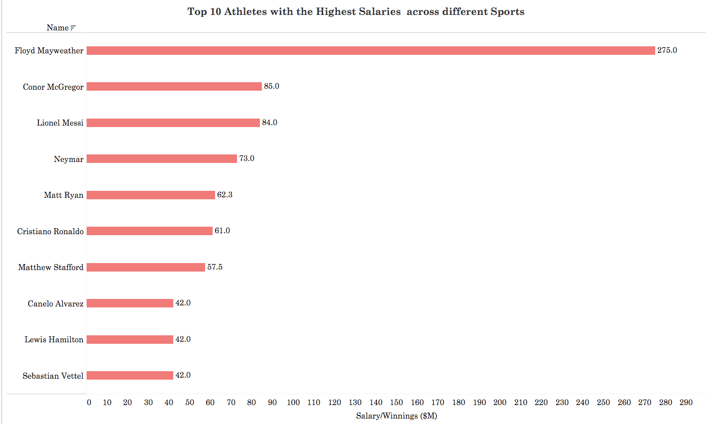
The Following Visual Shows the Top 10 Highest paid Athletes According to their Salaries in 2018.
Floyd Money MayWeather is the highest paid athlete , due to the fact that he is yet to lose a boxing match in his career , and every boxing game he plays generated millions of revenues.

by Safia Msallam | May 5, 2020 | Visualization


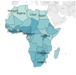
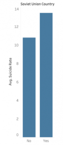
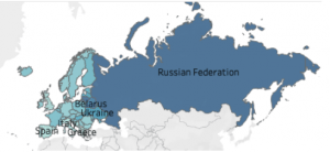
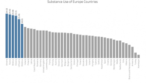
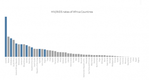
Suicide is the act of intentionally causing one’s own death. Each year approximately one million people die from suicide. In the last 45 years suicide rates have increased by 60% worldwide. This visualizations are part of a research project to identify the reasons of high suicide in Africa and Europe followed recommendations. This two map visualizations represent the names of the highest countries with suicide rate on the maps. The reasons of high suicide in Africa is high spread of lethal deceases like AIDS/HIV (and lack of proper health systems. Represented in one of the graphs, the HIV/AIDS rates of Africa Countries are in the graph were the blue bars of the graph represent countries with highest suicide. In another graph, data showed that post Soviet Union countries have higher suicide rate than other European countries. Also, the European countries where there is high substance use , the suicide rates rises. It is shown in the graph that countries which are in blue, the ones with highest suicide and very high in substance use.

by Ghida | May 5, 2020 | Dashboard, Visualization
Females in the Arab World are always faced with discriminatory situations in a ‘professional environment’. From personal questions in an interview to on-the-job obstacles, something always has to remind us of who we are and how anchored we are to it. It is not very different around the world, however, females have only recently started to break through the notions of the ‘working man’, proving that the only professional difference between them is inside the minds of those who believe it exists.
When I started exploring the World Development Indicators data on Tableau, I could not but stop at the Employment to Population Ratio. So I developed a dashboard visualized below.

As seen on the map, there are big differences in Female Employment to Population Ratios around the world. Looking deeper into the ratios of 2 adjacent but very different cultures, the European Union and Arab Countries – the line graphs to the right -, we can notice the difference in the gaps between female and male ratios. While the Male Employment to Population Ratio is almost the same across both areas, there is a big difference in the female’s numbers, of course affecting the total ratios.
I believe the needed change starts in education – not only that of little girls who need to be equipped by the time they can join the workforce, but also of societies to be welcoming, and supportive of those girls. Many forces enter in this journey, in many cases education is an unaffordable luxury, which is why the intrusion of governments and NGOs is highly needed.
The featured image is from Aptology.

by Tarek El khayat | May 5, 2020 | Visualization
The fertility mutates from region to another and it is related to the culture, education level and civilization. It also decreases from year to year because of civilization, weather, and human life style.
This Dash compares 3 different countries USA: Advance country , Lebanon : Arab region and Africa:third world and shows that all the countries will have the same fertility rate in the future.
Data source: https://www.opendatalebanon.org/

