From telecoms and travel to banking and consulting, services play a key function in transforming a country’s economic strength. But for Lebanon, the story hidden in the data tells a completely different reality—one of a consistently growing services deficit over the last two decades.
Looking at 20 years of trade data, I examined how Lebanon’s services balance transformed across key economic periods. The story became immediately clear:
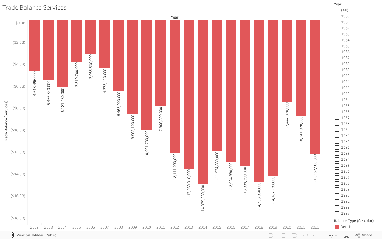
For 21 consecutive years, Lebanon has never escaped a services trade deficit, and the gap continues to deepen.
Why This Matters
For more than twenty years, Lebanon has faced a continuing services trade deficit. The country’s imports, including finance, logistics and professional consulting, have consistently exceeded its exports. The ongoing imbalance heightens economic vulnerability and increases Lebanon’s reliance on foreign service suppliers.
Between 2002 and 2022, the trade balance remained consistently negative. During its 2014-2018 peak, the trade balance deficit surpassed $14 billion, revealing how deeply rooted this issue has become.
The visualization below highlights how this deficit has evolved across key periods
A Decline That Accelerates After 2011
Lebanon’s services deficit was negative but relatively stable in the early 2000s. However, after 2011, the decline accelerated. Between 2012 and 2019, the gap widened significantly, reflecting both regional instability and Lebanon’s growing internal financial difficulties.
The data reveals that services imports consistently exceeded exports, and the gap grew into one of the largest deficit levels Lebanon has faced in recent decades, approaching –17 billion USD at its worst.
A Brief Pause—Then Another Drop
During the pandemic in 2020, the deficit slightly decreased—mainly due to reduced travel and service utilization. Unfortunately, this improvement is temporary. In 2021 and 2022, the deficit rises again, continuing the very trend Lebanon has struggled with for years.
What This Means
A persistent services trade deficit highlights structural vulnerabilities. It reveals that Lebanon is consistently spending more on imported services than it generates from exports. With time, this imbalance becomes a financial burden that weakens financial stability and increases dependence on external inflows.
The Big Idea
Examining two decades of data highlights how Lebanon’s service trade deficit has continued to expand, revealing Lebanon’s economic vulnerability. The figures are striking on their own, but when presented as a story, the patterns become impossible to overlook.
What Can Lebanon Do?
Reducing the services deficit requires structural changes rather than short-term fixes. Strengthening digital services, tourism, and healthcare exports can create new revenue streams. Supporting export-oriented SMEs — especially those providing regional outsourcing services — can also help Lebanon compete more effectively.
Policy efforts should focus on promoting digital transformation, encouraging service-based startups, and building stronger regional trade partnerships. Over time, these measures can help diversify Lebanon’s export base, reduce dependency on imported services, and move the country toward a more sustainable trade position.
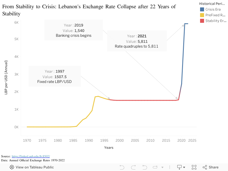
On paper, it was a success story. A flat red line that looked safe, predictable, and almost felt untouchable and unchangeable. But beneath that reassuring flatness laid a system that was quietly breaking apart.
In this visualization, I trace the Lebanese pound (LBP) against the US dollar from the 1970s until today, splitting the story into three distinct eras: the Pre-Fixed Rate Era in yellow, the Stability Era with the official peg in red, and the Crisis Era in blue, where everything unraveled. The goal is not just to show numbers, but to reveal how a long period of apparent stability can mask growing fragility.
Before the peg: A fragile build-up (1970-1997)
The story starts in the 1970s and 1980s, shown in yellow. During this period, the Lebanese pound gradually weakens against the dollar. The line climbs steadily from near-flat values to over 1,500 LBP per USD by the mid-1990s.
What is important and alarming here is the direction of the climb: the Lebanese pound keeps losing value. There is no stability yet, only a slow, visible decline.
By 1997, the rate reaches 1,507.5, which becomes the famous official peg. That point is annotated on the chart because it marks a turning point: from moving exchange rate to a fixed one.
The illusion of stability (1997–2018)
From 1997 to 2018, the line turns red and becomes almost perfectly horizontal.
During those 22 years, the official rate stays pegged at 1,507.5 LBP per USD.
Visually, this flat line had been sending a powerful message which is “The currency is under control and Your money is safe.”
But a flat line doesn’t mean a healthy system. In fact, the opposite was happening. Behind that reassuring red line, public debt was climbing relentlessly. Budget deficits were widening. The entire economy had become dependent on fresh dollars flowing into the banking sector to maintain the illusion. The system was running on borrowed time and borrowed money.
The visualization deliberately keeps this middle section clean: one color, very few marks, a high data-ink ratio. The flatness is visually reassuring. And that’s precisely the problem. The chart shows us exactly what Lebanese citizens saw: a promise of stability that felt permanent. What it didn’t show is what couldn’t be seen in the numbers, was the invisible rot beneath the surface that was forming.
The collapse: 2019 onwards
The calm ends abruptly at 2019, marked with an annotation: “Banking crisis begins.” At first, the rate moves only slightly, from 1,507.5 to around 1,540 LBP per USD. A tiny change after decades of flatness. Barely noticeable.
But this small kink is the first visible crack. The system couldn’t hold.
From 2020 onwards, the line turns blue and shoots upward exponentially. By 2021, the value plummets to around 5,811 LBP per USD which is more than four times the official peg. The curve becomes nearly vertical, showing a visual representation of lost control and shattered trust. Instead of a slow, manageable depreciation, Lebanon experiences a collapse.
This is where the chart stops being just macroeconomics. Each point on that blue line isn’t an abstract number. It’s a family at the supermarket realizing their money buys half as much as last month. It’s a teacher whose salary, once stable, can barely cover rent. It’s life savings that quietly disappear, not because they were spent, but because their value evaporated overnight.
Insights:
What began as a flat, boring line became the steepest crisis in decades. The Lebanese pound went from appearing to be one of the world’s most stable currencies to becoming a cautionary tale of currency collapse.
The visualization tells us something important about systems, trust, and stability itself: a flat line maintained by freezing numbers rather than fixing underlying problems is not stability at all. It’s a mirage. And when mirages disappear, people lose more than just money—they lose faith in the institutions meant to protect them.
The real story isn’t in the numbers. It’s in what the numbers hide, and what happens when the hiding is no longer possible.