by Sara Dabbous | May 7, 2020 | Dashboard, Visualization
Since I started working in the healthcare sector I’ve always been interested in knowing more about this industry. As such, while exploring the WDI Data I studied several healthcare indicators and it turns out – Lebanon is doing better than we thought! I was intrigued to know what’s beyond those indicators, and luckily I found a detailed dataset about Primary Health Care Centers in Lebanon on The Humanitarian Data Exchange, I was surprised to know we had this many centers.
Could this visualization be a sign of a sound healthcare system ?
Did this awareness in healthcare aid us in containing the Covid-19?
Do you think there is a better future for the healthcare system for Lebanon, or will it be worst?
Personally, I am optimistic..
So here are some things I didn’t know:
- There are 174 Operational Primary Healthcare Centers in Lebanon
- There are 25 PHC funded by UNHCR
- There are 100 PHC that provide subsidized services.
- Nabatieh has 0 operational PHCs.
- The North governorate has the highest number of operational PHC: 36

In this dashboard, I prepared – using Tableau – a map that shows the different Operational PHC locations in Lebanon filtered by UNHCR Funding. Alongside it, is a bar chart showing the percentage of operational PHC in each Governorate. Finally, at the bottom, you can find a stacked bar chart representing the number of operational PHC per governorate, highlighting those who offer subsidized services.

by Nour Chaccour | May 6, 2020 | Visualization
In every Lebanese driver, there is a hidden Michael Schumacher inside of him/her. Unfortunately with all NGOs providing all possible resources for the promotion of road safety awareness, car accidents numbers are all the way up. The sad part is that drinking and driving is illegal but do we really abide by this law. When was the last time you called a taxi because you were drunk? And the most important aspect is that car Speed is a competition and a show off.
It was interesting to find through the below dashboard that most car accidents happens during summer season (July and August).
The dataset contains both monthly and yearly statistics of car accidents in Lebanon from 2007 to 2019. This dataset is aggregated by the number of car accidents, the number of injuries, and the number of fatalities.

by Tarek El khayat | May 5, 2020 | Visualization
The fertility mutates from region to another and it is related to the culture, education level and civilization. It also decreases from year to year because of civilization, weather, and human life style.
This Dash compares 3 different countries USA: Advance country , Lebanon : Arab region and Africa:third world and shows that all the countries will have the same fertility rate in the future.
Data source: https://www.opendatalebanon.org/

by Carlos Ibrahim | May 5, 2020 | Visualization
In this Dashboard, we can see how the area harvested with tomatoes in Lebanon didn’t change too much throughout the years, while at the same time the quantity produced has increased a lot, so this show us how the new agriculture methods with the pesticides used have affected a lot the production quantity with keeping the same area harvested. But, does this huge increase has negative effects on us? And what are the circumstances of this on humans?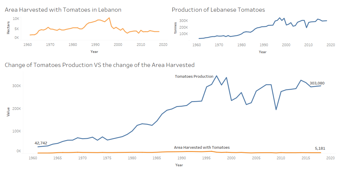
Data used is from Open Data Lebanon: https://www.opendatalebanon.org/job/tomatoes-supply/