Access to healthcare in Lebanon depends on one simple but critical factor: where you live. But until you visualize the distribution of facilities across the country, it’s hard to truly see how unequal that access is.
I started this project by aggregating six types of health facilities — hospitals, clinics, medical centers, pharmacies, labs and radiology centers, and first-aid centers — across all districts using the PKGCube Health Resources dataset. After cleaning and restructuring the data, one pattern immediately stood out: Lebanon’s map of healthcare is far from balanced.
To understand this more clearly, I built a district-level visualization and redesigned it using explanatory design principles. And once the noise was removed, the picture became unmistakable.
The Key Insight
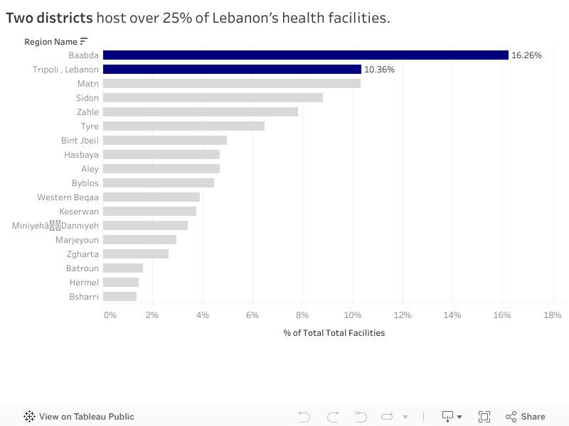
Two districts — Baabda and Tripoli — hold more than a quarter of all health facilities in the entire country. Just two.
Meanwhile, at the opposite end, districts like Hermel and Bsharri combined account for less than 3%.
In a country with major infrastructure gaps and uneven population distribution, this imbalance has consequences:
It shapes how far people travel to access care.
It affects waiting times, congestion, and referral patterns.
And in crisis situations, it determines who gets help quickly and who doesn’t.
The redesigned visualization highlights this story intentionally. The top two districts are shown in strong blue, while the rest of the country fades into context. No clutter, no distractions — the contrast lets the insight speak for itself.
What It Means
This distribution doesn’t automatically mean Baabda and Tripoli are “over-resourced” or that Hermel and Bsharri are “neglected.” Counts are not the same as capacity, staffing, or service quality.
But the numbers do reveal something important: If health planning is meant to be equitable, we can’t treat all districts as if they start from the same baseline.
Policymakers and NGOs could use these insights to:
Prioritize new facility investment in low-share districts
Support underserved areas with mobile clinics or telehealth units
Track whether the distribution becomes more or less concentrated over time
What Comes Next
This visualization is a starting point. The next step is to connect the facility distribution with:
District-level population
Accessibility and travel time
Facility capacity indicators
That is when the story becomes more than a map — it becomes a tool for planning.
For now, the message is simple: Lebanon’s health infrastructure is unevenly distributed, and two districts carry a disproportionate share of the country’s access.
The Healthcare Scene in Lebanon Rami spent the majority of his life in Aley, Choueifat El Aamrousiyeh, a quiet town where people know each other all throughout the area. When Covid-19 began spreading in Lebanon, he assumed that his location would be relatively safe in terms of health implications. After all, the news was primarily focused on Beirut.
During peak months, Rami started hearing about his neighbors testing positive at a pace he certainly did not expect. Meanwhile, his cousin Leila, who lives close by in Kahhaleh, hardly knew anyone infected. They were both in the same region, but faced entirely different risks.
Rami’s worry and stress levels grew a lot, especially for his elderly parents with chronic conditions. If Covid spread in his town at a fast pace, would they be able to get help in time? Would testing and vaccination centers be available in close proximity to where they live? Would nearby hospitals be overwhelmed with full capacities?
Leila and Rami’s experiences reflect what many Lebanese families endure. Two households in the same region, but different towns, had completely different stress levels regarding the readiness of healthcare emergency responses.
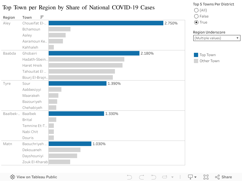
Health Patterns in Lebanon: What the Data Reveals We tend to think of public health at the regional level, but covid behaved more so at a town level per region. This exposed imbalances that are not usually explored. Top town per region with the highest contribution to the total national case count revealed unexpected results:
In Aley (region), Choueifat Aamrousiyeh alone accounted for 2.75% of all cases in the country.
In Baalbek-Hermel, Baalbek alone stood out with 1.33%, which is much higher than surrounding towns
The remaining regions showed similar patterns: one or two towns carried the majority of cases
What Does This Mean Exactly? People like Rami, who happen to live in a high risk town, experienced a completely different pandemic from people in towns just a few kilometers away. This is likely to repeat in the future if another major healthcare crisis hits the country.
Moving Forward, What Can Be Done?
Prioritize hotspot towns: testing centers, clinics, and awareness campaigns should start where case data shows concentration, not where population is highest.
Build local readiness plans: Instead of generic region level plans, towns with higher infection percentages need specific preparation steps (rapid testing, temporary isolation centers, and community awareness).
Use data driven action plans: Covid case percentages help identify where outbreaks are likely to happen again. If regions plan smarter, hospitals and clinics face less chaos.
Strengthen communication and public awareness: Towns with consistently high rates should receive ongoing health messaging to prevent repeat scenarios.
The Key Takeaway By understanding how Covid-19 was not distributed proportionately across towns, we can finally design smarter, more effective responses. This applies not only to pandemic/epidemics, but to any future public health threat in Lebanon.