When COVID-19 began spreading across Lebanon, not all towns were affected in the same way. Some communities were already carrying another burden long before the pandemic arrived: chronic diseases such as hypertension, diabetes, and cardiovascular conditions. This raised an important question: did towns with more chronic illness also experience higher COVID-19 case numbers?
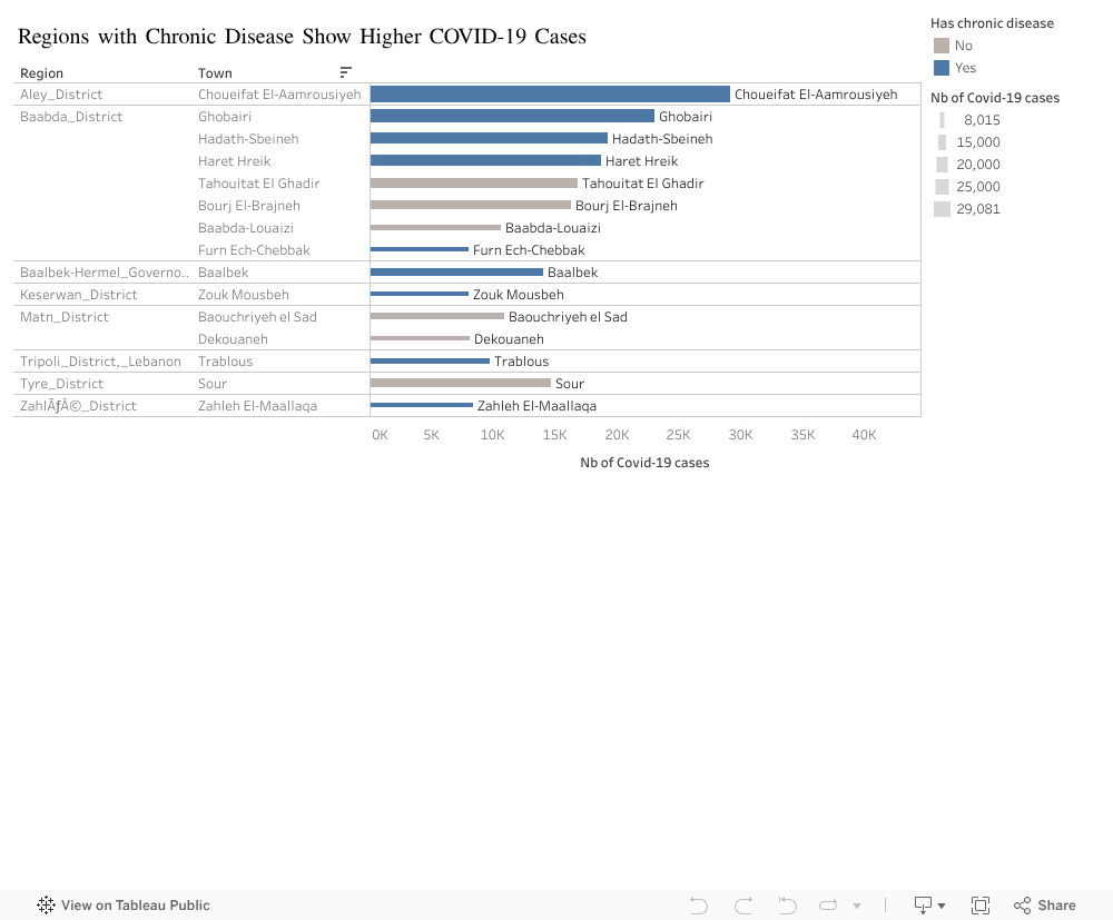
To explore this, I visualized the relationship between chronic disease presence and the total number of COVID-19 cases across Lebanese towns. The visualization below compares towns with and without chronic disease burdens, making it easy to see which communities were hit hardest as shown below.
As the bars reveal, the towns shown in blue — those with chronic disease — consistently appear at the top of the ranking. Choueifat, Ghobeiri, Hadath-Sbeineh, Haret Hreik, and Tahouitat El Ghadir stand out with significantly higher COVID-19 case counts. By contrast, towns represented in grey, with no chronic disease reported, tend to have lower case numbers and cluster toward the bottom of the list.
This pattern suggests that the pandemic amplified pre-existing vulnerabilities. Towns where chronic diseases were more common may also have had denser populations, older residents, more complex healthcare needs, or other structural factors that made containment more difficult. Although this visualization does not prove direct causation, the correlation is clear and consistent.
Understanding these disparities is crucial for future public-health planning. Communities carrying a dual burden — high chronic disease prevalence and elevated infection rates — would benefit from targeted support, improved access to care, and early intervention strategies. The visualization serves as a reminder that pandemics do not impact all towns equally, and that underlying health conditions can shape the trajectory of a crisis in powerful ways.
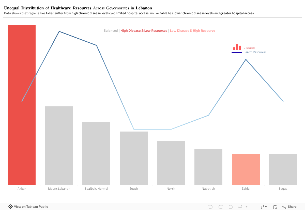
In principle, regions with higher disease levels should have stronger access to healthcare resources. This visualization, however, shows a different pattern.
For this analysis, I compared two indicators across Lebanon’s Governorates: (1) Diseases (2) Access to Health Resources
Akkar: High Disease, Limited Access
Akkar consistently shows some of the highest chronic disease levels, yet it has one of the lowest levels of hospital access among the regions.
Zahle: Lower Disease, Higher Access
In contrast, Zahle displays lower disease levels but relatively higher access to hospitals.
By comparing disease levels with healthcare access, the visualization shows a clear mismatch across several governorates. Akkar and Zahle represent two opposite cases, yet the overall pattern remains consistent: health needs and available resources are not aligned across Lebanon.
This raises a key policy question: Are healthcare resources being allocated based on current population needs, or on outdated infrastructure patterns? The evidence suggests that capacity does not scale with actual disease burden in several regions.
To address this, the government should:
Conduct a nationwide needs-based healthcare assessment to map disease burden against current facility distribution.
Reallocate resources and funding toward governorates with persistent gaps, particularly in high-need, low-access areas like Akkar.
Implement dynamic resource planning models that adjust allocations annually based on updated health data.
Expand primary healthcare centers in underserved regions to reduce pressure on major hospitals.
Improve transportation and referral systems to ensure patients in remote areas can reach care efficiently
This isn’t about hospital numbers. It’s about a system that gives some regions a chance and leaves others without one.
Samer is a 58-year-old shop owner in Baabda. He has diabetes and hypertension, and like many others living with chronic conditions, he spent the early months of the pandemic in quiet fear. He followed every guideline, avoided unnecessary outings, and even closed his shop early just to stay safe.
As I began working with data on chronic disease prevalence across Lebanon, I kept thinking about people like Samer; individuals whose health risks existed long before COVID-19 arrived. It made me wonder: Do districts with more people like Samer also end up reporting more COVID-19 cases?
At first, the logic seemed simple: more chronic conditions should mean higher vulnerability, and higher vulnerability should mean more cases.
But once I visualized the data, the story turned out to be more complicated than that.
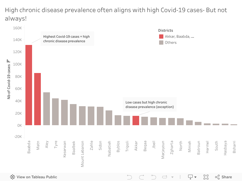
When we look at Baabda, Samer’s home district, the pattern is exactly what we expect. Baabda and Matn have a high chronic disease prevalence which explains why they recorded the highest number of COVID-19 cases. These districts appear in red in the visualization because they represent the expected relationship: high chronic disease prevalence accompanied by high COVID-19 case counts.
Most other districts show the same downward pattern: fewer chronic illnesses tend to come with fewer reported infections. It’s the straightforward story we anticipate.
Until one district breaks it.
While exploring the data, Akkar immediately stood out. Unlike Baabda or Matn, Akkar shows relatively low COVID-19 case numbers despite having a high prevalence of chronic diseases. At first glance, this shouldn’t happen. But Akkar tells a different health story.
Akkar is less dense, has fewer specialized medical centers, and mobility patterns differ. But an important social factor also played a role: many residents initially believed COVID-19 was “just a flu”, something exaggerated, not dangerous. Because of that, people were far less likely to get tested, especially when symptoms were mild or unclear.
So, the low case numbers may not reflect low infections, they reflect low detection. Akkar shows us that vulnerability isn’t only biological or medical. Sometimes it’s cultural, structural, or tied to trust in the health system itself.
That was the moment when the visualization stopped being merely a chart and became a real narrative.
People like Samer live in districts where both chronic disease and COVID-19 risks were high and highly visible. But in Akkar, people with the same medical vulnerabilities faced a quieter, more hidden risk, one that doesn’t always show up in official numbers but still shapes their health outcomes.
This is the heart of the story: patterns tell us what usually happens, but exceptions reveal what we might be missing.
Understanding these mismatches matters. High-case, high-risk districts like Baabda and Matn may need more hospital capacity and emergency planning. High-risk, low-case districts like Akkar may need earlier outreach, awareness campaigns, and accessible screening, especially in communities that may initially resist testing.
If we focus only on case counts, we risk overlooking communities that need protection long before outbreaks become visible.
When I think back to Samer, closing his shop early every night, hoping to stay healthy, I’m reminded that data becomes meaningful when it reflects real people. In public health, the story doesn’t live only in the trend. It lives in the exception. Because that’s where we discover the next challenge before it appears.
Teta Salma lives in a small village in the Hermel District. The nearest clinic is far from her home and opens on an unpredictable schedule, so routine tests are rarely part of her life. She often feels tired but assumes it is simply age catching up with her. During a visit to her daughter in Mount Lebanon, she took her to a nearby medical center for a simple checkup. That day she learned she had diabetes. The condition had been part of her life for years. It had only been discovered because she finally had access.
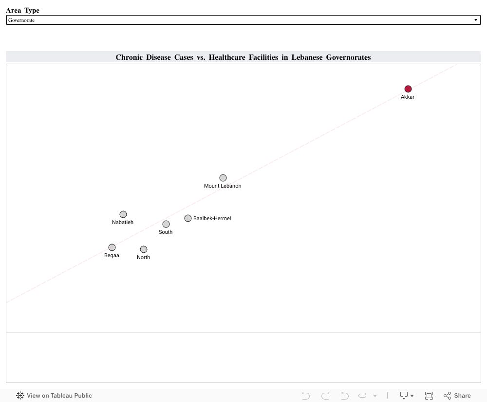
Her experience reflects something that appears across Lebanon when we look at the data. Using the Health Status 2023 and Health Resources 2023 datasets from PKGCube, I compared reported chronic disease cases with the number of healthcare facilities available in each governorate and district. I combined hypertension, cardiovascular disease and diabetes into one chronic disease measure. I then compared these counts with the number of care centers and first aid centers in each region:
The visualization revealed a clear pattern: Regions with stronger reach and more places to get a routine check reported higher counts of chronic disease. Akkar stands out with 390 chronic disease cases and 126 healthcare facilities. Mount Lebanon and Baalbek Hermel show a similar alignment. Areas with limited reach, such as Hermel or the Western Beqaa, showed much lower numbers.
These lower numbers do not necessarily reflect lower illness. They reflect reduced visibility. When people cannot reach a clinic easily, fewer conditions are recorded and many remain unnoticed until symptoms become harder to ignore.
To understand how better reach affects health data, I looked at the experience of Thailand. The country expanded primary care and community screening through its Universal Health Coverage program.Once routine checks became easier to access, more cases of hypertension and diabetes were identified, especially in rural areas. Detection of hypertension increased from 48.9 percent in 2016 to 53.3 percent in 2019, and diabetes detection rose from 67.4 percent to 74.7 percent during the same period. These changes showed how wider access can reveal conditions that were present long before.
This is similar to what we see in Lebanon. When people have access, more of the country’s true chronic disease burden becomes visible. When access is limited, the data looks lighter than reality.
A practical next step for Lebanon is to expand routine screening in districts with fewer facilities. Mobile clinics, community testing days and partnerships with universities or NGOs can bring basic checks closer to the communities that need them. Improved digital record systems can also help track early diagnoses more accurately. Monitoring places like Hermel, Bsharri or the Western Beqaa can show if these efforts are working.
Healthcare access shapes what we know about people’s health. Strengthening that access gives families the chance to understand their conditions earlier and manage them with clarity. It also brings us back to people like Teta Salma. Her diabetes did not begin the day she was screened. It became visible because she finally reached a place where someone could help her.
Supporting more communities in this way can bring hidden conditions to light and build healthier lives across Lebanon.
During the peak of the COVID-19 pandemic back in 2021, waking up to news of people passing away due to symptoms complications became the norm, but in the midst of the overwhelming news, one man’s story hit us hard. His name was Nader, a 46-year-old from Baabda, a man known for his loud laugh, strong coffee, and long Friday lunches with friends. We knew him as the “office guy”; he was in fact there for everyone, until the day when his lungs failed him. He caught COVID, the symptoms escalated quickly. Within days, his oxygen levels dropped, and despite being admitted to the hospital, the virus was already overpowering a weak cardiovascular system. Everyone was in shock, since Nader was just in his mid-40s, and we expected he’d beat the virus easily. But once the doctors informed us he didn’t make due to his overworked cardiovascular system, we understood it was beyond COVID-19, and not only Nader’s lungs have failed him, but a whole lifestyle and healthcare system.
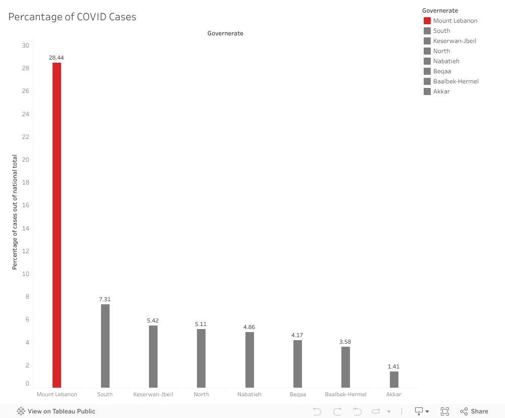
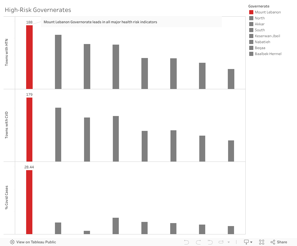
This raised a bigger question for us: Which areas in Lebanon have unusually high levels of chronic disease that make its residents more at risk during crises? To explore this, we analyzed health data across governorates, focusing on cardiovascular disease (CVD) and hypertension (HTN). We first explored how the percentage of COVID-19 cases out of national totals was distributed, with Mount Lebanon leading in this area.
To understand further the extent of the health risk, we compared these chronic disease patterns to COVID cases in all Lebanese Governorates. What we saw flagged Mount Lebanon as a hight risk Governorate as it has the regions with the highest burden of CVD and HTN also recorded the highest COVID cases. This means that in these areas, the symptoms of COVID-19 will be exacerbated by the existing chronic disease, which leads to more complicates and higher hospitalization rates.
The highest-risk governorate being Mount Lebanon isn’t only about pandemic response. It’s about addressing the silent epidemic of chronic disease that makes future health crises even more dangerous. Based on our analysis, we believe it’s time to expand early screening programs, increase community-level hypertension detection, and strengthen preventive care. Preventative measures are needed so that the most vulnerable groups are able to cope with unprecedented health emergencies. If we focus on prevention now, we can reduce risk and help ensure that stories like Nader’s don’t repeat themselves.