In Japan, it is common for businesses to rely on the belief that well-crafted, reliable products can sell themselves without heavy marketing. One small online furniture shop followed this philosophy closely, focusing on quality materials, clean design, and dependable service rather than advertising campaigns.
The approach worked.
Orders were steady, reviews were positive, and most furniture categories- including chairs, shelves, bookcases, and storage units- consistently generated profit. By all traditional indicators, the business was healthy.
Yet something remained unusual: despite growing revenue, overall profit growth was slower than expected. The business was performing well, but its profitability did not scale proportionally with sales. This discrepancy prompted a closer look into where exactly profit was coming from, and where it might be slipping away.
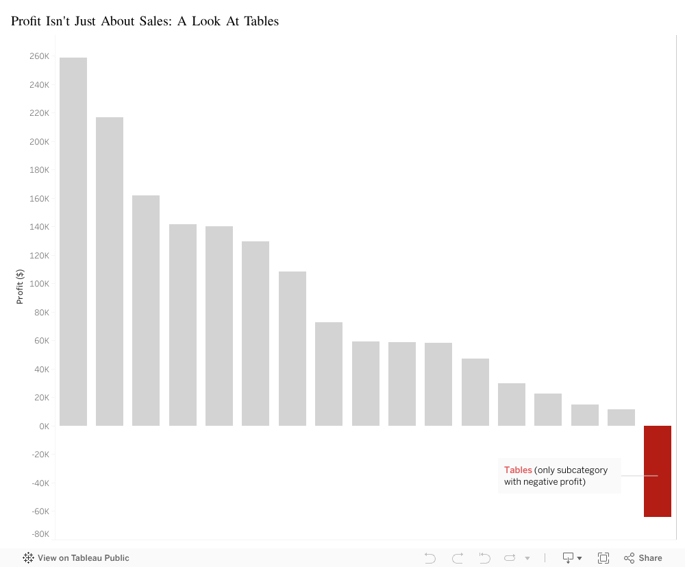
To investigate the issue, a visualization was created to compare profit across all product subcategories. The results were striking. Almost every bar on the chart showed positive profit. Except one.
Tables: -$64,083.
The only unprofitable subcategory in the entire catalog.
This finding was particularly surprising because tables were not low-demand items; in fact they were bestsellers. From a revenue standpoint, tables performed extremely well.
However, when analyzed beyond the point of sale, the underlying issue became clear. Tables carried significantly higher operational costs than any other category:
They required two delivery workers due to their size and weight
They were difficult to deliver in most Japanese apartments with narrow hallways and small elevators
They consumed significant warehouse space because of their bulky shape
They were more prone to scratches or delivery damage, leading to replacements and refunds
In short, tables were profitable at the moment of sale but unprofitable everywhere after the sale.
The business was not struggling because demand was weak- it was struggling because one high-demand product quietly erased a portion of the gains made by every other category.
Recognizing this pattern allowed the company to take targeted action to correct the issue. Several operational improvements were introduced:
Table packaging was redesigned to better withstand delivery
A modest oversized-item surcharge was added to reflect true handling costs
Warehouse organization was adjusted to reduce movement and handling time
These adjustments helped the business align its operational costs with its revenue, restoring profit balance across the catalog.
The visualization ultimately highlighted a broader lesson:
A product can be popular, well-reviewed, and frequently purchased- yet still unprofitable if its hidden costs exceed what it brings in.
Revenue alone does not determine success. Understanding the full journey of a product, from warehouse to delivery, is essential for sustaining a healthy business.
If you’re Lebanese, you know that coffee is more than a drink. It’s a companion for all occasions; from kick-starting your morning with an energy booster, to a beverage to enjoy while having conversations with family and friends, and especially during late-night studying. It’s how we wake up, how we host, and how we quietly share connection and love.
With that in mind, I wanted to look at coffee from a different angle: through data. Using a dataset of transactions from a café, I explored:
Which drinks are most popular
How consumption changes across the time of day
Which hours are the busiest
And how daily revenue fluctuates across the week
The goal is simple: if coffee is so central to our culture, when exactly are we showing up, and what are we ordering?
Why does this matter? Café owners find it hard to know exactly when to staff up and which drinks to push.
This visualization ranks drinks by total revenue. A few patterns stand out:
Lattes and Americanos bring in most of the money, with a balanced consumption of each drink throughout the day.
Other drinks, such as Cortado and Hot Chocolate are also consumed but at much smaller level compared to their counterparts.
Despite having many options to choose from, individuals tend to enjoy the classics. These are the drinks that keep the line moving and the espresso machines busy.
Next, I looked at revenue by hour of day. This gives us a clear view of when people frequent cafés the most. The pattern is very typical:
A strong morning rush between roughly 8:00 and 10:00 AM as people grab coffee on the way to work or university.
A smaller afternoon bump, around 3:00 to 5:00 PM, when people need a second boost or meet friends.
Sales gradually drop off into the evening.
These are the hours when extra baristas would be needed the most, and popular drinks should be front and center to keep service fast.
Time of day isn’t the only dimension that matters. I also wanted to know:
Are some days of the week more predictable than others?
This boxplot shows the distribution of daily revenue for each weekday:
The middle line in each box is the typical (median) daily revenue.
The height of the box and whiskers shows how much that day’s revenue can fluctuate.
From this view:
Weekdays tend to have higher median revenue than weekends.
Some days, especially mid-week and Friday, show taller boxes and more high outliers, meaning they can be very good or just average.
Weekends (particularly Sunday) are a bit calmer: slightly lower but more stable daily sales.
So if you’re planning staffing or inventory, weekdays are where you need more flexibility, while weekends can be managed more steadily.
Because most revenue comes from weekday morning and late-afternoon peaks driven by a few core drinks, we should staff and promote around those windows to serve faster and sell more
In the high-stakes world of real estate and tourism investment, there is a prevailing feeling that the map has already been drawn. We are constantly told that the “smart money” has already moved, that the best locations are taken, and that finding a new opportunity means fighting for scraps in saturated markets. When we look at the industry, we usually see two things: expensive, crowded success stories, or underdeveloped ghost towns that no one wants to visit.
But sometimes, if you look at the data differently, the map changes.
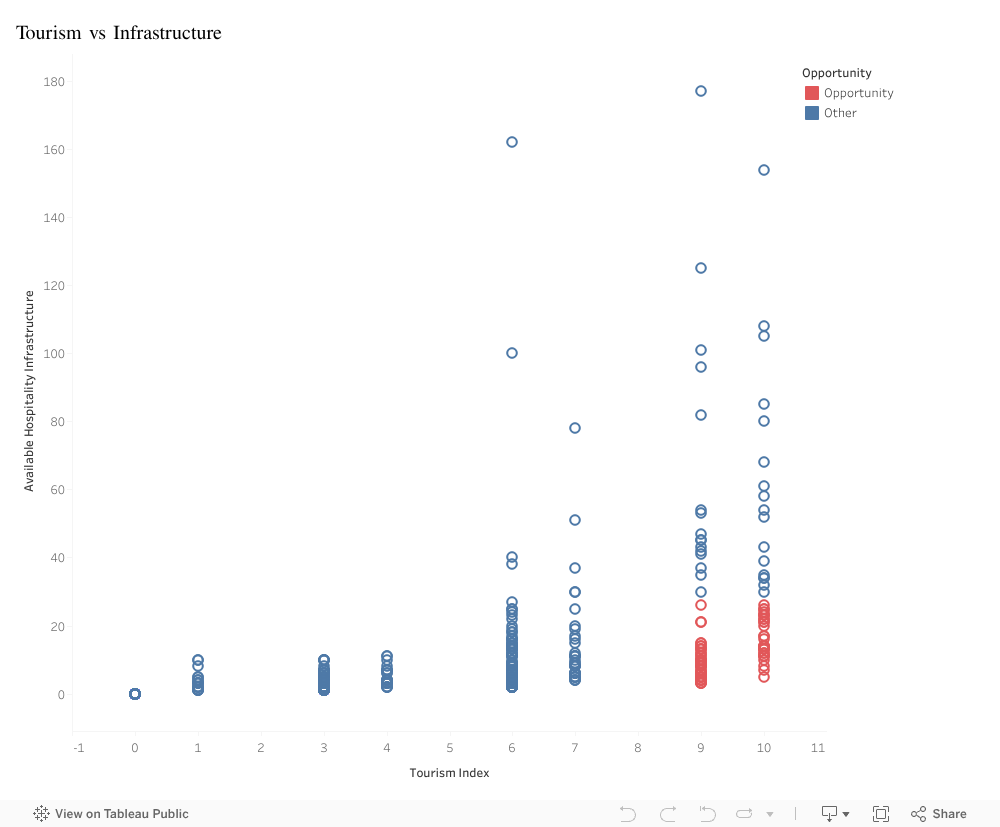
In this visualization, I analyzed the relationship between two critical factors: the Tourism Index (the raw, magnetic appeal of a destination, from natural wonders to historical sites) and Available Hospitality Infrastructure (the actual supply of hotels, restaurants, and services).
At first glance, the sea of blue dots confirms the traditional idea. The data follows a predictable, efficient path. In the top right, you see the famous destinations: high appeal matched by high infrastructure. These are successful, but they are also a dangerous gamble; expensive to enter and fiercely competitive. In the bottom left, you see the opposite: low appeal and low infrastructure. No surprise there.
But as you scan the bottom right of the chart, the pattern fractures.
This is where the red dots appear, and they tell a completely different story. These data points represent towns with a Tourism Index of 9 or 10, world-class destinations that tourists are desperate to visit. Yet, their infrastructure bars are effectively at zero.
This gap represents a massive market failure, and for an investor, a market failure is a goldmine.
These aren’t towns that need marketing; they are towns that need capacity. The demand is already there, waiting for someone to unlock it. By ignoring the crowded top-right corner and focusing on this specific cluster, investors can bypass competition entirely. Building here means you aren’t just another hotel in a crowded city; you are the hotel in a destination people are already fighting to see.
Big Idea
The data reveals a rare and profitable anomaly: a specific cluster of towns with world-class tourist demand but near-zero infrastructure. Investors should pivot away from saturated markets and target these “red dot” locations to secure a first-mover advantage in destinations where demand drastically outstrips supply.