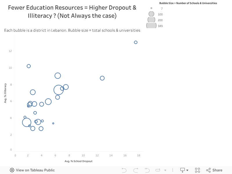
For years, we’ve assumed that improving education in Lebanon simply meant building more schools. So when I visualized the 2023 district-level dataset, I expected to see a clear pattern: more resources leading to lower dropout and illiteracy. But as the bubble chart came together, a different story emerged.
Districts like Akkar, Baalbek-Hermel, and Hermel despite having a large number of schools and universities, still showed some of the highest illiteracy and dropout rates in the country. At the same time, regions like Baabda, with similar or even fewer resources, performed significantly better. This contradiction revealed that access alone doesn’t guarantee learning.
What the data showed instead is that deeper socioeconomic and cultural factors shape educational outcomes far more than infrastructure. Poverty, limited community support, and inconsistent teaching quality undermine the effectiveness of available schools. This indicates that to improve education in Lebanon, the focus needs to shift. Rather than expanding the number of institutions, we should invest in teacher development, student support systems, and programs that address the social and economic challenges students face.
The story told by this visualization is simple but important: meaningful progress requires targeting the barriers outside the classroom, not just counting the classrooms themselves.
Every year, my G11 IB Business students surprise me with strong performance in Paper 1, yet many struggle with Paper 2. I always suspected the finance component was the reason, but until I analyzed the standardized data visually, I didn’t realize how clear the gap truly was.
About the Exams
Paper 1 primarily tests structured responses and conceptual knowledge. Paper 2, on the other hand, is heavily quantitative:
balance sheets
cash flow forecasting
break-even analysis
investment appraisal
Students often describe Paper 2 as “the confusing one.”
The question was: How big is the performance gap? And who needs the most support?
Insight: What the Data Reveals
The redesigned visualization highlights three clear insights:
1. Paper 1 Performance Is Consistent
Most students score between 70%–90%, showing strong understanding of theoretical business concepts.
2. Paper 2 Scores Drop Sharply
When sorted descending, the blue bars reveal a steep decline and several scores below 30%.
3. The Weakness Is Skills-Based, Not Knowledge-Based
Even strong Paper 1 students struggled in Paper 2. This indicates a clear pattern: Students grasp business theory well, but lack confidence in financial reasoning.
Call To Action: Turning Insight into Teaching Strategy
This analysis was not just descriptive; it became prescriptive.
Based on the data, I am implementing:
Weekly finance skills clinic
Step-by-step financial examples
Mini case studies integrating calculations
Targeted support for students below 30%
Low-stakes finance practice sheets
Conclusion
Visualization transformed a vague assumption into a targeted teaching strategy. The data makes the story visible, and the story drives the action.