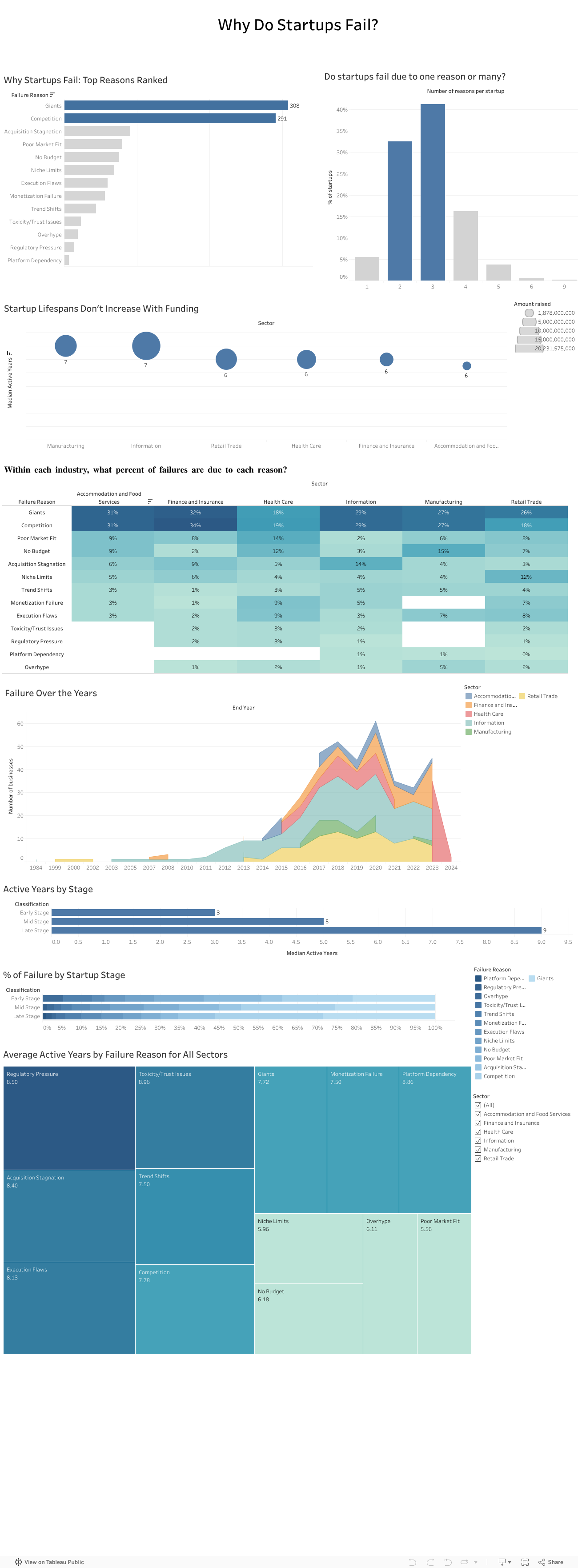
If you’ve spent any time in the startup world, you’ve probably heard the usual explanations for failure:
“We ran out of money.” “Bad timing.” “Wrong hire.” “Investors didn’t understand us.”
These reasons sound familiar because founders repeat them all the time. But when my team and I analyzed a dataset of more than 400 failed startups across multiple industries, a very different picture started to appear. The story of failure turned out to be much bigger than isolated mistakes or unlucky timing. It was deeper, more structural, and surprisingly predictable.
Failure rarely comes from one reason
One thing became clear very fast: startups almost never collapse because of a single issue. Most fail through a chain of events that build on one another.
In our dataset, about 40 percent of companies had three interconnected reasons behind their collapse. Sometimes a weak market fit slowed revenue and created cash pressure that left the company exposed to competitors. Other times overspending made the startup dependent on fundraising until investor sentiment shifted and the runway disappeared.
Either way, failure unfolded like a sequence of falling dominoes rather than one dramatic moment.
Competition quietly kills more startups than anything else
Across all sectors, competition was one of the most common reasons for shutdowns. And not just any competition. It was usually large, established players with strong distribution, deeper pockets, and loyal customers.
Nearly one in four failures mentioned competitive pressure. This confirmed what many founders experience but rarely quantify: good ideas often die quickly when the market is already controlled by powerful incumbents.
We tend to focus on product quality, team strength, and execution. Yet sometimes the biggest factor is simply how crowded or hostile the market is.
Your industry shapes how you fail
Another pattern that stood out was how differently failure plays out across sectors:
Healthcare startups struggled with regulation, slow adoption, and “no budget” barriers.
Tech and information startups were hit by rapid shifts in trends.
Retail and food startups faced thin margins, intense competition, and saturation.
So failure is not random. It is shaped by the environment each founder steps into from day one.
More funding does not mean a longer life
One of the most surprising findings was how little funding influenced survival. When we compared total money raised with lifespan, the relationship was almost flat.
Most startups survived five and a half to seven years, regardless of how much capital they had. Funding buys time, but it does not fix deeper problems like:
weak demand
slow adoption
dominant competitors
a misaligned business model
poor retention
This challenges a core belief in the startup world: raising more money does not automatically increase your chance of survival. The data simply did not support that.
What investors told us confirmed everything
To understand how investors themselves view these patterns, we surveyed 13 investment professionals. Their insights mirrored our data:
Competition was seen as the highest-risk factor.
Many felt the ecosystem lacked visibility and reliable signals.
They relied heavily on external sources to compensate.
Their top priorities were long-term growth and expansion potential.
Investors knew the risks, but they didn’t always have the tools to measure them consistently.
We also presented our findings to a company
To avoid analyzing the data in isolation, we presented our work to an investment company. Their feedback was striking. They struggled with the same issues many founders face, including unpredictable competition, unclear early-stage signals, and limited data visibility.
Our analysis helped them name challenges they had sensed for years but couldn’t articulate. It showed that this problem is not just academic. It is experienced daily in the ecosystem.
Where we go from here
The findings point to one clear conclusion: startups do not just need better products or stronger teams. They need a more realistic understanding of the terrain they are entering.
A stronger evaluation model would include:
Deeper market and competition analysis This means going beyond optimistic TAM slides and focusing on concentration levels, switching costs, and competitive power.
Sector-specific risk profiles Every industry has its own patterns, barriers, and threats.
Stage-appropriate evaluation Early-stage risk is not the same as late-stage risk.
A consistent and simple competition risk score Something investors can use to compare opportunities objectively.
This type of framework is completely feasible with public data and existing tools. What matters is applying it early and consistently.
Final takeaway
Startups do not fail because founders are not capable or hardworking. They fail because they often walk into markets they were never equipped to survive in.
If founders and investors begin paying as much attention to market structure as they do to product and passion, the startup ecosystem could look very different. And maybe fewer great teams would disappear not because they failed, but because the game they tried to play was stacked against them from the start.
How Data Visualization Revealed the Real Issues Behind the Instability in the Performance of ChocoStory
Launched in 2018 in Verdun (Beirut), ChocoStory quickly gained popularity: a prime location, strong foot traffic, and the owners’ network. The store combines walk-in chocolate items products with experiences like chocolate workshops and a museum.
However, when we first examined ChocoStory’s performance, one thing was immediately clear: growth wasn’t steady. Sales would surge, only to drop sharply right after, and this pattern kept repeating every year.
That raised a key question. Why did the business grow in some periods but lose momentum just as quickly? This pointed to structural issues rather than simple seasonality.
Our approach is simple but powerful: use data to understand how market dynamics, customer preferences, and internal costs shape ChocoStory’s inconsistent performance. We used a series of visuals that helped us walk through the timeline and understand what was affecting the numbers.
Understanding the Swings in Performance
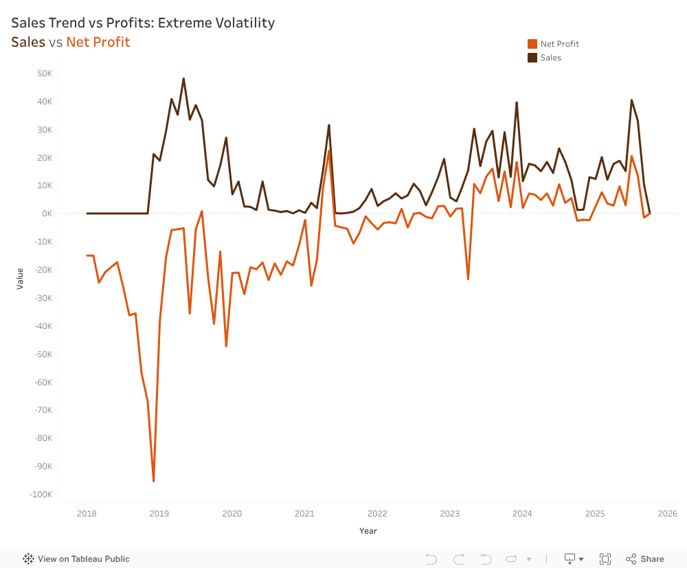
The first step was mapping both sales and net profit from their opening in 2018 until the present.
This revealed a cycle of volatility that repeats year after year, showing how heavily the business relied on peak seasons. Net profits follow the exact same pattern as Sales, almost like a shadow, just consistently lower. Profitability relied entirely on sales peaks rather than efficient operations, meaning any drop in demand immediately pushed the company into a loss.
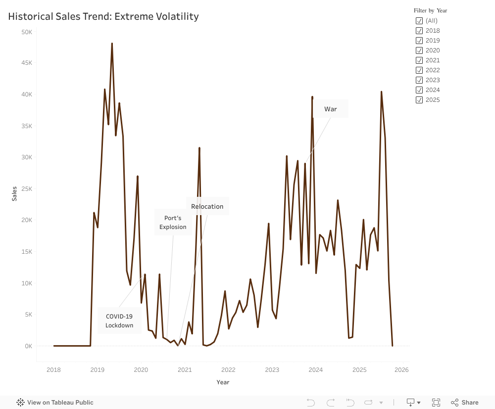
How External Events Influenced the Numbers
Looking across the years, it became clear that ChocoStory’s performance was closely tied to what was happening around it.
The early period was steady, but the situation changed fast.
Covid-19: Foot traffic reliance backfires; digital gap hurts.
Port Explosion: Supply chain chaos; no quick adaptation.
Disruptions will happen, but their impact depends on how equipped the business is to handle them. Too often, ChocoStory reacted slowly or only partially.
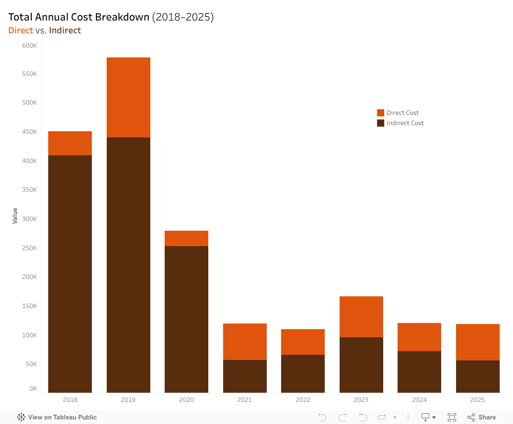
What the Cost Structure Revealed
At first glance, ChocoStory’s expenses looked normal, but when they were broken down into the direct and indirect costs stacked barchart, a different reality emerged. Before 2021, direct costs (workshop materials, chocolate ingredients, packaging, etc.) were relatively stable. Indirect costs, however (rent, utilities, electricity, etc.), fluctuated heavily, with not enough revenues to break even.
The total expenses vs net profit line chart showcased two lines behaving in a symmetrical pattern. When expenses rose, profits dropped. Likewise, when expenses fell, profits increased. This approximate symmetry highlighted a deeper issue: ChocoStory had almost no safety margin. With indirect costs absorbing such a large share of total expenses, the business was operating with a net profit loss. It was only after the 2021 relocation that the gap between the lines narrowed down, and ChocoStory began breaking even. However, they were unable to sustain an upward profit trend beyond break even.
4. Rethinking the Product Portfolio
ChocoStory offers a wide range of chocolate items. There are 206 products, compared to just 28 service offerings.
At first glance, this creates the impression of a product-led business, assuming they generate enough profits compared to operational weight. Yet, comparing the revenue generated by each proves otherwise:
Based on that chart, it becomes clear that products generated around LBP 4.5B only, while services reach LBP 11B. The highest revenue contributors were the services (workshops and museum) indicating that ChocoStory operates more as an experience-driven destination and less like a traditional chocolate shop.
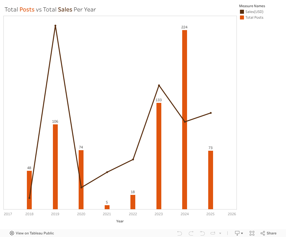
Visibility and Online Presence
We reviewed the platforms because visibility on social media affects how easily customers find and engage with the business. We looked at posting activity across Instagram, Facebook, and Threads from 2018 to 2025 and compared yearly posts with yearly sales. Activity varied widely. In 2021, only five posts were published during the relocation period, which aligned with the lowest sales in the dataset. Posting increased again in 2023 and peaked in 2024, but sales did not return to 2019 levels, when posting was more moderate. We also noted that ChocoStory was not active on TikTok, despite it being a major discovery platform for local experiences.
Our wider analysis showed a clear gap in engagement by content type. A workshop-and-museum video reached more than 784,000 views, while a seasonal product post received 37 likes. This showed that experience-focused content resonated far more than product photos. Taken together, the results suggest that visibility shifted across the years, and that content type mattered more than posting frequency.
A Clearer Path Forward
ChocoStory’s main challenge isn’t the chocolate, it’s not understanding its customers. Our team recommended concentrating on the audiences that naturally fit the workshop experience, especially children between 4 and 14. Schools and camps can create a steady flow of visits throughout the year. Simplifying the product list can reduce operational strain and help redirect attention to the experiences that matter most.
During our visit, the ChocoStory team confirmed that these insights aligned with their own observations. They plan to reduce the number of products, strengthen communication around the workshops, and develop a more structured marketing plan.
This analysis showed how much can be learned from placing data into clear visuals. Trends that look confusing in raw numbers become understandable once they are visualized. ChocoStory faced several disruptions from outside events, but many challenges also came from how the business was structured. With a clearer view of what drives performance, the company can now build on its strengths and create more stable growth.
University isn’t supposed to feel like survival. But for many students, it does.
Ask around on any campus, AUB included, and you’ll hear the same quiet confessions: “I can’t focus anymore,”“I haven’t slept properly in weeks,”“Everything is due at once,” or simply, “I’m tired.” Not the casual kind of tired, but the deep-down kind that mixes pressure, deadlines, expectations, and anxiety all into one heavy load.
Our team wanted to understand this feeling, not through anecdotes alone but through data. And when we dug into two national student stress datasets, the story that emerged was stronger and clearer than any of us expected.
This dashboard is that story.
Why We Started This Project
Stress isn’t just “part of university life.” It shapes how students sleep, think, eat, learn, and show up. And when stress keeps rising semester after semester, it becomes more than a personal issue. It becomes a systemic one.
So we asked ourselves:
What exactly is driving student stress?
What does it look like in real numbers?
And is there something we, as a university community, can actually do about it?
To answer that, we turned hundreds of student responses into an interactive visualization designed to show, clearly, simply, and honestly, what stress looks like across psychological, social, and academic dimensions.
The results were eye-opening.
What the Data Reveals — A Human Story Hidden in Numbers
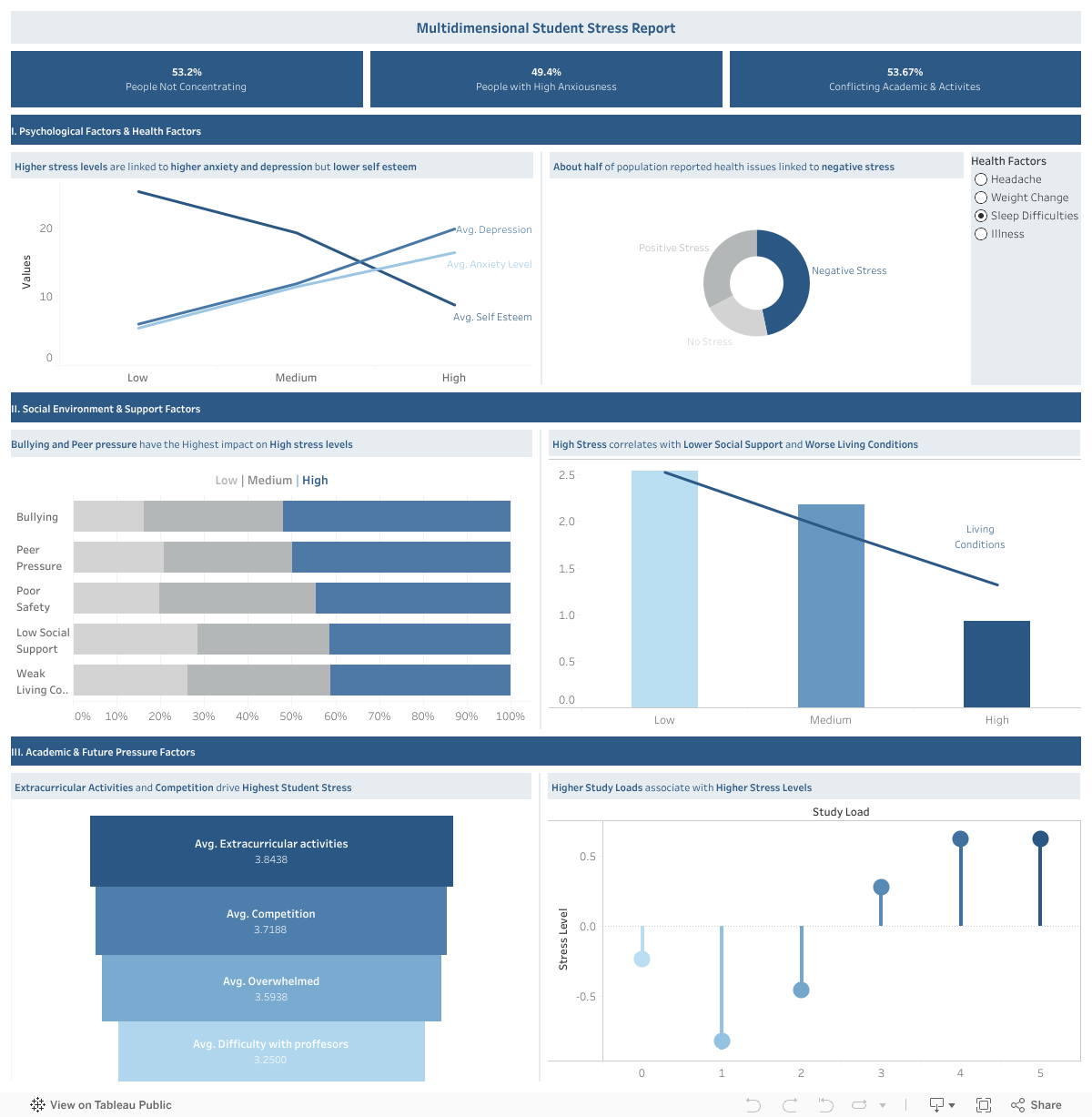
1. Stress is not just emotional — it affects how students think and function.
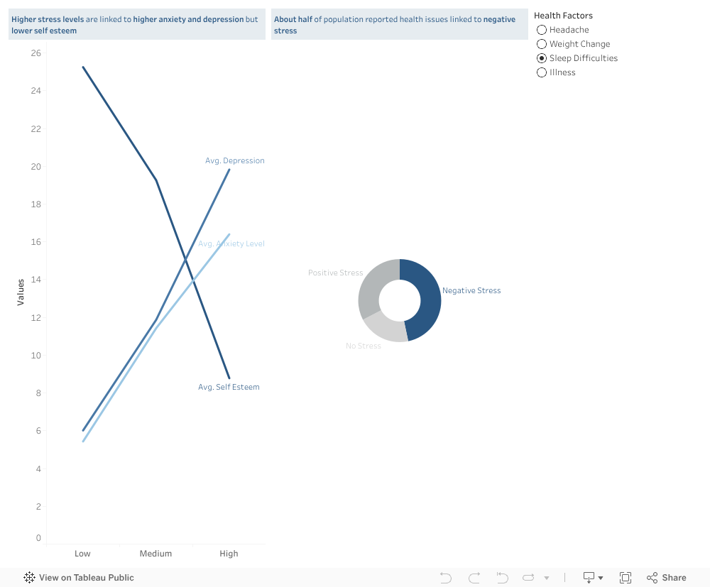
Half of the students in our dataset reported difficulty concentrating (53%), and nearly as many reported high anxiety (49%). As stress rises, the dashboard shows a sharp rise in anxiety and depression, and a clear drop in self-esteem.
It isn’t just academic pressure — it’s identity-level pressure.
2. Social environment matters more than we think.
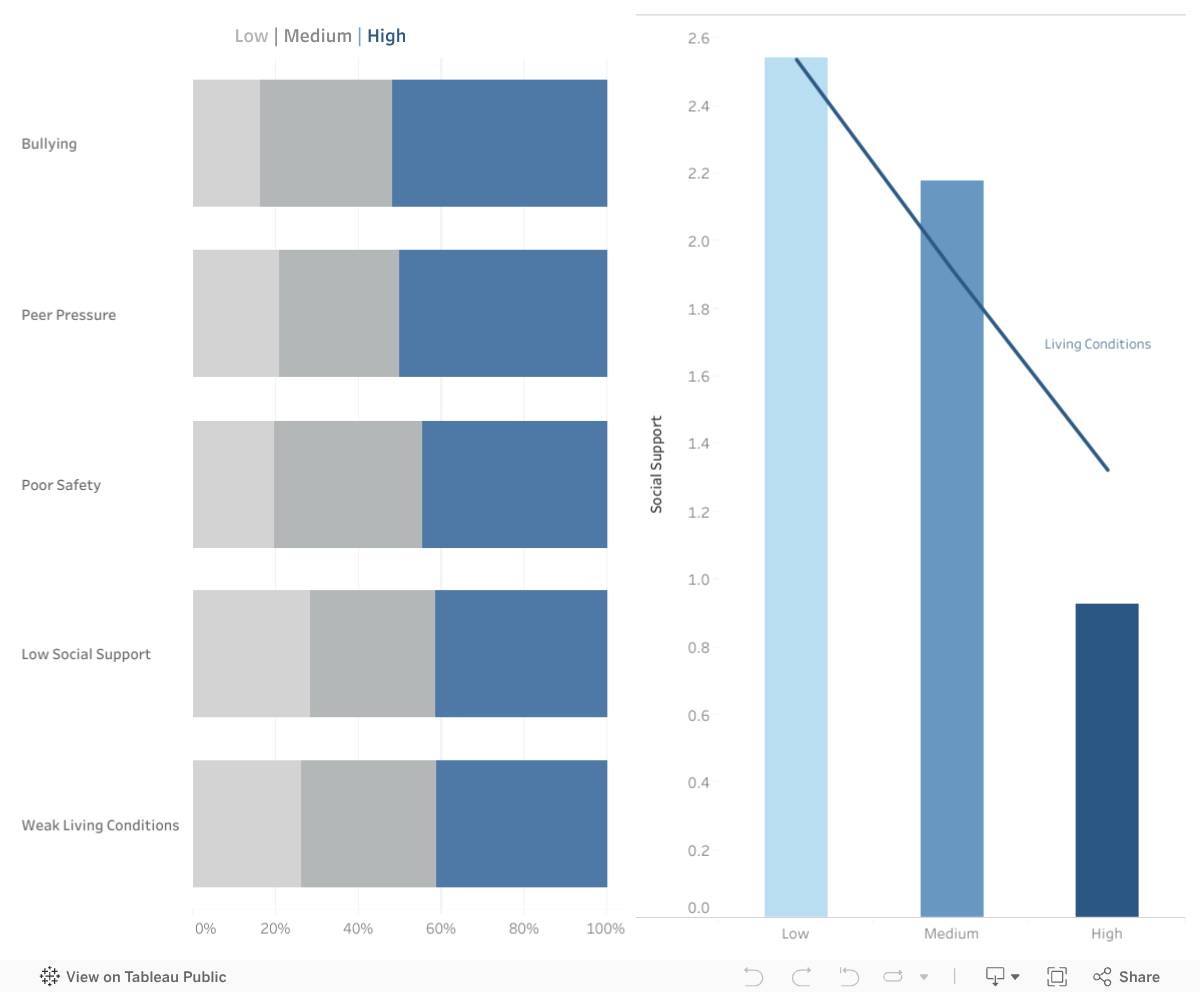
One of the most powerful patterns in the dashboard comes from the social and environmental factors:
Bullying and peer pressure rise sharply with stress
Low social support strongly correlates with high stress
Poor living conditions amplify stress far more than expected
Stress doesn’t start in the classroom; it grows in the spaces between classes too — in dorm rooms, social circles, financial challenges, unspoken expectations, and the feeling of being alone when things get overwhelming.
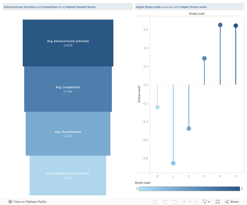
3. Academic load is a major trigger — and not just the amount of work.
The dashboard shows a clear pattern:
More competition → higher stress
More difficulty with professors → higher stress
Feeling overwhelmed → higher stress
Higher extracurricular activities → highest stress of all
But the real insight is this:
It’s not only how much work students have.
It’s when that work happens.
Deadlines pile up in the same week, tasks overlap, and students end up sacrificing sleep, health, and well-being trying to meet multiple high-stakes demands simultaneously.
This insight became the heart of our solution.
Our Solution: A Shared Academic Load Calendar for AUB
Imagine a semester where:
Students know what’s coming weeks ahead
Professors can see when other courses have major deadlines
Overloaded weeks are immediately flagged
Departments can plan more fairly
Stress spikes become predictable — and preventable
Our proposed Shared Academic Load Calendar does exactly that.
It’s a simple idea with a big impact: one place where professors enter deadlines and workload estimates, and a shared, color-coded calendar shows the cumulative load across courses.
For students:
A clear view of their upcoming weeks, no more last-minute shock.
For professors:
A quick way to avoid piling large assessments on the same week as others.
For programs and departments:
A data-backed view of overloaded periods, enabling better planning.
Universities like Sydney, Dundalk Institute of Technology, and Kingston University have already implemented similar systems — and the evidence is clear: It reduces clustering, improves fairness, and helps students breathe again.
Why This Matters
This project isn’t only about data or dashboards. It’s about the people behind the numbers — the students who push through heavy weeks, juggling stressors we never fully see.
If there’s one message our visualization makes undeniably clear, it’s this:
Student stress is not random, and it’s not inevitable.
It’s structural, and fortunately, structure can be changed.
Our goal is not just to reveal the problem but to spark a conversation about how we can create a healthier, more humane academic environment at AUB.
Because when workload becomes transparent, stress becomes manageable. When professors coordinate, students gain clarity. And when data reveals the bottlenecks, universities can fix them.
Explore the Interactive Dashboard
You can interact with the full dashboard here:
Take a minute to explore it — follow the lines, the trends, the colors. Behind every point is a real student with a real story.
A Final Word
Academic pressure will always exist — but unnecessary pressure doesn’t have to.
If this dashboard can start a conversation… If the proposed solution can inspire a change… If one student feels less overwhelmed because their workload is finally balanced…
Then this project has done what it was meant to do.
We owe students more than “you’ll figure it out.” We owe them structure, transparency, and space to thrive.
And meaningful change begins when we look at the data — and truly listen.
If you lived in Lebanon during the summer of 2015, you remember the smell before you remember the headlines. The waste crisis seeped into every street, every balcony, every bus ride. Mountains of uncollected trash became part of the landscape, and for a moment it felt as if the country itself had stopped breathing.
Nearly a decade later, that memory hasn’t faded, not because it’s distant, but because it never fully left. Today, we still step out for a walk and brace ourselves for the familiar sting of a garbage pile baking under the sun. We navigate around dumped furniture abandoned on sidewalks, pass corners where torn bags reveal forgotten clothes, and catch the lingering scent of waste that has become an unwelcome companion in many public spaces.
Lebanon’s waste crisis did not begin in 2015, and it certainly didn’t end there. But that moment marked a turning point, a reminder of how fragile our systems are and how urgently we need solutions that last.
The waste problem goes back way before 2015, and as a response to it, arcenciel started working towards sustainable practices in Lebanon that led to the creation of its Environmental Program.
In a country where waste is burned in the open, dumped along riverbeds, or left to rot in overflowing landfills, arcenciel has spent decades building powerful systems that protect both people and the environment through four units within its Environment Sector: DERE (Solid Waste Recycling), DEHO (Hospital Waste Treatment), the Social Boutique (circular economy initiative for clothing waste), and the Brocante (circular economy initiative for unwanted furniture and household items).
1. DEHO: Saving Lives During the Pandemic
arcenciel operates specialized facilities that collect, sterilize, and shred infectious medical waste, converting it into non-hazardous material suitable for regular disposal.
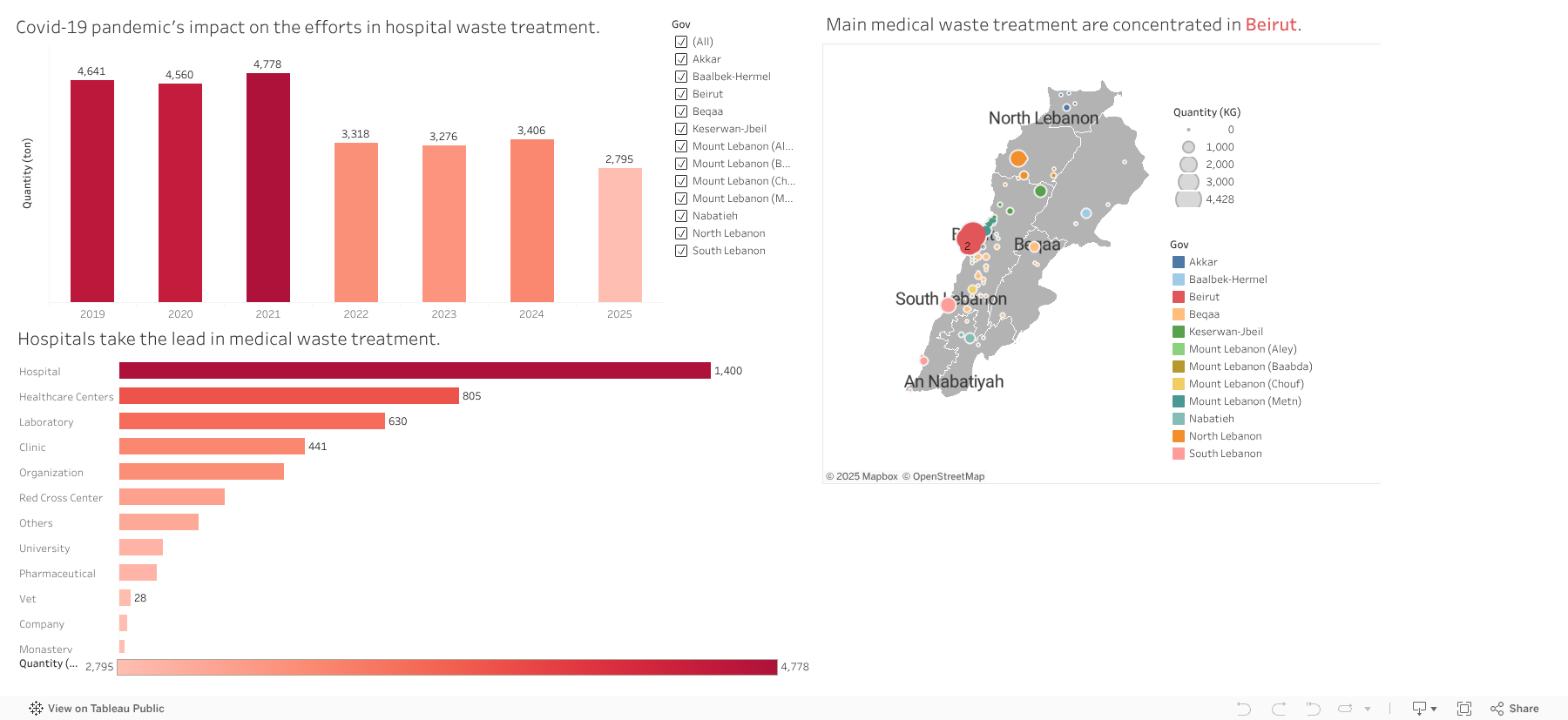
When we looked at the timeline of medical waste in Lebanon, one pattern immediately stood out. Between 2019 and 2021, the curve shoots upward, a sharp peak that mirrors the most intense years of the COVID-19 pandemic. In those years, DEHO handled record quantities of medical waste, reaching nearly 4,700 tons. Behind those numbers were packed hospital corridors, nonstop testing, and the global scramble for disposable protective equipment.
But the story shifts after 2022. As the pandemic slowly loosened its grip, medical waste volumes began to fall. By 2025, at least up to mid-October, the total had dropped to around 2,795 tons, signaling a gradual return to more typical levels.
The client landscape tells its own part of the story. Unsurprisingly, hospitals dominate, making up the largest share of medical waste generators, around 1,400 institutions. They’re followed by healthcare centers, labs, and clinics. Yet one detail we hadn’t expected emerged quietly in the data: veterinary practices. There are only 28 of them in the system, but they still appear as steady contributors to DEHO’s operations, a reminder that “medical waste” extends beyond human healthcare.
On the map, another pattern comes into focus. The brightest cluster sits right where you’d expect, Beirut, home to the country’s biggest hospitals and medical centers. Mount Lebanon forms a secondary ring, and beyond that, smaller dots scatter into Bekaa and the North. The geography of medical waste, it turns out, closely follows the geography of healthcare itself.
2. DERE: The Decline of Solid Waste Recycling
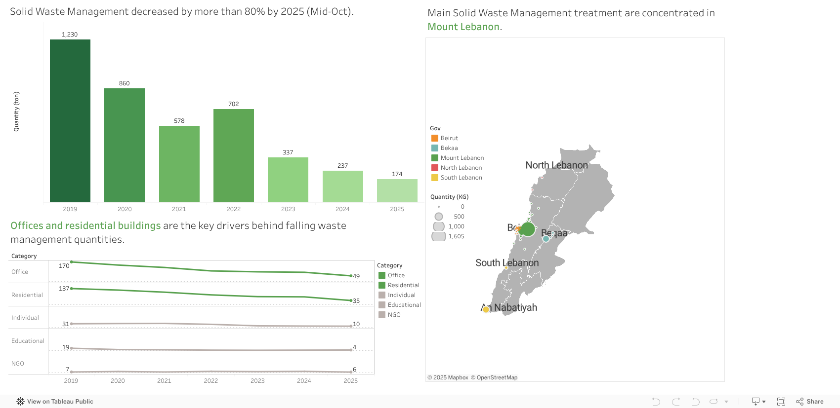
For many people, arcenciel’s Rolling Caps project is the first thing that comes to mind when they think about recycling, a simple act of collecting plastic caps that grew into a nationwide habit. But as we dug deeper into the DERE dataset, it became clear that the story of solid waste management goes far beyond bottle caps. It is, in fact, a story of quiet decline.
Between 2019 and mid-October 2025, the amount of solid waste managed by arcenciel fell by more than 85%, from 1,230 tons to just 174 tons. This isn’t a sudden dip; it’s a steady, multi-year decline that signals a deeper shift in how waste is being generated, sorted, and collected in Lebanon.
The drop becomes even clearer when looking at who’s producing this waste. Offices and residential buildings, once the core of the system, have significantly pulled back. Office clients shrank from 170 to 49, and residential buildings from 137 to 35. NGOs and individuals stayed relatively stable but remain small contributors, while educational institutions almost disappeared from the client base altogether. The trend points to a broader decline in organizational participation in recycling practices.
Spatially, most activity is concentrated in Mount Lebanon, with far less taking place in Beirut and very little in the Bekaa. This pattern mirrors our survey responses, suggesting similar geographic trends in both waste generation and public engagement.
For many, the Rolling Caps project remains the most memorable symbol of arcenciel’s recycling efforts, a simple initiative that caught national attention. Yet the data shows a more complex reality: solid waste management has been steadily shrinking, reminding us of the work needed to rekindle participation and rebuild trust in sustainable systems.
3. Social Boutique: Clothing Donations as a Social Lifeline
If DERE shows us how waste declines, the Social Boutique shows us how resources circulate. At its heart, the boutique is a simple but powerful idea: clothing donated by the public is sorted, repaired, and redistributed to families who need it most. What arrives as a bag of used clothes leaves as warmth and support.
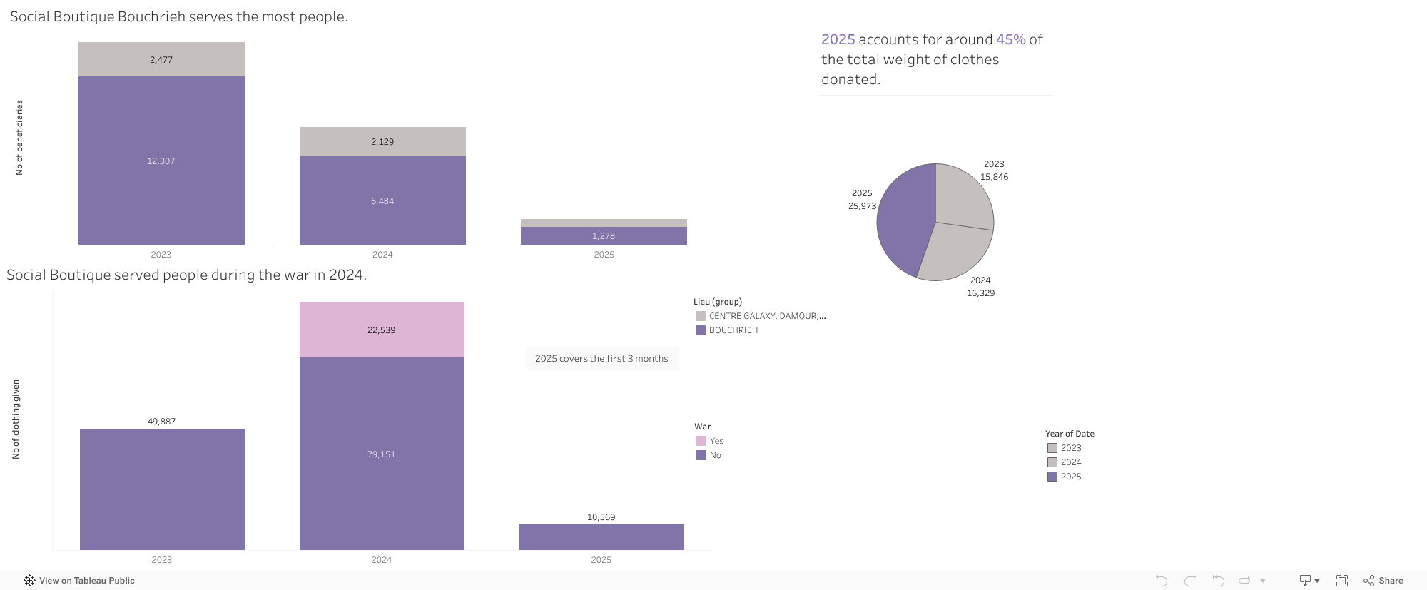
From 2023 to 2025, the data reveals an interesting pattern. Even though 2025 only includes records up to mid-October, it already accounts for an unusually large share of the total clothing weight collected, suggesting early-year surges or improvements in how donations are handled. The Bouchrieh center stands out as the busiest hub, serving more than 12,000 people in 2023 and over 6,000 in 2024, with Zahlé and Galaxy following behind at smaller but meaningful scales.
One spike in the data is impossible to ignore: in late 2024, over 22,000 clothing items were tagged as war-related. These represent urgent distributions during October to December, when thousands of families were displaced and in need of immediate support.
But the Social Boutique’s impact isn’t just in the items it collects it’s in the people who make it all work. The team is mostly women, many from vulnerable backgrounds, including women with disabilities. Through steady employment and community support, they turn donated clothes into a lifeline for others, becoming key players in Lebanon’s circular economy.
4. Brocante: Furniture Reuse and the Circular Economy in Action
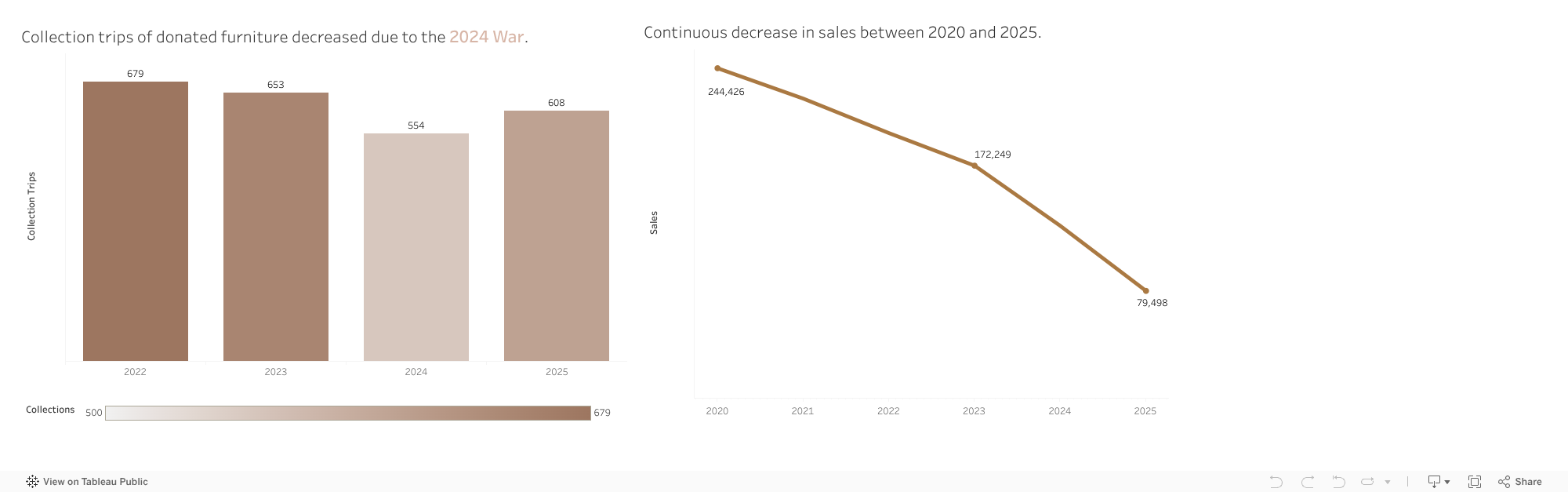
The Social Boutique tells the story of clothing, then the Brocante tells the story of furniture, the heavy, bulky pieces that often end up on sidewalks or abandoned during crises. Instead of becoming waste, these items enter arcenciel’s circular economy: collected from homes, repaired when needed, and resold at accessible prices to support the organization’s sustainability. Furniture often ends up on sidewalks, in empty lots, or in landfills, but the Brocante transforms these discarded items into opportunities. The collection trip data reveals patterns shaped by Lebanon’s crises. Trips declined during 2024, reflecting war-related mobility challenges, but rose again in 2025.
The data shows a mixed pattern in collection activity. Between 2022 and 2025, the number of collection trips, each representing at least one donated furniture or household item, fluctuated. Trips dropped from 679 in 2022 to 554 in 2024, before rising again to 608 in 2025 (with data only until October). The dip in 2024 isn’t random; it mirrors the disruptions of the 2024 war, when mobility, relocations, and donation patterns were heavily affected.
Sales, however, tell a clearer story. From 2020 to 2025, total revenue from Brocante items steadily fell from 244,426 USD to 79,498 USD. But this decline isn’t about fewer donations or lower demand. As the Environment Sector lead explained, it reflects an operational gap: the closure of the Galaxy Mall showroom in December 2024 and the delayed opening of the new Zalka Eco Hub in April 2025. With no physical space to sell items for several months, early 2025 shows a sharp drop in revenue, a logistical pause rather than a weakening of the model.
Despite these fluctuations, the Brocante remains a cornerstone of arcenciel’s approach to circularity, turning what might have become trash into both environmental and financial value.
Recycling at home and giving your recyclables to arcenciel
Donating clothes or furniture
🗺️ Collection points are available at all 10 arcenciel centers across Lebanon.
📧 For large quantities of recyclables, furniture, or clothing, contact: info@arcenciel.org
What about the future?
If the present reflects the weight of Lebanon’s challenges, the future reflects the power of what its communities can achieve when circularity, inclusion, and sustainability are not just ideas, but everyday practice. And this future is not theoretical, it is already beginning, one recycled bottle, one hospital partnership, one donated chair, and one empowered individual at a time.
Lebanon is often described as a water-rich country. With hundreds of natural springs feeding rivers, valleys, mountain basins, and dams, it is natural to expect reliable access to clean water. Yet for many households, purchasing water from private suppliers remains a normal part of daily life, even in regions surrounded by natural water sources.
This mismatch raised a simple but important question: If Lebanon has so many natural springs, why do so many towns still rely on purchased water?
What the Data Shows
The visualization compares two key measures across Lebanon’s governorates:
The number of natural springs (total, permanent, or seasonal)
The percentage of towns in each governorate that rely on purchased water
You can interact with the chart using filters to:
Explore specific governorates
Switch between total, permanent, or seasonal springs
Show or hide the purchased-water trend line
A Surprising Pattern
At first sight, we might expect places with many springs to rely less on purchased water. But the data reveals a different story.
Akkar and Mount Lebanon appear consistently water-rich across all spring types (total, permanent, and seasonal) yet roughly a quarter of their towns still rely on purchased water. This shows that even governorates with abundant natural sources do not always provide reliable public access.
Beqaa, despite having far fewer springs than Akkar and Mount Lebanon, records the highest reliance on purchased water, with more than a third of its towns depending on private suppliers. This makes Beqaa a clear example of how limited natural springs and weak distribution amplify each other.
Baalbek-Hermel, South Lebanon, and Nabatieh have moderate to low numbers of springs, yet many of their towns continue to use purchased water as well. Even where seasonal or permanent springs exist, public networks often cannot capture or distribute them effectively.
Interestingly, the North, which has the lowest number of springs in every category, relies less on purchased water than water-abundant governorates like Akkar and Mount Lebanon. This contrast reinforces the idea that the challenge is not simply about how much natural water a region has, but how well that water is managed, delivered, and made accessible to households.
The pattern is clear: Water availability and water access are not aligned.
In other words, Lebanon doesn’t have a water availability problem. It has a water accessibility problem.
Why This Gap Exists
The visualization points to a structural mismatch: the regions with the most springs are not always the regions with the best water service. Broader assessments of Lebanon’s water sector help explain why:
Many springs are located far from population centers
Distribution networks are fragmented or old
Seasonal springs are not always integrated into supply systems
Even permanent springs may not be connected to public pipelines
This means that households may live only a few kilometers from a natural spring yet still lack regular public water service, pushing them toward purchased water, especially in summer or during shortages.
Why This Matters
Understanding this mismatch reshapes the way we think about Lebanon’s water challenges:
The problem is not simply “water scarcity”
The problem is also about distribution, planning, and infrastructure
Investing in better transport systems, modernizing networks, and capturing more of the existing springs could significantly reduce households’ dependence on purchased water.
Conclusion
Lebanon is not a water-poor country! It is a country where natural abundance doesn’t translate into reliable access.
By exploring where springs are located versus where purchased water is still heavily relied upon, this visualization highlights a critical opportunity:
Lebanon doesn’t need more natural water. It needs better ways to deliver the water it already has.
Understanding this mismatch is only the first step. Lebanon needs a water system that can collect, distribute, and deliver its natural resources to the communities that depend on them. Improving planning, strengthening networks, and making better use of existing springs can significantly reduce the country’s reliance on purchased water.
So the real question going forward is this: how can Lebanon turn the water it already has into water people can actually count on?