Dear Communities,
Save Guyana!
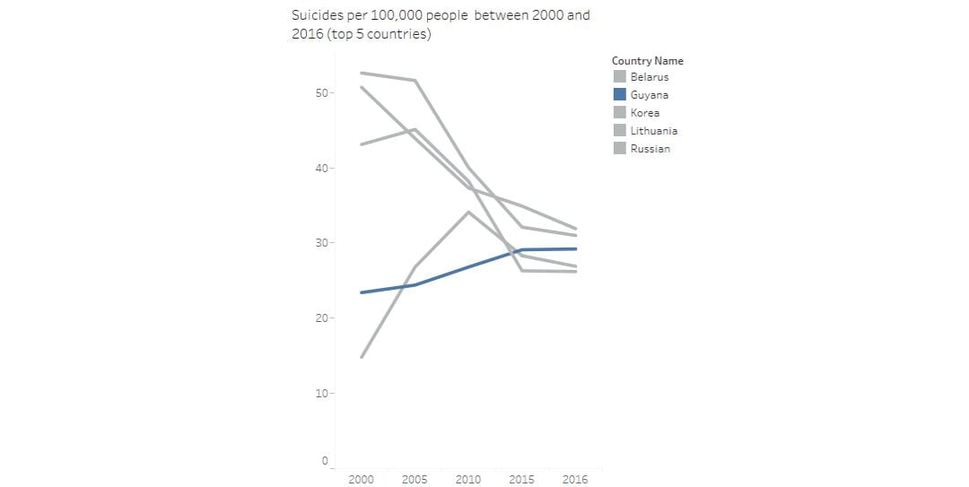
Since 2000 Guyana is witnessing an increase in number of suicides. This increase should grab communities attention to work hard on reducing this rate. We have to instill hope again in every home in Guyana.
“This is my favorite part about analytics: Taking boring flat data and bringing it to life through visualization” John Tukey

0 Comments