Data Visualization

Blog of the Data Visualization & Communication Course at OSB-AUB

This is my favorite part about analytics: Taking boring flat data and bringing it to life through visualization” John Tukey

The relation of Mobile subscription and Mortality rate

by | May 4, 2020 | Visualization | 0 comments

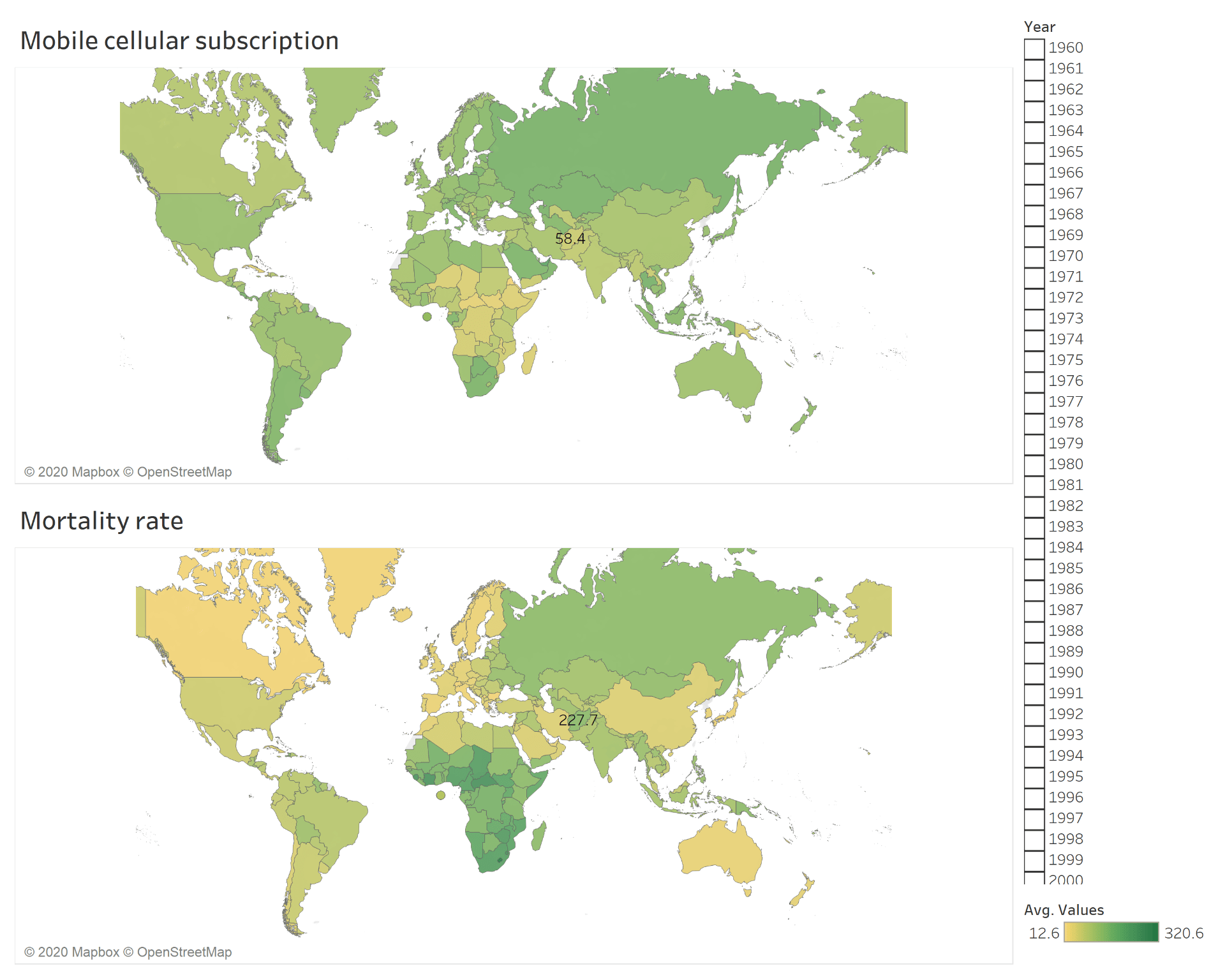
The Dashboard shows the mobile subscription rate around the world between 2013 till 2019 and compare it with the mortality rate. It is clear that the mortality rate is related to another factor and there is no contribution between the increase of mobile subscription and the mortality rate and the mobile is not the direct cause of mortality
0 Comments

Submit a Comment

Your email address will not be published. Required fields are marked *