
In principle, regions with higher disease levels should have stronger access to healthcare resources. This visualization, however, shows a different pattern.
For this analysis, I compared two indicators across Lebanon’s Governorates:
(1) Diseases
(2) Access to Health Resources
Akkar: High Disease, Limited Access
Akkar consistently shows some of the highest chronic disease levels, yet it has one of the lowest levels of hospital access among the regions.
Zahle: Lower Disease, Higher Access
In contrast, Zahle displays lower disease levels but relatively higher access to hospitals.
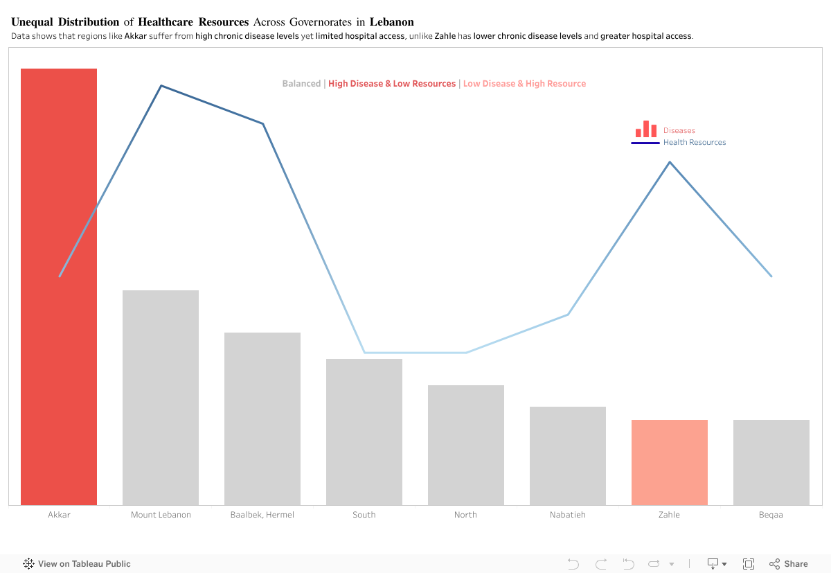
By comparing disease levels with healthcare access, the visualization shows a clear mismatch across several governorates. Akkar and Zahle represent two opposite cases, yet the overall pattern remains consistent: health needs and available resources are not aligned across Lebanon.
This raises a key policy question: Are healthcare resources being allocated based on current population needs, or on outdated infrastructure patterns? The evidence suggests that capacity does not scale with actual disease burden in several regions.
To address this, the government should:
- Conduct a nationwide needs-based healthcare assessment to map disease burden against current facility distribution.
- Reallocate resources and funding toward governorates with persistent gaps, particularly in high-need, low-access areas like Akkar.
- Implement dynamic resource planning models that adjust allocations annually based on updated health data.
- Expand primary healthcare centers in underserved regions to reduce pressure on major hospitals.
- Improve transportation and referral systems to ensure patients in remote areas can reach care efficiently
This isn’t about hospital numbers. It’s about a system that gives some regions a chance and leaves others without one.
0 Comments