
Access to healthcare in Lebanon depends on one simple but critical factor: where you live.
But until you visualize the distribution of facilities across the country, it’s hard to truly see how unequal that access is.
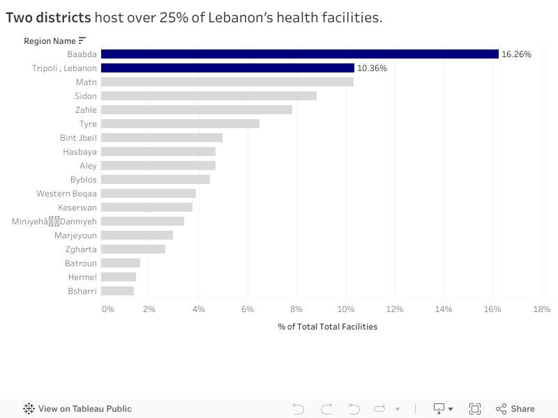
I started this project by aggregating six types of health facilities — hospitals, clinics, medical centers, pharmacies, labs and radiology centers, and first-aid centers — across all districts using the PKGCube Health Resources dataset. After cleaning and restructuring the data, one pattern immediately stood out: Lebanon’s map of healthcare is far from balanced.
To understand this more clearly, I built a district-level visualization and redesigned it using explanatory design principles. And once the noise was removed, the picture became unmistakable.
The Key Insight
Two districts — Baabda and Tripoli — hold more than a quarter of all health facilities in the entire country.
Just two.
Meanwhile, at the opposite end, districts like Hermel and Bsharri combined account for less than 3%.
In a country with major infrastructure gaps and uneven population distribution, this imbalance has consequences:
-
It shapes how far people travel to access care.
-
It affects waiting times, congestion, and referral patterns.
-
And in crisis situations, it determines who gets help quickly and who doesn’t.
The redesigned visualization highlights this story intentionally. The top two districts are shown in strong blue, while the rest of the country fades into context. No clutter, no distractions — the contrast lets the insight speak for itself.
What It Means
This distribution doesn’t automatically mean Baabda and Tripoli are “over-resourced” or that Hermel and Bsharri are “neglected.” Counts are not the same as capacity, staffing, or service quality.
But the numbers do reveal something important: If health planning is meant to be equitable, we can’t treat all districts as if they start from the same baseline.
Policymakers and NGOs could use these insights to:
-
Prioritize new facility investment in low-share districts
-
Support underserved areas with mobile clinics or telehealth units
-
Track whether the distribution becomes more or less concentrated over time
What Comes Next
This visualization is a starting point. The next step is to connect the facility distribution with:
-
District-level population
-
Accessibility and travel time
-
Facility capacity indicators
That is when the story becomes more than a map — it becomes a tool for planning.
For now, the message is simple:
Lebanon’s health infrastructure is unevenly distributed, and two districts carry a disproportionate share of the country’s access.
0 Comments