
Samer is a 58-year-old shop owner in Baabda.
He has diabetes and hypertension, and like many others living with chronic conditions, he spent the early months of the pandemic in quiet fear. He followed every guideline, avoided unnecessary outings, and even closed his shop early just to stay safe.
As I began working with data on chronic disease prevalence across Lebanon, I kept thinking about people like Samer; individuals whose health risks existed long before COVID-19 arrived. It made me wonder:
Do districts with more people like Samer also end up reporting more COVID-19 cases?
At first, the logic seemed simple:
more chronic conditions should mean higher vulnerability, and higher vulnerability should mean more cases.
But once I visualized the data, the story turned out to be more complicated than that.
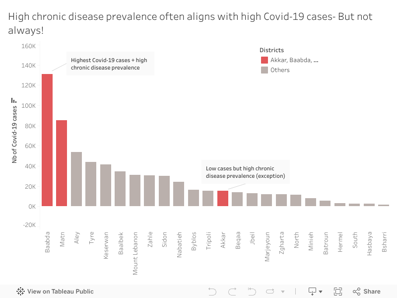
When we look at Baabda, Samer’s home district, the pattern is exactly what we expect.
Baabda and Matn have a high chronic disease prevalence which explains why they recorded the highest number of COVID-19 cases. These districts appear in red in the visualization because they represent the expected relationship:
high chronic disease prevalence accompanied by high COVID-19 case counts.
Most other districts show the same downward pattern: fewer chronic illnesses tend to come with fewer reported infections.
It’s the straightforward story we anticipate.
Until one district breaks it.
While exploring the data, Akkar immediately stood out.
Unlike Baabda or Matn, Akkar shows relatively low COVID-19 case numbers despite having a high prevalence of chronic diseases.
At first glance, this shouldn’t happen. But Akkar tells a different health story.
Akkar is less dense, has fewer specialized medical centers, and mobility patterns differ.
But an important social factor also played a role: many residents initially believed COVID-19 was “just a flu”, something exaggerated, not dangerous. Because of that, people were far less likely to get tested, especially when symptoms were mild or unclear.
So, the low case numbers may not reflect low infections, they reflect low detection.
Akkar shows us that vulnerability isn’t only biological or medical. Sometimes it’s cultural, structural, or tied to trust in the health system itself.
That was the moment when the visualization stopped being merely a chart and became a real narrative.
People like Samer live in districts where both chronic disease and COVID-19 risks were high and highly visible.
But in Akkar, people with the same medical vulnerabilities faced a quieter, more hidden risk, one that doesn’t always show up in official numbers but still shapes their health outcomes.
This is the heart of the story: patterns tell us what usually happens, but exceptions reveal what we might be missing.
Understanding these mismatches matters.
High-case, high-risk districts like Baabda and Matn may need more hospital capacity and emergency planning.
High-risk, low-case districts like Akkar may need earlier outreach, awareness campaigns, and accessible screening, especially in communities that may initially resist testing.
If we focus only on case counts, we risk overlooking communities that need protection long before outbreaks become visible.
When I think back to Samer, closing his shop early every night, hoping to stay healthy, I’m reminded that data becomes meaningful when it reflects real people.
In public health, the story doesn’t live only in the trend.
It lives in the exception.
Because that’s where we discover the next challenge before it appears.
0 Comments