Patrick Lynn Warren Sr., Vincent “Vinny” M. Belmonte, Angelo Quinto, Andre Maurice Hill… What do these names mean to you? Probably nothing.
Michael Jackson, Oprah Winfrey, Lebron James… you probably got excited just hearing their names.
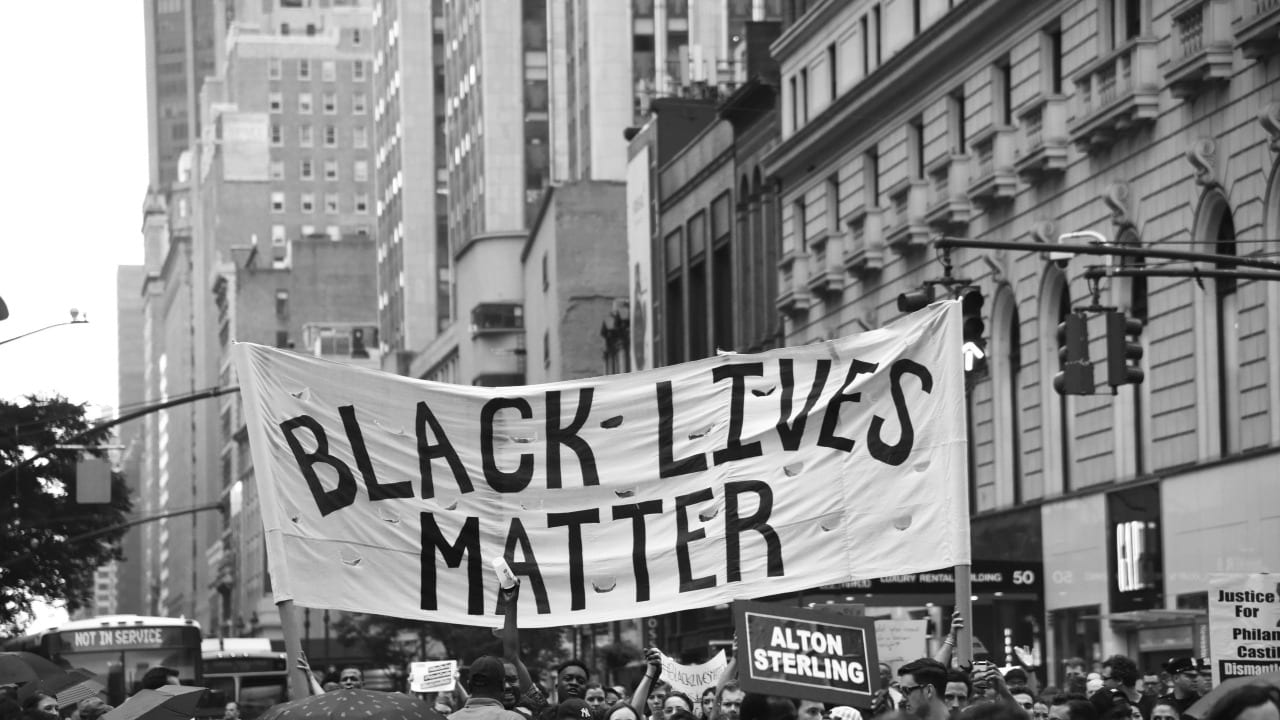
Well, the first group of people are a set of victims of police violence, their lives were so cheap that they were killed and shot dead unfairly. Police brutality and violence is an issue that we see everywhere, that accompanied with racism, is causing the world the lives of so many innocent people.
In our research we aim at highlighting this issue through facts and data visualized in graphs that emphasize the severity of the situation. We don’t stop there. We also tackle the black lives matter movement and its effect on the numbers of police-caused deaths and racism. Finally, we suggest a new potential solution and evaluate it

0 Comments