
University isn’t supposed to feel like survival. But for many students, it does.
Ask around on any campus, AUB included, and you’ll hear the same quiet confessions: “I can’t focus anymore,” “I haven’t slept properly in weeks,” “Everything is due at once,” or simply, “I’m tired.” Not the casual kind of tired, but the deep-down kind that mixes pressure, deadlines, expectations, and anxiety all into one heavy load.
Our team wanted to understand this feeling, not through anecdotes alone but through data. And when we dug into two national student stress datasets, the story that emerged was stronger and clearer than any of us expected.
This dashboard is that story.
Why We Started This Project
Stress isn’t just “part of university life.” It shapes how students sleep, think, eat, learn, and show up. And when stress keeps rising semester after semester, it becomes more than a personal issue. It becomes a systemic one.
So we asked ourselves:
- What exactly is driving student stress?
- What does it look like in real numbers?
- And is there something we, as a university community, can actually do about it?
To answer that, we turned hundreds of student responses into an interactive visualization designed to show, clearly, simply, and honestly, what stress looks like across psychological, social, and academic dimensions.
The results were eye-opening.
What the Data Reveals — A Human Story Hidden in Numbers
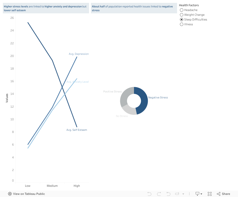
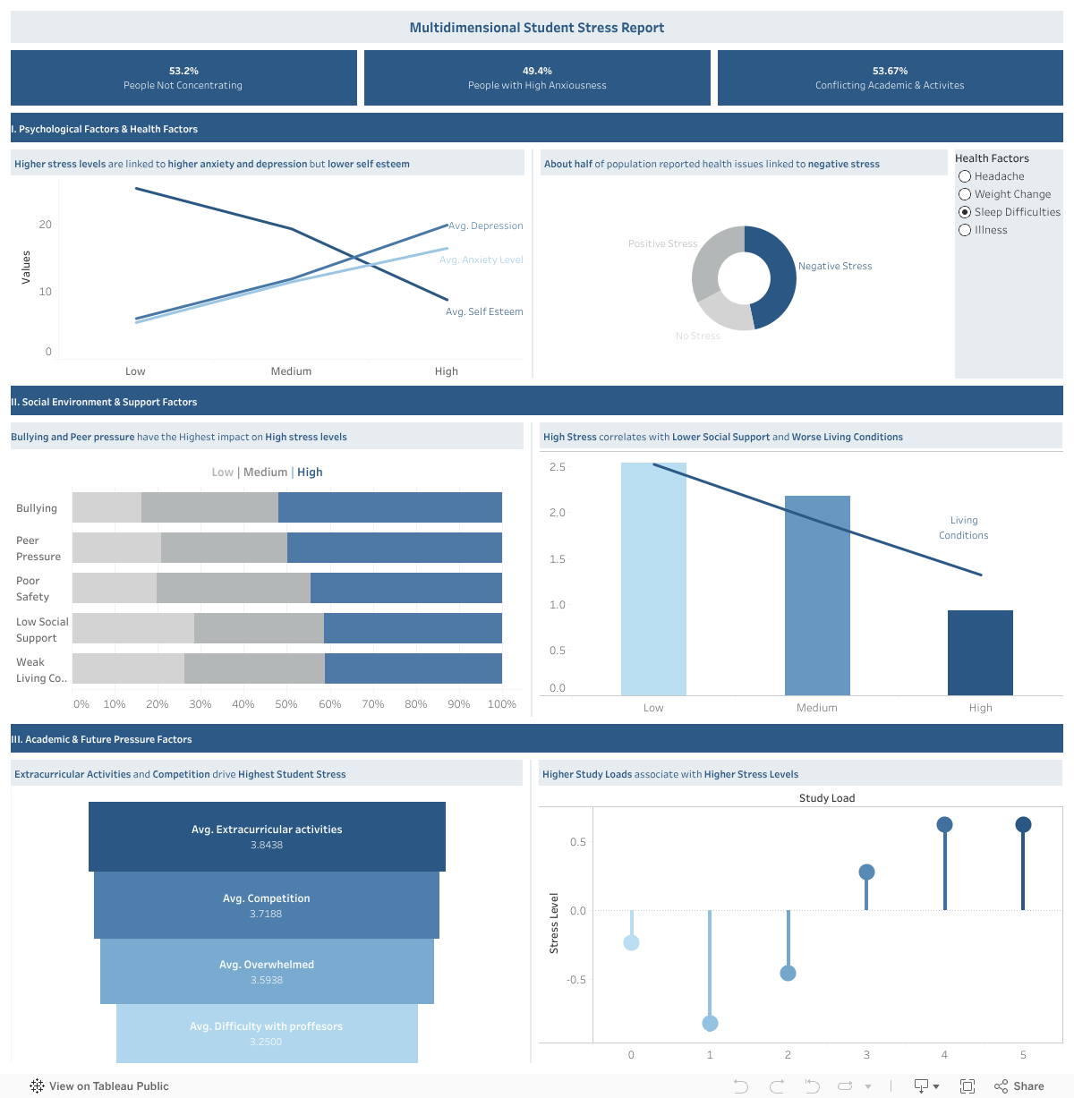
1. Stress is not just emotional — it affects how students think and function.
Half of the students in our dataset reported difficulty concentrating (53%), and nearly as many reported high anxiety (49%).
As stress rises, the dashboard shows a sharp rise in anxiety and depression, and a clear drop in self-esteem.
It isn’t just academic pressure — it’s identity-level pressure.
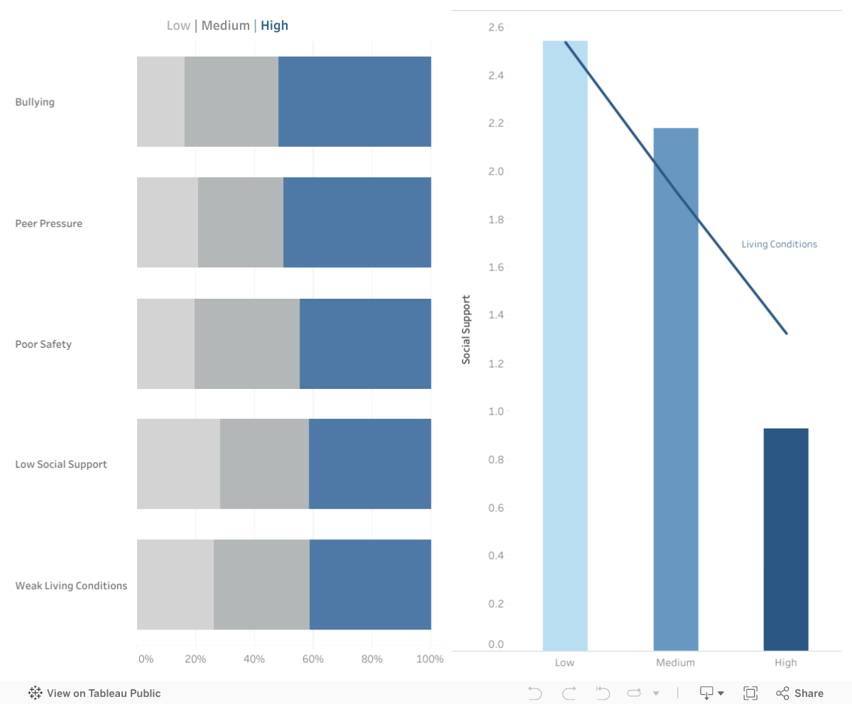
2. Social environment matters more than we think.
One of the most powerful patterns in the dashboard comes from the social and environmental factors:
- Bullying and peer pressure rise sharply with stress
- Low social support strongly correlates with high stress
- Poor living conditions amplify stress far more than expected
Stress doesn’t start in the classroom; it grows in the spaces between classes too — in dorm rooms, social circles, financial challenges, unspoken expectations, and the feeling of being alone when things get overwhelming.
3. Academic load is a major trigger — and not just the amount of work.
The dashboard shows a clear pattern:
- More competition → higher stress
- More difficulty with professors → higher stress
- Feeling overwhelmed → higher stress
- Higher extracurricular activities → highest stress of all
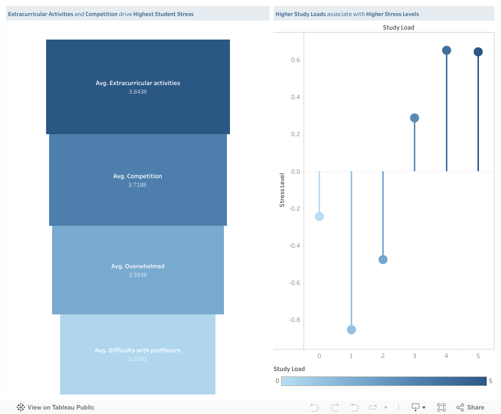
But the real insight is this:
It’s not only how much work students have.
It’s when that work happens.
Deadlines pile up in the same week, tasks overlap, and students end up sacrificing sleep, health, and well-being trying to meet multiple high-stakes demands simultaneously.
This insight became the heart of our solution.
Our Solution: A Shared Academic Load Calendar for AUB
Imagine a semester where:
- Students know what’s coming weeks ahead
- Professors can see when other courses have major deadlines
- Overloaded weeks are immediately flagged
- Departments can plan more fairly
- Stress spikes become predictable — and preventable
Our proposed Shared Academic Load Calendar does exactly that.

It’s a simple idea with a big impact: one place where professors enter deadlines and workload estimates, and a shared, color-coded calendar shows the cumulative load across courses.
For students:
A clear view of their upcoming weeks, no more last-minute shock.
For professors:
A quick way to avoid piling large assessments on the same week as others.
For programs and departments:
A data-backed view of overloaded periods, enabling better planning.
Universities like Sydney, Dundalk Institute of Technology, and Kingston University have already implemented similar systems — and the evidence is clear:
It reduces clustering, improves fairness, and helps students breathe again.
Why This Matters
This project isn’t only about data or dashboards. It’s about the people behind the numbers — the students who push through heavy weeks, juggling stressors we never fully see.
If there’s one message our visualization makes undeniably clear, it’s this:
Student stress is not random, and it’s not inevitable.
It’s structural, and fortunately, structure can be changed.
Our goal is not just to reveal the problem but to spark a conversation about how we can create a healthier, more humane academic environment at AUB.
Because when workload becomes transparent, stress becomes manageable.
When professors coordinate, students gain clarity.
And when data reveals the bottlenecks, universities can fix them.
Explore the Interactive Dashboard
You can interact with the full dashboard here:
Take a minute to explore it — follow the lines, the trends, the colors.
Behind every point is a real student with a real story.
A Final Word
Academic pressure will always exist — but unnecessary pressure doesn’t have to.
If this dashboard can start a conversation…
If the proposed solution can inspire a change…
If one student feels less overwhelmed because their workload is finally balanced…
Then this project has done what it was meant to do.
We owe students more than “you’ll figure it out.”
We owe them structure, transparency, and space to thrive.
And meaningful change begins when we look at the data — and truly listen.
0 Comments