
Have you ever had a phone call cut at the worst possible moment?
Dropped calls feel random to users, but for network engineers they follow clear patterns.
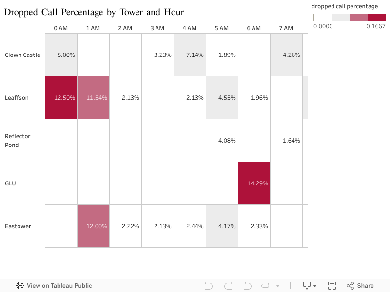
This visualization shows how phone call quality changes by cell tower and hour of the day, helping identify when and where calls are most likely to drop.
What does this chart show?
The heatmap below displays the percentage of attempted calls that were dropped.
Each row represents a cell tower, and each column represents an hour of the day.
Light colors mean few or no dropped calls.
Darker red cells represent higher dropped call percentages.
Key Insights
At first glance, most of the grid is calm — meaning many towers perform well most of the time.
But a few patterns immediately stand out:
• Leaffson tower shows spikes just after midnight
• Eastower also shows higher dropped calls around midnight
• GLU tower has a strong spike around 6 AM
These hotspots suggest that dropped calls are not random, but concentrated in certain places and times.
Why This Matters
Instead of assuming the network is bad everywhere, this visualization helps show exactly where improvements should be prioritized.
By focusing on a small number of tower–hour combinations, the telecom operator could significantly improve customer experience without redesigning the entire network.
0 Comments