 When we first began reviewing the company’s profitability across subcategories, one issue kept resurfacing: some segments were growing steadily, while others quietly chipped away at our overall performance. We suspected that a few subcategories were dragging profit down, but we needed a clear, visual way to identify which ones.
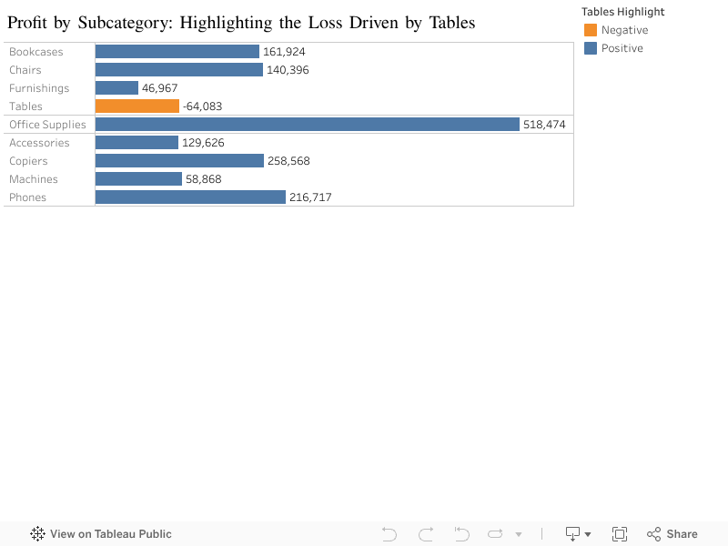
That led us to build a simplified profit-by-subcategory chart, removing unnecessary clutter and focusing only on the message that mattered. Once visualized, something became immediately clear: while most subcategories contribute positively to profit, Tables are the only one with a significant negative profit, sitting at a loss of around 64,000. By contrast, categories like Copiers and Office Supplies deliver strong, healthy profit levels, forming the backbone of our performance.
What makes this finding important is that it highlights a very specific point of leakage in an otherwise positive portfolio. Without a visual breakdown, this loss could easily be buried under the stronger-performing categories. But by isolating each subcategory and color-coding the negative performer, the issue becomes impossible to miss.
In other words, this visualization isn’t just a chart — it’s a diagnostic tool. It points directly to where strategic attention is needed. Should we reassess pricing? Review supplier costs? Consider reducing discounts or adjusting inventory? Tables clearly require deeper investigation to understand why they are underperforming while similar categories such as Chairs, Bookcases, and Furnishings show stable or positive profit outcomes.
This insight gives us a starting point, not an ending. With Tables clearly flagged as the outlier, we now know exactly where to begin our analysis, and we can allocate time and resources efficiently instead of combing through dozens of product lines blindly.
0 Comments