
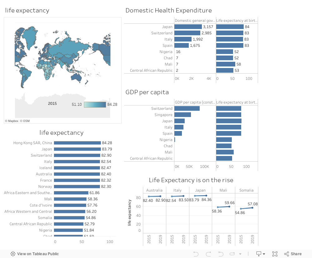
I will be tackling an important key metric that concerns the entire community, It is the large inequality of Life Expectancy across the World. Through our visualizations, we will discover the major conditions standing behind this problem. Life expectancy is the average age of death in a population, and it highly depends on the country’s conditions. This map showing countries in different colors can validate the inequality of life expectancy that has been around for many years.
We can see from this visual (Data from 2015), that the lowest life expectancy in the world was 51.1 and the highest is 84.28 years, which means that there are more than 30 years of difference, which is considered a huge difference in another word we can say that people in China, Japan, and Spain live 30 years longer than people in Chad, Nigeria, Central African Republic…
By first looking at these countries, we can see that the top countries with the highest life expectancy are known to be wealthier countries as Spain, Switzerland, Italy, and Australia and the worst life expectancy that is below 60 years is in the poorest countries, this population live in extreme poverty with very limited health knowledge and sanitary precautions. To confirm this analysis, I created a visual to analyze the impact of GDP per capita on some of these ton their life expectancy.
From these visuals, we can see that the countries with the lowest life expectancy are countries with the lowest GDP per capita, which will affect their health systems and life standards, these same countries are suffering from high Neonatal mortality rates, which is considered a major driving factor that leads to a significant decrease in life expectancy. The mortality at an early age is due to the absence of health measures in these poor countries, suffering from a lot of diseases with minimum access to medicines and healthcare facilities.
Unsurprisingly, from this visual, we can observe the link between life expectancy and health expenditure, countries that can spend more on their health can have longer lives than countries with low health expenditure.
Thus, the potential solution is improving the health standards which means developing resilient Health Care systems and supporting those countries, especially during pandemics and natural disasters. What can validate this solution by the progress seen in life expectancy in all countries over the years, and the expectations of the United Nations that people are now expecting to live longer due to improvements in health in preventing neonatal and young age mortality.
My Recommendations to increase life expectancy not only for poor countries, but also globally, and to decrease the gap between wealthy and poor countries are specific medical innovations in case of pandemics like vaccines, improving public sanitation, and increasing healthcare expenditure to achieve equitable population health outcomes. It is always important to keep on examining the factors affecting life expectancy and study the context of each country and build a database of the underlined reasons to be able to take the best approach to reach the highest possible level of equitable life expectancy.
0 Comments