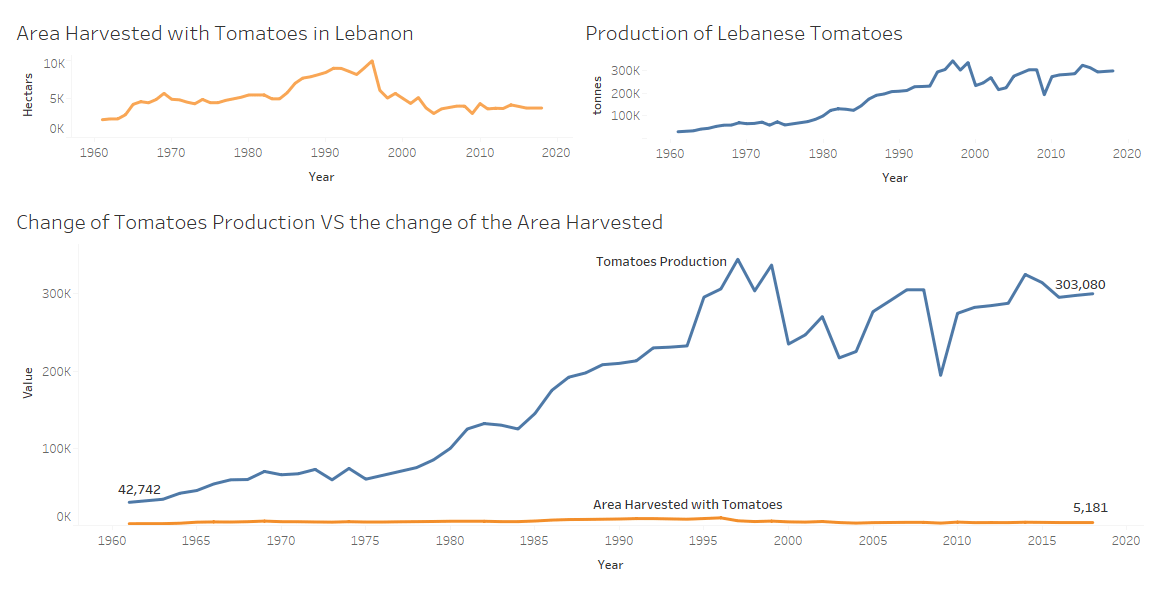
In this Dashboard, we can see how the area harvested with tomatoes in Lebanon didn’t change too much throughout the years, while at the same time the quantity produced has increased a lot, so this show us how the new agriculture methods with the pesticides used have affected a lot the production quantity with keeping the same area harvested. But, does this huge increase has negative effects on us? And what are the circumstances of this on humans?
Data used is from Open Data Lebanon: https://www.opendatalebanon.org/job/tomatoes-supply/

0 Comments