In the least developed countries across the world, balancing the number of newborn and the unfortunate number of infants who pass away remains a challenge. These regions often face the difficult challenge of high birth rates, which contribute to an explosive population growth that strains their already limited resources. However, reducing infant mortality proves to be a crucial challenge. Today, we will discuss the complex and pressing issue of finding a balance between birth rates and infant mortality in the least developed countries, seeking to highlight the societal, economic, and health implications of this delicate balance.
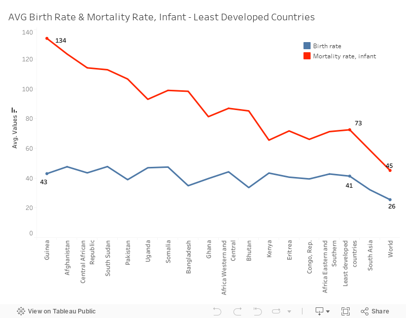
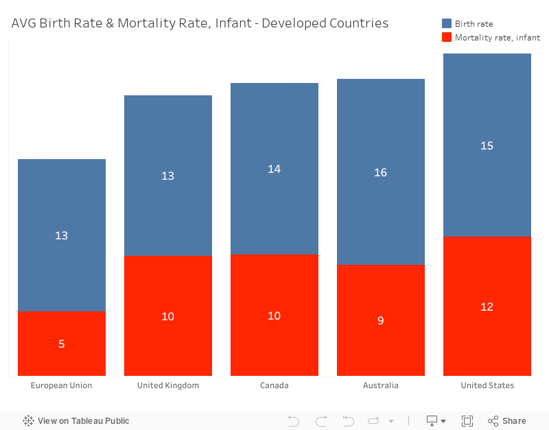
According to word bank data, the average global infant mortality rate for 2021 is 45 deaths per 1,000 live births. However, in least developed countries, the average infant mortality rate is generally much higher, at 73 deaths per 1,000 live births. For example, in Guinea, the average infant mortality is 134 deaths per 1,000 live births which is double the rate seen in the least developed countries. On the other hand, we can clearly observe the low average of infant mortality rate in developed countries. Taking the European Union as an example, the average rate is just 5 deaths per 1,000 live births.
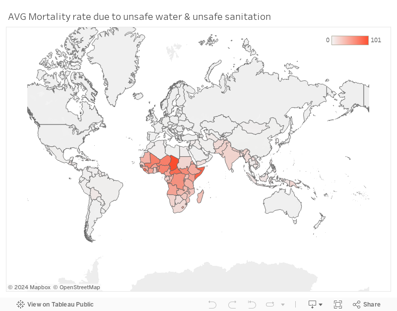
The high average rate of infant mortality can be attributed to various factors, such as inadequate healthcare quality, poor maternal health, political instability, exemplified by South Sudan and limited access to clean water, particularly in certain African countries.
To address the high average rate of infant mortality associated with these highlighted factors, enhancing healthcare infrastructure and quality in affected regions is crucial. This can be achieved by investing in medical facilities, providing training for healthcare professionals, and ensuring the availability of essential medical supplies and equipment. Moreover, improving maternal health can be achieved through educational program and accessible prenatal care, which significantly contribute to reducing the infant mortality rates. Efforts should also be made to provide clean water access to communities, especially in some African countries, by implementing clean water initiatives and supporting infrastructure development. Finally, promoting stability and peace in regions like South Sudan can create a favorable environment for healthcare improvements and access to essential services.
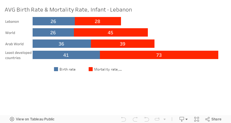
Several countries have already taken steps to improve their healthcare systems, including investments in infrastructure, expanding vaccination coverage, and enhancing prenatal care and skilled birth attendance. For example, Lebanon achieved a significant 39% reduction in infant mortality over a decade by implementing improvements in their healthcare sector.
In conclusion, ensuring access to quality healthcare is a key strategy to reduce infant mortality rates. To accomplish this, it is essential to support the collaboration between the public and private sectors, as well as international organizations, to improve the healthcare systems. Furthermore, efforts should be directed towards training local healthcare workers, strengthening the supply chain, and facilitating access to clean water. To transform these recommendations into tangible and long-lasting solutions, a steady commitment is necessary, along with consistent support from developed countries.
Team: Jana Chazbeck, Olguinia El Ferzli, Josephine Kaadou, Haydar Hamdan and Rawane Ibrahim.
Note that you can watch the videos here if you faced any technical or connections issues while visiting the website:
Reinvented toilets video:
Volunteers video:
Thank You for visiting our website!
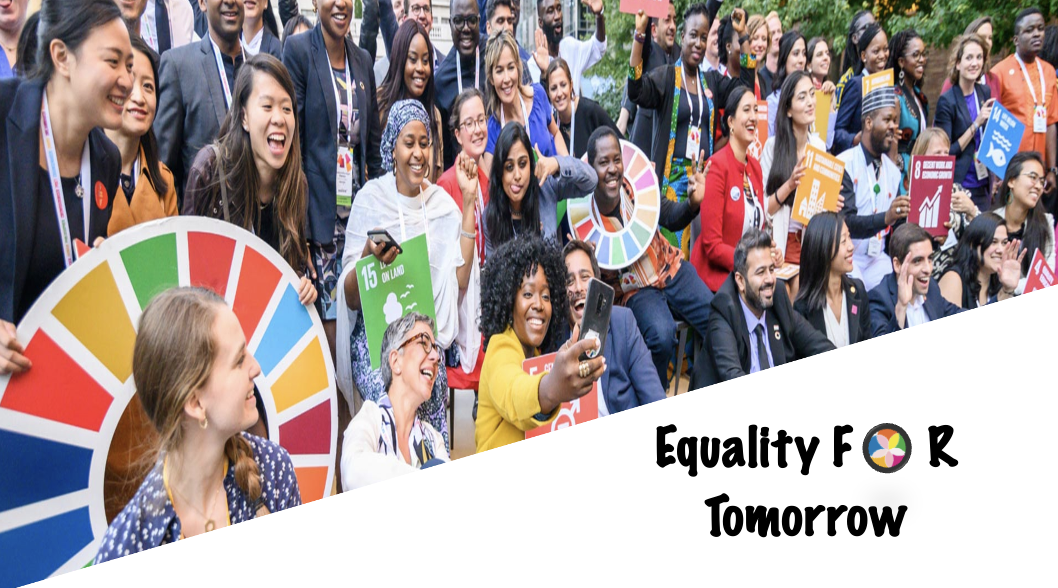
Ensure healthy lives and promote well-being for all at all ages GOAL:3
On the morning of his 45th birthday, Pedro woke up feeling depressed and anxious what was supposedly a happy occasion was one step closer to inevitable death for Pedro. You see no one in Pedro’s family has ever surpassed the age of 50 to think of it Pedro doesn’t know anyone who has lived above 50 in Mozambique. as Pedro went into the
kitchen to see his three children and wife who had prepared a lovely breakfast for this day. The thought that in a few years he won’t be able to be next to his loved ones ever again broke his heart no father wishes to leave his children.
Mozambique is one of many countries that suffer from low life expectancy at birth due to poor healthcare in the country. Even if the treatment was availableit would be extremely expensive. The average person who lives in Mozambique like Pedro couldn’t afford treatment when needed. All over the country, people are dying early because treatment for simple diseases is not easily accessible.
This tragic occurrence leads to the early death of many people. Like Pedro, there are thousands of people who pray that the government will establish an effective well-trained healthcare system that is also affordable and accessible to everyone in the country.
A proper healthcare system will extend the lives of people like Pedro who wish to stay next to their loved ones for years to come without fear of death at an early age. For a health system to be truly effective it needs to be adequately supervised by the government along hiring trained professionals to ensure the success of the system.
strong regulations and close observation by governments are required so that hospitals and pharmacies don’t take advantage of the people.
If proper healthcare is made accessible to people, health expenditure will increase leading to an increase in life expectancy.
Everyone deserves to live a long healthy life!
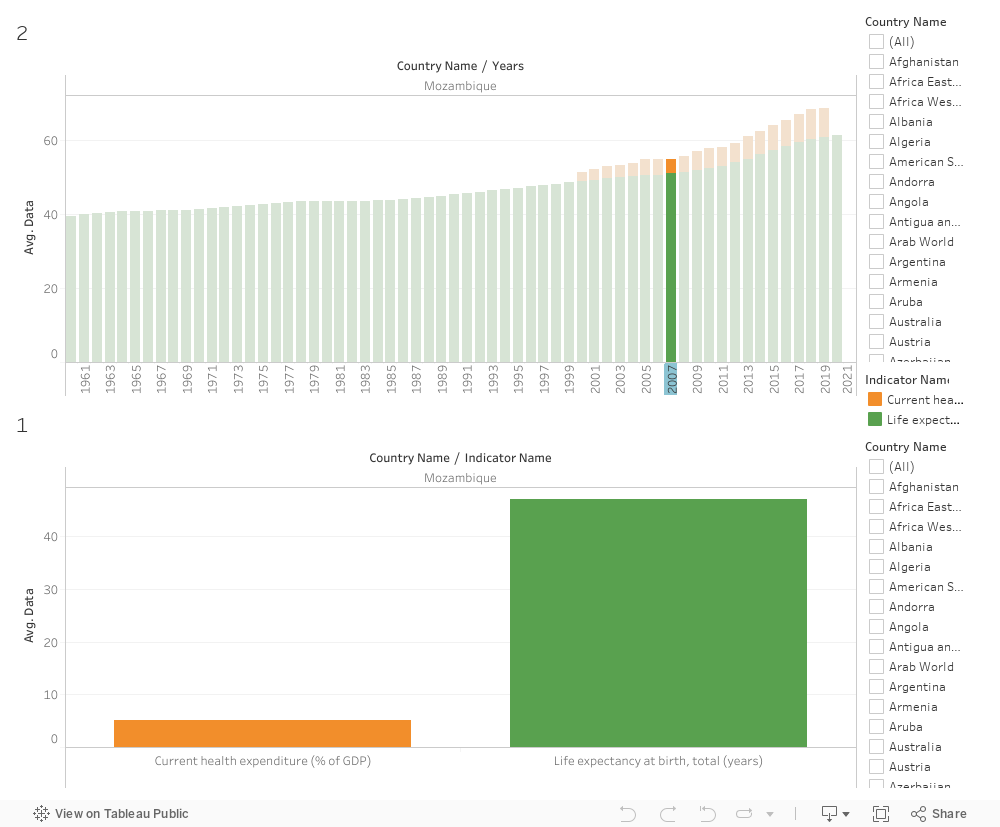
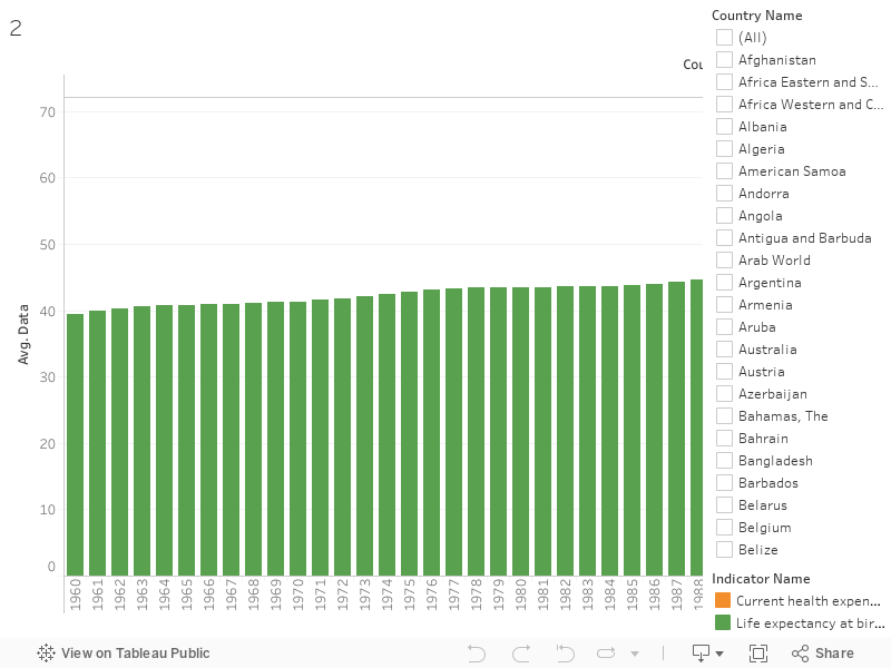
In year 2000 we can see that the life expectancy at birth was an average of 48.95 years back then the current health expenditure(%of GDP) was on average 2.26
In year 2019 Mozambique Current health expenditure (%of GDP) became an average of 7.83 and obviously the life expectancy at birth increased to 60.85 years
PROBLEM: The lack of proper healthcare Leeds to Low life expectancy in less developed countries this means that people are dying at early ages Because they do not get access to early diagnosis ,timely treatments and resources to treat the disease.
PROBLEM EVIDENCE :Life expectancy depends on variables that are related to healthcare resources it is obvious That if we look at the current health expenditure(%GDP) that represents the level of resources c
hanneled to health relative uses of the different countries we can see that countries who spend less on health expenditure have a lower life expectancy and vice versa.
POTENTIAL SOLUTION: Proper access to healthcare is associated with lo
w risks of mortality meaning higher life expectancy. Providing access to healthcare and making prices of medication affordable is essential also it is important to focus on patient engagement and connection in order to treat the patient better
SOLUTION DETAILS:Government should work on lowering prices of prescription drugs so that they can be accessible to people who need them. Government must preserve the interests of its citizens by supplem
enting the market where there are gaps and regulate markets to improve efficiency and illuminate any unfairnessin the health sector this will require strong regulations and close observation by governments
SOLUTION VALIDATION:Through the graphs we can see valid evidence that countries that spend more on current healthcare expenditure tend to have higher life expectancy for example In Mozambique in year 2000 we can see that the life expectancy at birth was an average of 48.95 years back then the current health expenditure(%of GDP) was on average 2.26 when the current health expenditure started increasing so did the life expectancy in year 2019 Mozambique Current health expenditure (%of GDP) became an average of 7.83 and obviously the life expectancy at birth increased to 60.85 years meaning that The life expectancy improved 11.9 years this was also the case in a lot of other countries
RECOMMENDATION: For this to be possible it is recommended to recruit train and produce rise health workers because they are the heart of any strong healthcare system also establish affective surveillance on the healthcare industry (pharmacies and hospitals) by improving access to affordable Stable inclusive treatments
Authors: Tala Abdul Samad, Nour Al Bidewe, Basman Hariri, Sara Sadaka, Aziz Saliby, Jean-Pierre Sakr
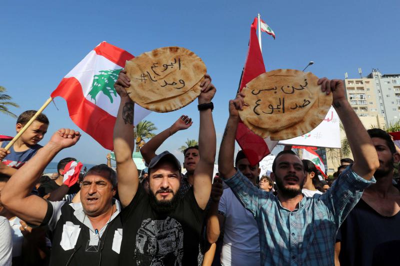
Over the past two years, Lebanon has been witnessing compounded crises such as brain drain, poverty, unemployment, and inequality. On October 3rd, we wanted to listen to the factors that affected the Lebanese the most. Borhan, a 60-year-old man living in Beirut, was one of the people we met. We captured a video with him to show the suffering of the Lebanese since the start of the crisis where he comprehensively described the severe living conditions. As we all know, 2019 was a year of transformation for Lebanon, beginning with the October 17th revolution in 2019, following the global pandemic in 2020, and the rise of inflation. Borhan expressed the feelings of most Lebanese, where he identified the problems that we are facing as residents. Many people mentioned that specific sectors have been hit the most, therefore we would like to perform exploratory data analysis and surveys using different datasets to be able to identify inequalities. We are also interested in using a data-driven approach to identify gaps and inequalities that exist in the education, income, and health sectors.
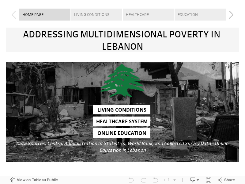
As a result, we have exploited the World Bank’s World Development Indicatorsand we have identified several indicators which we have used as proxies to measure multidimensional poverty in Lebanon. We chose to have a topic related to the multidimensional poverty index in Lebanon compared to the Arab region. Since the multidimensional poverty index is calculated using three different dimensions, namely education, living conditions, and health, we decided to divide the three different dimensions among us.
Living Conditions:
Housing is a significant indicator of the multidimensional poverty (MDP), and based on ESCWA calculations, the main indicators to assume whether housing is counted as depreciation for a household or not are ‘Overcrowding rate’ – the percentage of the population living in an overcrowded household – ‘Housing type’ i.e. houses, apartments, row houses, townhouses and duplexes, ‘Sanitation quality’ – availability of handwashing facilities, toilet cleanliness.
Historical data related to housing utilities in Lebanon was gathered from theCentral Administration of Statistics (CAS), which contains significant indicators to measure MDP such as water, electricity, gas, actual rent, furnishings, household equipment and routine household, and others. Data is shown monthly from December 2007 till September 2022.
This data reported many indicators highlighting the increase in poverty on multiple sides. It is worth reporting that the consumer price index (CPI) Housing Utilities in Lebanon records the highest score this September 2022 (363.3) compared to October 2021 (215.9).
Looking at the nutrition level, food inflation was detected as the cost is more skewed to the right for the year 2021-2022; rising food prices reduce the purchasing power of food consumers. Another devaluation could be mentioned in the transportation sector, as the transportation sub-index of the CPI basket in Lebanon increased by 2339 points in September of 2022 (3,725), compared to August 2021 (1,386); the cost of transportation is significantly increasing, resulting in a limitation to access in the transportation sector.
It is worth mentioning that the CPI in Lebanon has more than doubled over the past year, peaking this September 2022 at a score of 1,611.4 against 714.8 in October 2021, and a higher CPI indicates higher inflation. This eventually leads to adjustments in the cost of living and income, which tends to worsen inequality or poverty as it hits income and savings harder for poorer or middle-income households than for wealthy households.
Healthcare System:
As stated by Joao Martins, MSF Head of Mission in Lebanon, “The crisis in Lebanon has been driven by years of corruption and now we are seeing that this can contribute to the destruction of an entire health system just as effectively as war or a natural disaster”. As a result, it is important to conduct a deep dive analysis on the healthcare system in Lebanon which is a dimension that measures multidimensional poverty.
First we will look at the current health expenditure (%of GDP) which takes into account the public and private health expenditure. By comparing Lebanon to the Arab World, we can notice that the current health expenditure is higher along the mid 2000 with Lebanon having 11% in 2000 while the Arab World having 4%. After that, Lebanon witnessed a decrease and the Arab World an increase reaching a value of 9% and 5%, respectively. The decrease in the expenditure in Lebanon has negatively affected the healthcare system as medication and vaccines are becoming scarce. Looking more closely, we can see in the next graph that the access to immunization has tremendously decreased in Lebanon. On average the access to vaccines (such as DPT, HepB3, and measles) has decreased from 83% (2000) to 67% (2021).
On another hand, we evaluated the demand for private insurance in Lebanon. As we can see, the demand has decreased from 70% (2000) to 45% (2021). This decrease is due to all private insurance companies converting their payment method to fresh U.S. dollars and since the NSSF benefits have diminished due to the economic crisis, most Lebanese people are now left with no proper access to health assistance.
Education:
We also conducted a survey on school and university students to analyze access to online education during the COVID-19 pandemic which was also identified as the new normal.
You can be part of our project by filling this online survey. Your answers are highly valuable to the development of our dashboard since the larger the sample size, the more accurate our results would be.
At a later stage, we would like to present our results to our target audience which are UN agencies, local NGOs, and Lebanese ministries. We got a total of 135 responses from all over Lebanon where the survey was populated via social media platforms. The majority of the respondents were university students or graduates. Most of them were unemployed or employed in a full time position.
We asked the respondents about their evaluation to their online experience; the answers rated their experience as poor or fair. On a scale from 1 being a very bad experience and 5 being a very good experience, most of the respondents rated the effectiveness of online learning as 3. In addition, we asked about the preferred type of education; the majority answered the traditional physical method as the most preferred following the hybrid method as second preferred. These answers make us conclude that the online learning experience was not that good in Lebanon. This might be due to the lack of training from the government and the teachers.
To further explore the facilities that were available to ease the online learning experience, we asked the people about their access to devices, electricity and internet. For the devices, the majority had access to devices that were mainly Mobile phones or laptops. Most of the respondents have access to electricity but not all the time while almost all the respondents have access to internet but the variance changed between access all the time and access but not all the time. Most of the respondents reflected that they couldn’t focus and they weren’t serious about their studies during online learning. Furthermore, on a scale from 1 being not at all to 5 being for sure, we asked the people about their willingness to retake the online experience. The answers varied between 1 and 2 mainly.
Finally, we asked the people about the disadvantages of online learning. Some of the responses include poor network, electricity cuttage, procrastination, weak communication, lack of motivation to study, more distraction, professors are not equipped with the resources, challenging experience for both students and professors. From this survey, we can conclude that Lebanon wasn’t prepared well for such a situation, especially its basic infrastructure which includes bad electricity and network services.
A pandemic that is targeting the under-privilege, as if the right of living and being protected from such a disease is dependent on one’s status and unfortunate living conditions.
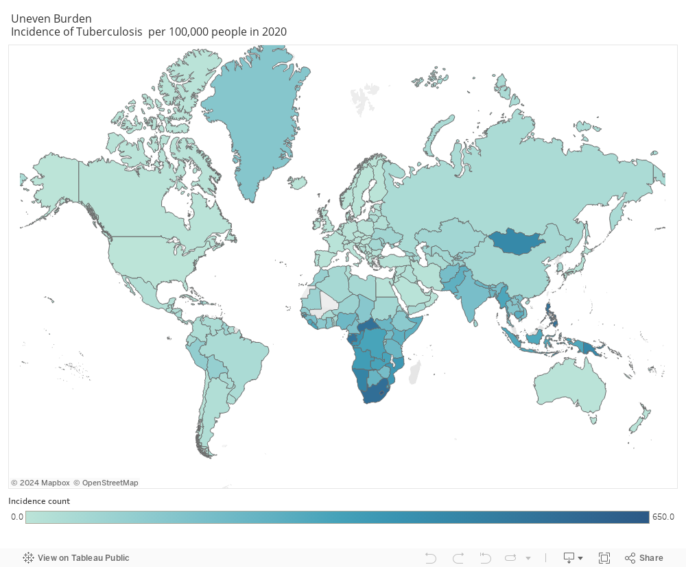
Tuberculosis continues to be a huge peril disease against the human population and according to WHO, TB is the leading cause of death in infectious diseases killing over 1.5 million people around the world in 2020 alone, 95% of which is occurring in developing country.
The below is a reflection of the data from the world data index showing the uneven distribution of TB incidence per 100,000 in 2020 that is occurring. A steady decrease in developed countries , however a remaining major problem in developing countries.
The World Health Organization (WHO), following the guidelines of the United Nations’ Sustainable Development Goals (SDGs), plans to eradicate the pandemic by the year 2030. The goal is to reach a 90% reduction rate in the number of deaths due to TB by the year 2030, and 95% by 2035.
Actions to be taken:
Allocate funding on providing chemoprophylaxis (the number one treatment for TB) to developing countries to increase access for the underprivilege and decrease spreading of TB.
Adjust healthcare policies and increase campaigns for free BCG vaccination in developing countries , making it mandatory as with many developed countries
Mass screening tests to detect dormant or active TB, to decrease spread especially with over-populated settings and among the immunosuppressants.
Increase Awareness campaigns to educate the population on the signs and symptoms and importance of preventive measures to be taken for a better chance of survival.
The key to an end of the pandemic starts with you!
I am a healthcare worker and I urge you after this blog to do the following:
Check your vaccination history on BCG, along with your family.
Educate your self with the signs and symptoms: persistent cough with bloody secretions , severe chest pain and shortness of breath , weight loss and generalized weakness , fever and night sweats
Tuberculosis may be dormant, meaning asymptomatic for years for that if you have never been tested, urgent medical screening is required.
If you experience any of the signs and symptoms , seek immediate medical help
Keep your distance when engaging in a conversation and avoid crowded places!