by nmd33 | Nov 20, 2025 | Uncategorized
If you’re Lebanese, you know that coffee is more than a drink. It’s a companion for all occasions; from kick-starting your morning with an energy booster, to a beverage to enjoy while having conversations with family and friends, and especially during late-night studying. It’s how we wake up, how we host, and how we quietly share connection and love.
With that in mind, I wanted to look at coffee from a different angle: through data. Using a dataset of transactions from a café, I explored:
-
Which drinks are most popular
-
How consumption changes across the time of day
-
Which hours are the busiest
-
And how daily revenue fluctuates across the week
The goal is simple: if coffee is so central to our culture, when exactly are we showing up, and what are we ordering?
Why does this matter? Café owners find it hard to know exactly when to staff up and which drinks to push.
This visualization ranks drinks by total revenue. A few patterns stand out:
-
Lattes and Americanos bring in most of the money, with a balanced consumption of each drink throughout the day.
-
Other drinks, such as Cortado and Hot Chocolate are also consumed but at much smaller level compared to their counterparts.
Despite having many options to choose from, individuals tend to enjoy the classics. These are the drinks that keep the line moving and the espresso machines busy.
Next, I looked at revenue by hour of day. This gives us a clear view of when people frequent cafés the most. The pattern is very typical:
-
A strong morning rush between roughly 8:00 and 10:00 AM as people grab coffee on the way to work or university.
-
A smaller afternoon bump, around 3:00 to 5:00 PM, when people need a second boost or meet friends.
-
Sales gradually drop off into the evening.
These are the hours when extra baristas would be needed the most, and popular drinks should be front and center to keep service fast.
Time of day isn’t the only dimension that matters. I also wanted to know:
Are some days of the week more predictable than others?
This boxplot shows the distribution of daily revenue for each weekday:
From this view:
-
Weekdays tend to have higher median revenue than weekends.
-
Some days, especially mid-week and Friday, show taller boxes and more high outliers, meaning they can be very good or just average.
-
Weekends (particularly Sunday) are a bit calmer: slightly lower but more stable daily sales.
So if you’re planning staffing or inventory, weekdays are where you need more flexibility, while weekends can be managed more steadily.
Because most revenue comes from weekday morning and late-afternoon peaks driven by a few core drinks, we should staff and promote around those windows to serve faster and sell more

by crr08 | Nov 20, 2025 | Uncategorized
Unequal Support: When Small Numbers Hide Real Lives
This is Jane, a 27-year-old Ethiopian domestic worker living in Akkar.
Last month, when she got sick, she had no access to community aid, legal protection, or medical support.
She waited four days before anyone could help her—not because support didn’t exist, but because in Akkar there are too few immigrant workers to be considered a priority.
Jane’s struggle is not personal—it’s structural.
Immigrant workers in Lebanon are not distributed evenly across the country, and when population numbers are small, support systems disappear.
Small communities become invisible, unheard, and unprotected.
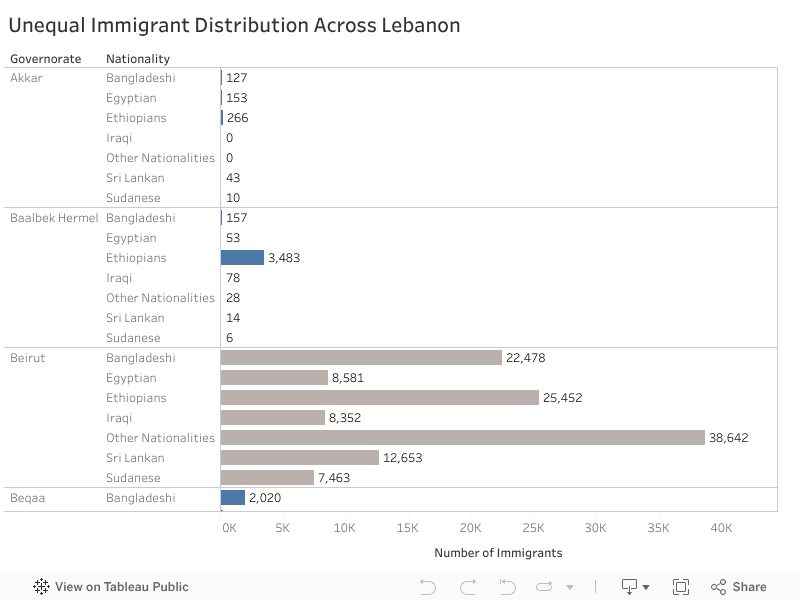
Below is the distribution of immigrant workers across Lebanon by nationality and governorate.
Everything in blue represents a community with fewer than 10,000 workers, meaning low visibility and often no access to essential support.
While Beirut hosts extremely large populations — for example 38,642 workers labeled “Other Nationalities” and 25,452 Ethiopians—governorates like Akkar host only 266 Ethiopians and 127 Bangladeshis.
Yet behind every small number is a real human life.
If We Do Nothing
If nothing changes, workers like Jane will continue to suffer in silence.
Low-population regions will remain overlooked, and inequality will deepen — not because help doesn’t exist, but because help isn’t distributed fairly.
What Can We Do?
Solution 1—Mobile Clinics
Mobile clinics are medical vans that travel to underserved regions to deliver basic healthcare.
They bring support to people who cannot safely or affordably reach Beirut.
During COVID-19, NGOs in Lebanon successfully used mobile medical units to reach remote areas — proving that mobility overcomes geographic inequality.
Solution 2—Rotating Outreach Teams
Teams of legal advisors, translators, and social workers rotate across governorates weekly, providing education, protection, and emergency help.
This approach already works in Jordan, where outreach teams support Syrian refugees in dispersed rural camps without needing permanent offices.
Solution 3—Minimum-Support Policies
A national guarantee ensuring every governorate receives a basic level of support, regardless of population size.
Just as Lebanon provides schools, electricity, and hospitals to small villages, immigrant workers deserve equal dignity and safety.
Findings & Recommendation
Support should not depend on population size — dignity must be universal.
Lebanon should adopt minimum-support policies, expand mobile and rotating services, and ensure that no worker is invisible.
Jane deserves to be seen. Every worker does.

by rmg18 | Nov 20, 2025 | Uncategorized
 Lebanon’s landscape is full of cultural, historical, and natural assets, yet tourism development across the country remains uneven. Using the UNDP Tourism Readiness dataset (1,136 towns across 25 districts), this analysis uncovers where Lebanon’s hidden tourism opportunities are and which regions lack the infrastructure to support them.
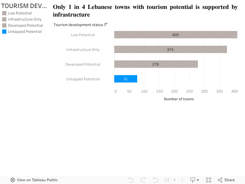
Tourism Potential Exists, But Not All Towns Are Developed
To understand tourism readiness, every town can be classified into one of four groups:
- Developed Potential: Towns with both potential and infrastructure
- Untapped Potential: Towns with potential but no infrastructure
- Infrastructure Only: Towns with infrastructure but no identified potential
- Low Potential: Towns with neither
Right away, a key insight emerges:
A considerable number of Lebanese towns have meaningful tourism potential but lack the infrastructure required to activate it.
This simple breakdown highlights that tourism potential is widespread across the country, but not always supported by visitor services such as guest houses, cafés, or restaurants.
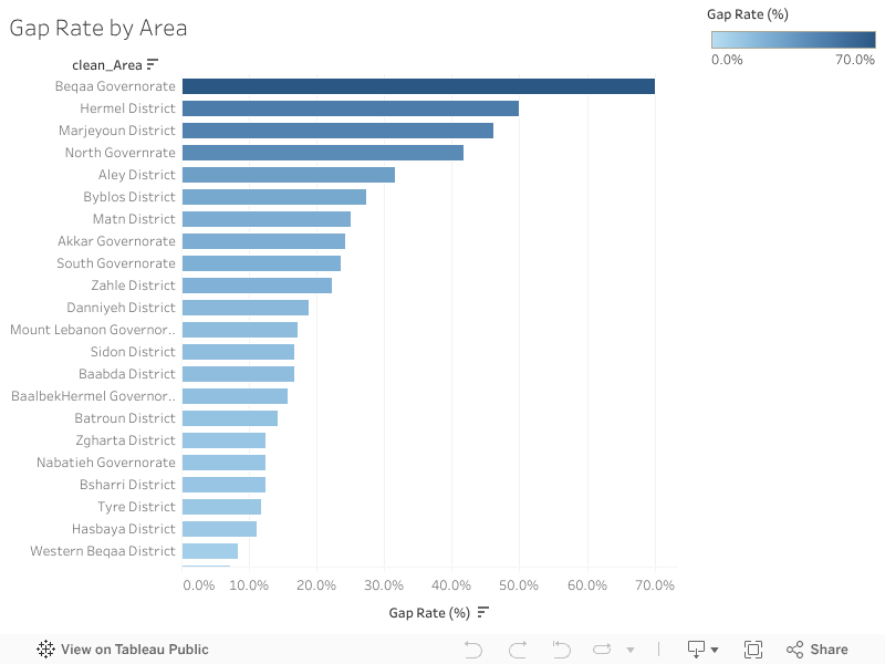
Some areas have much larger gaps than others
When looking at infrastructure gaps by area, the differences become clearer. Some districts have potential but very little tourism infrastructure to go with it.
In particular,
show some of the highest gap rates. These places have attractions and natural assets, but not enough facilities to support tourism activity. Meanwhile, districts like Mount Lebanon and Byblos are more developed and have infrastructure that aligns better with their tourism activity.
This chart makes it easier to see which areas are lagging behind and where new investment could make a real difference.
What this means for tourism planning
- Putting the insights together, a simple pattern appears:
- Many towns across Lebanon do have tourism potential
- But a noticeable share of them don’t have the infrastructure to support visitors
- The largest gaps show up in specific districts, not everywhere
- Improving basic services in these places could unlock new opportunities
Instead of focusing only on areas that are already popular, these findings suggest that Lebanon has several underdeveloped regions that could become strong tourism spots if they receive proper attention.
Conclusion
Lebanon already has the natural and cultural foundations for tourism. The challenge isn’t a lack of potential, it’s the uneven distribution of infrastructure.
By identifying where the gaps are, the data gives a clear starting point for planners, municipalities, and anyone interested in local development. Investing in infrastructure in high-potential but underserved towns could help bring more balance to Lebanon’s tourism map and open opportunities in regions that are currently overlooked.

by mmk136 | Nov 19, 2025 | Uncategorized
Sierra Leone is a small West African nation with a population of roughly 8 million people. Rich in natural beauty, cultural energy, and abundant resources. But behind the country’s potential lies a familiar struggle: an economy still leaning too heavily on a single sector. Agriculture has long been the backbone of national productivity, while mining, industry, and services often struggle to keep pace.
This structural imbalance has made Sierra Leone vulnerable, and nowhere was this more visible than in 2015, when the dual shocks of the Ebola outbreak and a collapse in global iron ore prices sent the economy into a tailspin. So, what exactly is going on beneath the surface? And what would it take to build a more resilient and diverse economy?
Agriculture consistently accounts for 50-63% of the GDP, leaving the nation vulnerable whenever farming seasons fail, prices fluctuate, or crises occur.
Industry is the most unstable sector, swinging wildly between 5% and 22%. And in 2015, it hit its lowest point, just 5% due to:
- The Ebola outbreak froze movement and production.
- A crash in global iron ore prices is forcing mining operations to shut down.
This year alone has exposed how dependent Sierra Leone’s industrial sector is on external forces.
Hovering between 28–36%, the services sector has been steady but sluggish, unable to compensate for weaknesses elsewhere. Together, these patterns reveal an economy that struggles to withstand shocks because it lacks balance.
A Way Forward: Building a Diversified Economy
If Sierra Leone wants long-term stability, it must diversify, plain and simple. That means:
- Strengthening industry
- Modernizing agriculture with value addition
- Expanding services and digital innovation
The proposed solutions are supported by real-world programs in Sierra Leone, confirming their credibility and feasibility.
- World Bank – Sierra Leone Economic Diversification Project
- Supports economic diversification beyond agriculture and mining.
- Strengthens SMEs, enhances value addition, and improves market access.
- Confirms agro-processing, service expansion, and SME support as national priorities.
- International Labour Organization – Opportunity Salone Programme
- Promotes youth entrepreneurship and job creation.
- Supports sustainable SME models and value chain development.
Validates the focus on integrating agriculture with industry.
The solutions are evidence-based, nationally aligned, partner-friendly, and feasible. But the question remains: how can Sierra Leone leverage these programs and data insights to fully unlock its economic potential?

by mjc11 | Nov 19, 2025 | Uncategorized
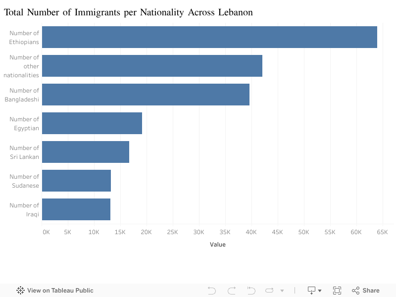
Foreign workers play a central role in Lebanon’s economy, especially in domestic labor, construction, and services. Yet the size of each migrant community is often misunderstood. Using data from AUB’s CODEC platform, this visualization compares the total number of immigrants by nationality across Lebanese districts. The goal is simple: to understand how the foreign workforce is distributed, without making assumptions or relying on anecdotes.
The comparison highlights one clear insight: Ethiopian workers form the largest non-Arab migrant community in Lebanon, with more than 60,000 individuals recorded across the dataset. They are followed by a broad category labeled “other nationalities,” which includes smaller groups not individually classified. Bangladeshi workers also represent a major share, clustered in sectors such as construction and cleaning services.
Egyptian workers occupy the next position, reflecting their long-standing presence in multiple economic sectors. Sri Lankan and Filipino communities, historically linked to domestic labor, remain significant but no longer dominate in size as they once did in the early 2000s. Meanwhile, Sudanese and Iraqi migrants are present in smaller numbers.
This simple bar chart helps break down a complex topic: the foreign workforce is not monolithic. Each nationality has its own scale, history, and economic role. By comparing totals side by side, the visualization offers a more accurate picture of Lebanon’s migrant landscape.
Understanding this distribution matters because it corrects misconceptions. Discussions often merge “foreign workers” into a single category, but the data shows a far more diverse and structured reality. A clearer picture of the migrant population can support better public understanding and more informed debates about labor dynamics in the country.