Data Visualization

Blog of the Data Visualization & Communication Course at OSB-AUB

This is my favorite part about analytics: Taking boring flat data and bringing it to life through visualization” John Tukey

Unemployment rate over time in main historical landmarks

by | May 4, 2020 | Visualization | 0 comments

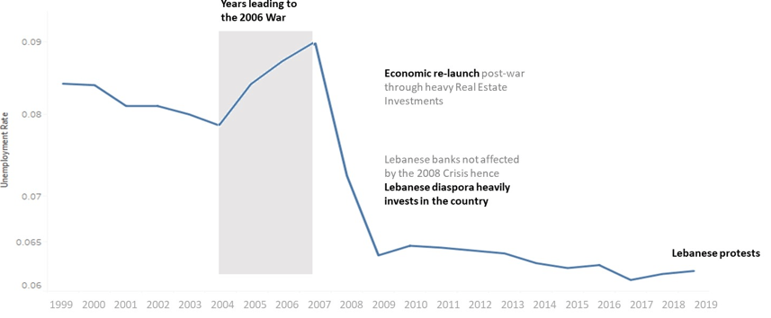
The labor market in Lebanon has been marked by its history of wars and economic downturn. In this graph, I show how each of these landmarks affected the unemployment rate weather in a negative or in a positive way. Where do we stand now and where are we heading with the revolution?

0 Comments

Submit a Comment

Your email address will not be published. Required fields are marked *